The top bar is a slim widget area above your header. Use it for things like a phone number, a short message, social icons or a small menu.
Its layout options are free. Top bar padding needs GP Premium’s Spacing module, and merging it with the secondary navigation needs the Secondary Navigation module; both are marked below.
Widgets: Appearance → Widgets → Top Bar
Settings: Appearance → Customize → Layout → Top Bar (appears once the Top Bar widget area has a widget)
The top bar widget area
The top bar only shows once it has content. Add widgets under Appearance → Widgets → Top Bar — as many as you like. The Top Bar section in the Customizer appears as soon as the area has at least one widget.
Settings
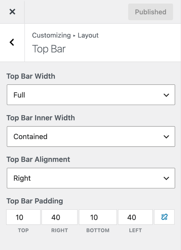
Top bar layout
In Customize → Layout → Top Bar:
- Top Bar Width — Full stretches the top bar’s background across the screen; Contained keeps it to your container width.
- Top Bar Inner Width — whether the widgets inside span the full screen or stay within the container.
- Top Bar Alignment — where the first widget sits (left, center or right). Widgets then alternate sides: with Left, the first widget goes left, the second right, the third left, and so on.
Top bar padding
Requires GP Premium — Spacing module.
Top Bar Padding sets the space inside the top bar, with separate top, right, bottom and left values in pixels. By default it’s 10px top and bottom and 40px left and right.
Top bar colours are in Colors and its background image in Background Images (GP Premium).
Merge with the secondary navigation
Requires GP Premium — Secondary Navigation module.
If the secondary navigation is set to Above Header, the Top Bar section gains Merge with Secondary Navigation. Tick it to show the top bar widgets and the secondary menu in one bar.
All options
| Setting | Section | Choices | Default | Requires | Customizer option |
|---|---|---|---|---|---|
| Top Bar Width | Top Bar | Full / Contained | Full | — | generate_settings[top_bar_width] |
| Top Bar Inner Width | Top Bar | Full / Contained | Contained | — | generate_settings[top_bar_inner_width] |
| Top Bar Alignment | Top Bar | Left / Center / Right | Right | — | generate_settings[top_bar_alignment] |
| Top Bar Padding | Top Bar | Top / Right / Bottom / Left, px | 10 / 40 / 10 / 40 | GP Premium — Spacing | generate_spacing_settings[top_bar_top], [top_bar_right], [top_bar_bottom], [top_bar_left] |
| Merge with Secondary Navigation | Top Bar | On / Off (shown when the secondary navigation is above the header) | Off | GP Premium — Secondary Navigation | generate_secondary_nav_settings[merge_top_bar] |
Settings can be changed in code with the option_generate_settings filter.
Related
- Header — the header below the top bar, including a top bar menu example
- Secondary Navigation — a second menu that can sit above the header
- Colors — top bar colours
- Background Images — top bar background image (GP Premium)
- Developer reference: Settings defaults filters