The off-canvas panel is a menu and widget area that slides in from the side, or covers the whole screen, when its button is clicked. It replaced the old Slideout Navigation in GP Premium 1.8.
Requires GP Premium — Menu Plus module. The whole guide is a GP Premium feature; the menu item height control also needs the Spacing module.
Settings: Appearance → Customize → Layout → Off Canvas Panel
Menu: Appearance → Menus → Display location Off Canvas Menu
Widgets: Appearance → Widgets → Off Canvas Panel
Settings
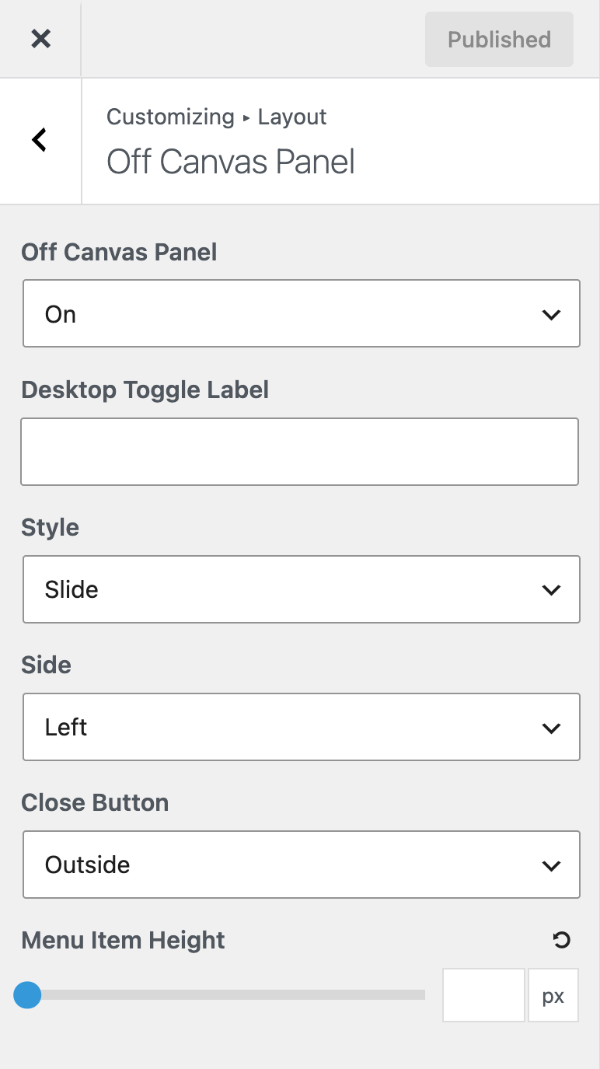
Turning it on
- Create a menu and assign it to Off Canvas Menu (theme locations).
- Set Off Canvas Panel to:
- Mobile only — the panel replaces the mobile menu. Useful for long menus, especially with a sticky navigation on mobile.
- Desktop only — adds a button to the desktop navigation that opens the panel.
- On — both.
- Off (default).
- Optionally set a Desktop Toggle Label to show text beside the desktop button.
Style, side and close button
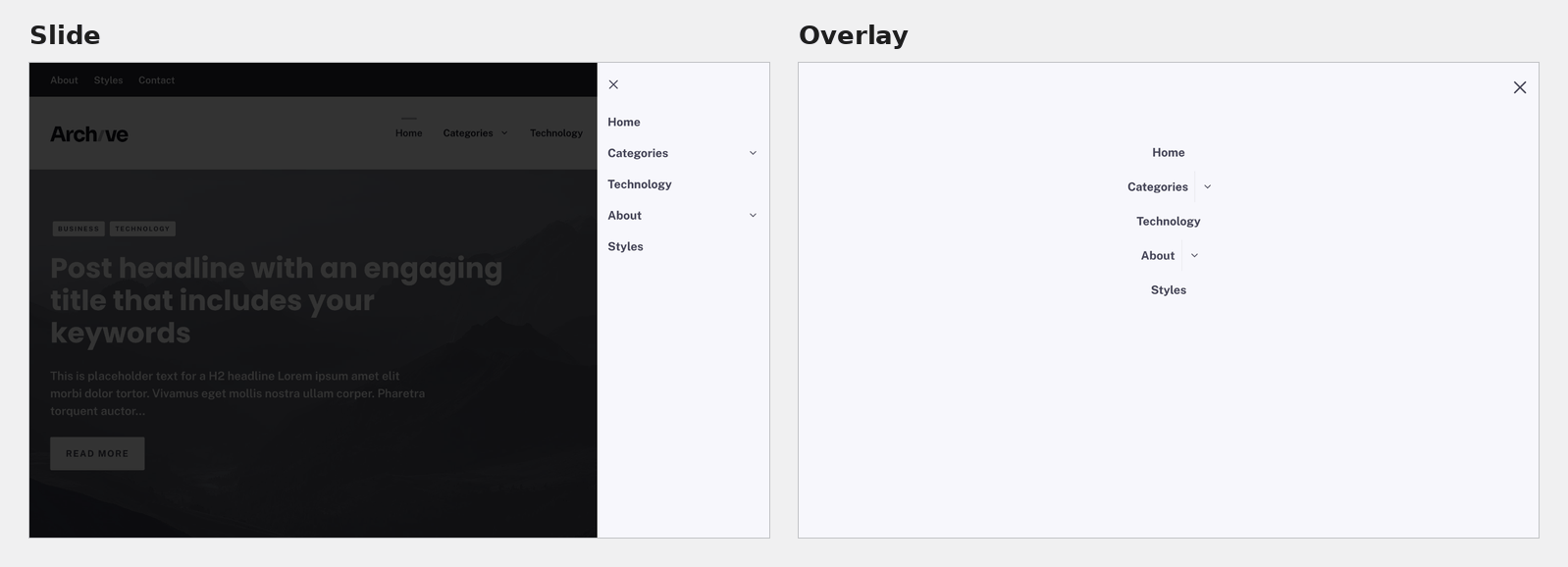
- Style — Slide (default) slides the panel in from the side; Overlay covers the whole screen. With Overlay, click Set Overlay Defaults to apply suitable colours and fonts; change them later in Colors → Off Canvas Panel and Typography.
- Side — with Slide, open from the Left (default) or Right.
- Close Button — Outside (default) or Inside the panel.
- Menu Item Height (Spacing module) — the height of menu items in the panel. Empty by default, so it uses the Primary Navigation height.
Off-canvas widget area
The panel has its own widget area: Appearance → Widgets → Off Canvas Panel. Widgets show below the menu — or on their own, if you leave the Off Canvas Menu empty.
Use the off-canvas menu only
To show only the off-canvas button on desktop, with no regular menu items:
- Assign your menu to Off Canvas Menu.
- Create an empty menu and assign it to Primary Menu.
- Set Off Canvas Panel to Desktop only or On.
- Place the button with Navigation Location.
See also Header example 1.
Empty panel?
If the panel opens with no menu items, check that a menu is assigned to Off Canvas Menu in theme locations.
All options
| Setting | Section | Choices | Default | Requires | Customizer option |
|---|---|---|---|---|---|
| Off Canvas Panel | Off Canvas Panel | Mobile only · Desktop only · On · Off | Off | GP Premium — Menu Plus | generate_menu_plus_settings[slideout_menu] |
| Desktop Toggle Label | Off Canvas Panel | Text (shown when the panel is on) | — | GP Premium — Menu Plus | generate_menu_plus_settings[off_canvas_desktop_toggle_label] |
| Style | Off Canvas Panel | Slide / Overlay | Slide | GP Premium — Menu Plus | generate_menu_plus_settings[slideout_menu_style] |
| Side | Off Canvas Panel | Left / Right | Left | GP Premium — Menu Plus | generate_menu_plus_settings[slideout_menu_side] |
| Close Button | Off Canvas Panel | Outside / Inside | Outside | GP Premium — Menu Plus | generate_menu_plus_settings[slideout_close_button] |
| Menu Item Height | Off Canvas Panel | 20–150 px | Inherits Primary Navigation | GP Premium — Menu Plus, Spacing | generate_spacing_settings[off_canvas_menu_item_height] |
Settings can be changed in code with the option_generate_menu_plus_settings filter.
Related
- Header — header examples built with the off-canvas panel
- Primary Navigation — menus, theme locations and navigation location
- Sticky Navigation — a navigation that stays on screen
- Colors and Typography — off-canvas panel colours and fonts
- Developer reference: Navigation and mobile menu hooks, Settings defaults filters