This guide covers the content of your posts and pages: spacing between their parts, featured images, the More tag and comments, plus recipes for buttons, videos and the updated date. How posts appear on the blog and archives is in Blog.
Everything here is free except the Content Separator, which needs GP Premium’s Spacing module.
Content Separator: Appearance → Customize → Layout → Container
Featured image and More tag: the post editor
Comments: Settings → Discussion
Settings
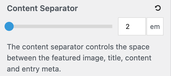
Content separator
Requires GP Premium — Spacing module.
Content Separator sets the space between the parts of a post — featured image, title, content and post meta — in em (default 2). It’s in Customize → Layout → Container, alongside the container settings.
Writing posts and pages
Adding featured images
A featured image shows above single posts and as the thumbnail on the blog and archives.
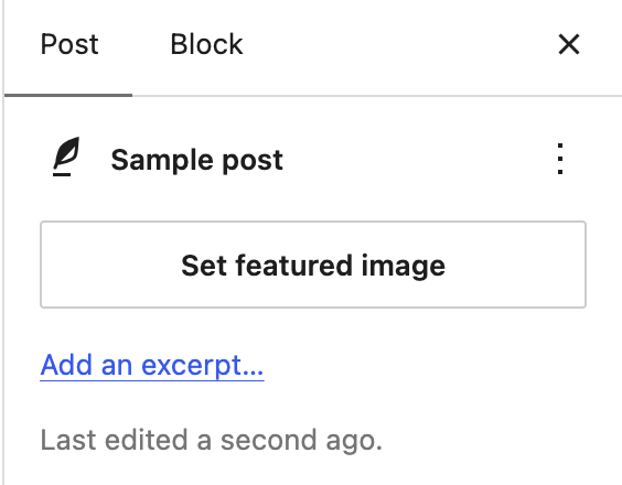
- In the post editor’s Post settings sidebar, open Featured image and click Set featured image.
- Choose or upload an image and click Set featured image.
To change or remove it, click the image in the sidebar and choose Replace or Remove. Where and how large featured images show is set in Blog › Featured images.
Using the More tag
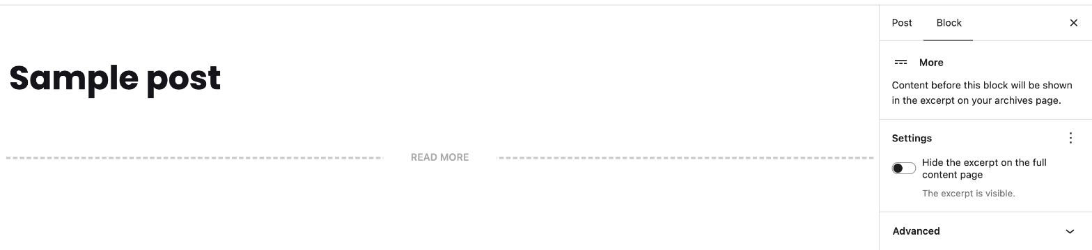
The More block sets where a post is cut off on the blog and archives, with a Read more link to the full post. Add a block where you want the cut and search for More.
The More tag takes priority over the excerpt word count. To ignore More tags across the site and use automatic excerpts instead, see the recipe.
Removing comments
WordPress turns comments on for new posts by default.
- For future posts and pages: in Settings → Discussion, untick the options at the top for comments and trackbacks.
- For existing ones: in Posts or Pages, use Quick Edit (or Bulk actions → Edit) and untick Allow Comments.
This only stops new comments; existing ones still show until you delete them under Comments. To turn comments off for a whole post type, use a plugin such as Disable Comments.
Classic Editor styling
Since WordPress 5.9 and GeneratePress 3.1.3, the theme no longer styles the Classic Editor. If you use the Classic Editor plugin and want the old styling back, add this PHP:
add_filter( 'generate_editor_styles', function( $editor_styles ) {
    if ( class_exists( 'Classic_Editor' ) ) {
        $editor_styles = array( 'assets/css/admin/editor-style.css' );
    }

    return $editor_styles;
}, 20 );
Recipes & customizations
Recipes add code as explained in Adding Custom Code.
Adding buttons
The simplest way to add a button is the Buttons block, or the GenerateBlocks Button block for more design control. To add one in HTML, use the theme’s button class — it takes your button colours and typography from the Customizer:
<a class="button" href="https://example.com">Your button text</a>Add a second class for other styles, then define it in CSS. Some examples:
/* A colour variant: class="button sun-flower" */
.button.sun-flower,
.button.sun-flower:visited {
    background: #f1c40f;
    color: #fff;
}

.button.sun-flower:hover,
.button.sun-flower:active {
    background: #e2b607;
    color: #fff;
}

/* A ghost button: transparent with a border, filled on hover */
.button.ghost,
.button.ghost:visited {
    background: transparent;
    border: 2px solid #fff;
}

.button.ghost:hover,
.button.ghost:active {
    background: #fff;
    color: #222;
    border-color: transparent;
}

/* Sizes */
.button.medium {
    font-size: 25px;
}

.button.large {
    font-size: 35px;
}
A gradient button that shifts on hover (fine-tune the colours with a tool such as cssgradient.io):
.button.gradient,
.button.gradient:visited {
    border-radius: 5px;
    background: linear-gradient(180deg, rgba(255, 183, 65, 1) 49%, rgba(214, 38, 38, 1) 100%);
    background-repeat: repeat-y;
    background-size: 100% 90px;
    background-position: 0 -30px;
    transition: all 0.35s ease;
}

.button.gradient:hover,
.button.gradient:active {
    background-position: 0;
}
For buttons in the menu, see Primary Navigation › Buttons in the navigation.
Adding a background video
A looping video behind a section of blocks — on a page, or in a Block Element Page Hero (GP Premium). This uses GenerateBlocks.
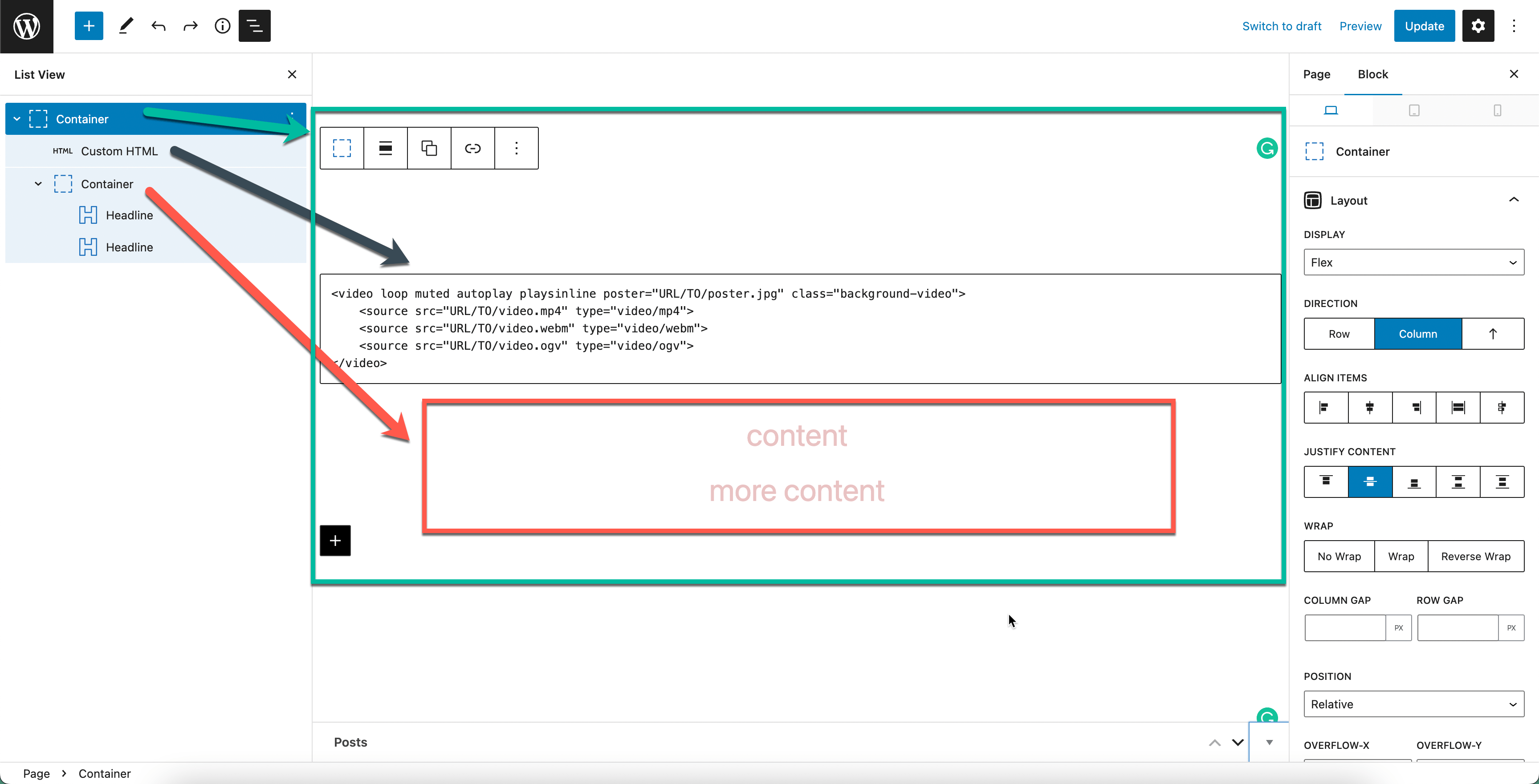
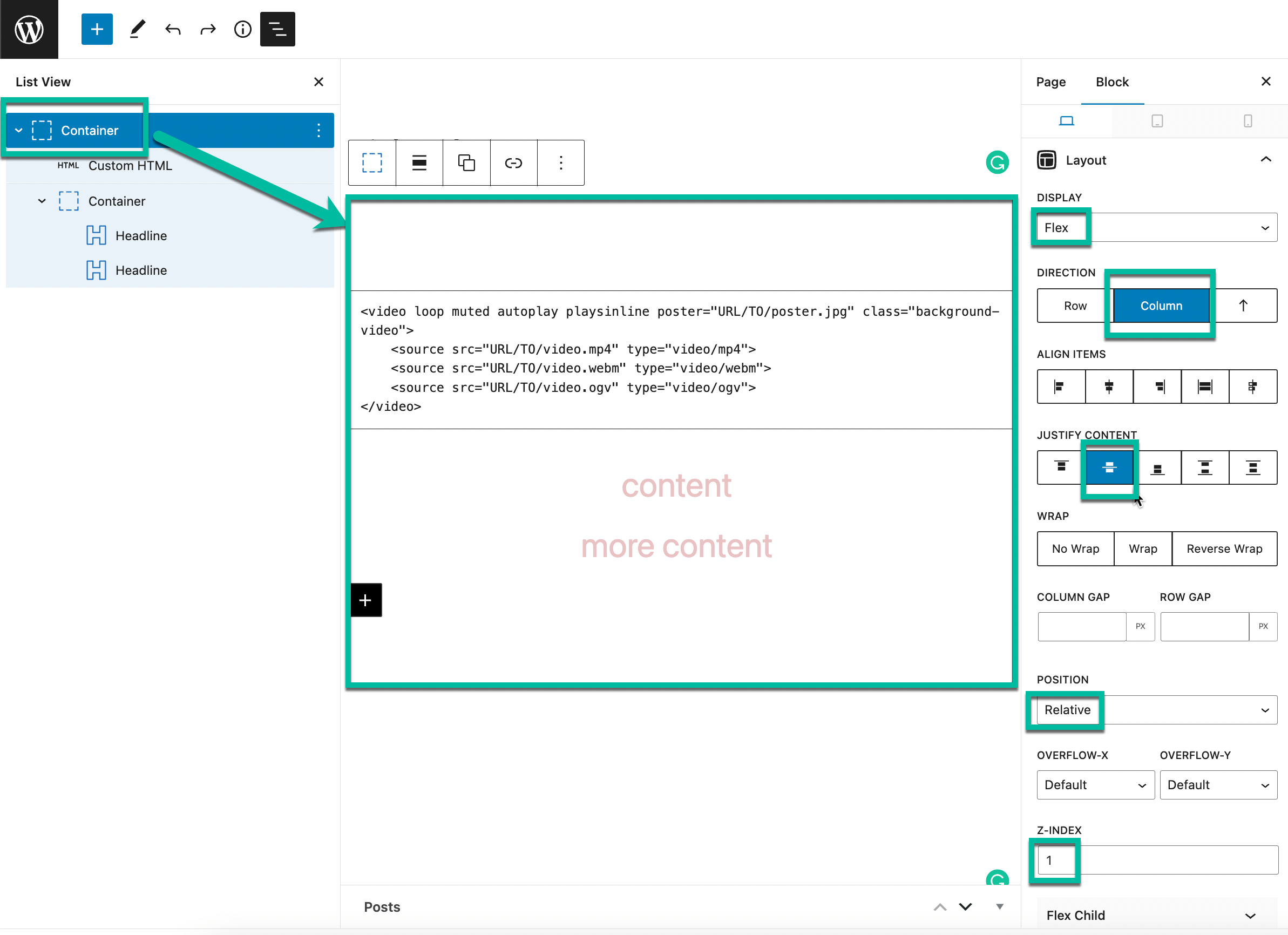
- Add the outer block. Add a GenerateBlocks Container (the Element block) and, in its Styles tab, set:
- Layout — Display to Flex; under Flex Layout, Flex Direction to Column; and under Alignment, Justify Content to Center if you want the text centred vertically.
- Sizing — a Min Height, for example 500px.
- Position — Position to Relative, and Overflow-X and Overflow-Y to Hidden.
- Add the video. Inside it, add a Custom HTML block. Only one
sourceis required:
<video loop muted autoplay playsinline poster="URL/TO/poster.jpg" class="background-video">
    <source src="URL/TO/video.mp4" type="video/mp4">
    <source src="URL/TO/video.webm" type="video/webm">
</video>
loop repeats the video, muted silences it, autoplay starts it on load, playsinline lets it play on phones, and poster is the image shown while it loads. To skip the video on phones and show only the poster, remove playsinline and add media="(min-width: 768px)" to each source.
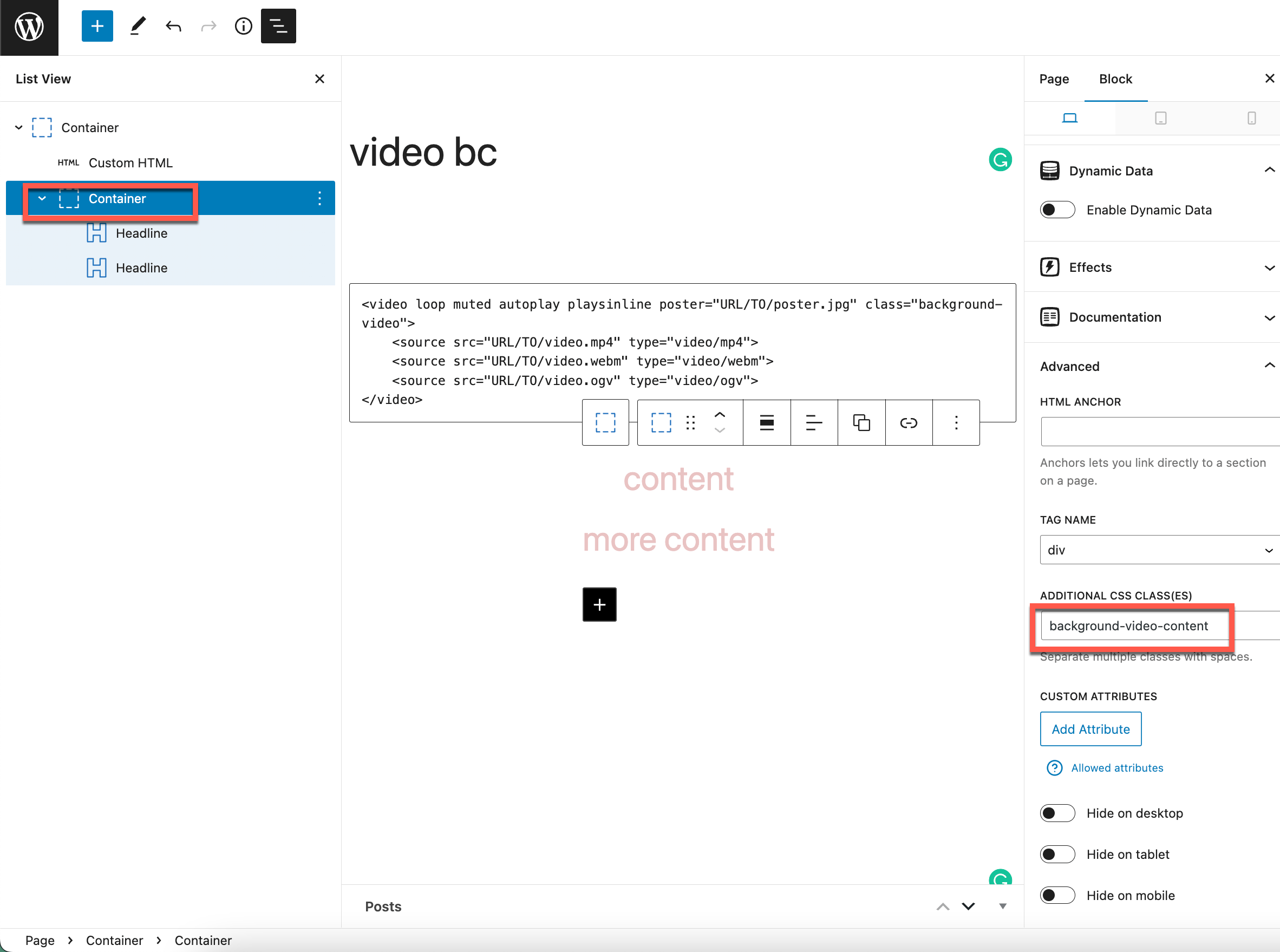
- Add the content. For text on top, add a second Container with the class
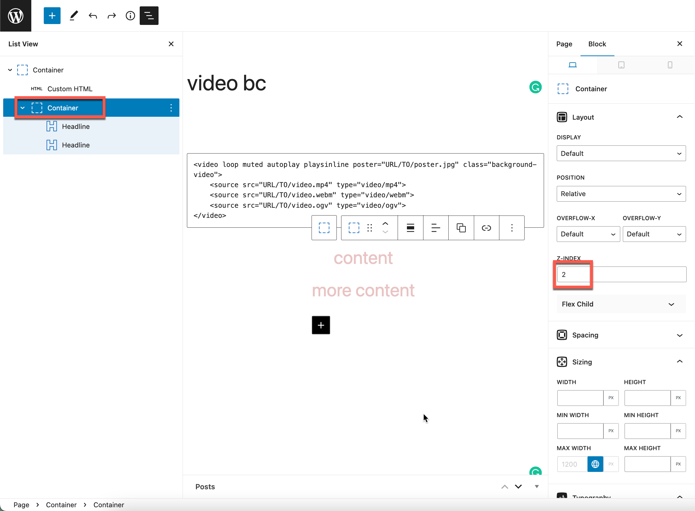
background-video-content, and put your headings and buttons inside. - Add the CSS:
.background-video {
    position: absolute;
    top: 0;
    right: 0;
    bottom: 0;
    left: 0;
    width: 100%;
    height: 100%;
    object-fit: cover;
    opacity: 0.5; /* Lets the background colour show through */
}

.background-video-content {
    position: relative;
    z-index: 1;
}
Responsive videos
Videos added with the YouTube or Vimeo embed blocks scale with the page. If you paste embed code (an iframe) instead, it may keep a fixed height. This CSS makes those iframes fill the width at a 16:9 ratio:
.entry-content iframe[src*="youtube.com"],
.entry-content iframe[src*="youtube-nocookie.com"],
.entry-content iframe[src*="vimeo.com"] {
    width: 100%;
    height: auto;
    aspect-ratio: 16 / 9;
}
Show the updated post date
To show the date a post was last updated instead of the date it was published, use generate_post_date_show_updated_only:
add_filter( 'generate_post_date_show_updated_only', '__return_true' );Or with CSS, which also lets you add a label:
.posted-on .updated {
    display: inline-block;
}

.posted-on .updated + .entry-date {
    display: none;
}

.posted-on .updated::before {
    content: "Last updated ";
}
In a Header Element (GP Premium): create a shortcode, then add [modified_date] to the Header Element’s content.
add_shortcode( 'modified_date', function() {
    return get_the_modified_date();
} );
For a full “Last updated” meta layout, see Blog › Entry meta styles.
Ignore More tags
If older posts use the More tag but you now want automatic excerpts, turn the More tags off site-wide instead of removing them one by one:
add_filter( 'generate_more_tag', '__return_empty_string' );All options
| Setting | Section | Choices | Default | Requires | Customizer option |
|---|---|---|---|---|---|
| Content Separator | Container | 0–10 em, step 0.1 | 2 | GP Premium — Spacing | generate_spacing_settings[content_element_separator] |
Related
- Blog — excerpts, featured image layout, columns and post meta
- Container — content padding and layout
- Page Hero — hero sections, including background video
- Troubleshooting › Excerpt issues
- Developer reference: Post meta and dates filters