The primary navigation is your main menu. Build the menu in WordPress, then use the Customizer to set where it sits, its width, how dropdowns open and how it behaves on mobile. For a logo inside the navigation, see Use navigation as header.
Most options are free. The mobile menu label and breakpoint need GP Premium’s Menu Plus module; menu item spacing needs Spacing.
Menus: Appearance → Menus
Settings: Appearance → Customize → Layout → Primary Navigation
Building your menu
Using the WordPress menu builder
Build menus at Appearance → Menus. Drag items to reorder them; drag one slightly right to make it a sub-menu item.
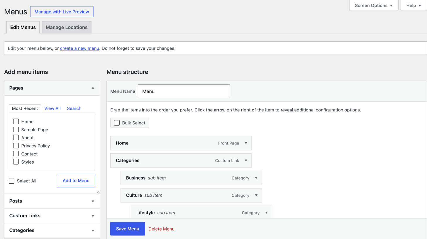
Create a new menu
- Go to Appearance → Menus and click create a new menu.
- Give it a name and click Create Menu.
Add pages to your menu
In Add menu items, open Pages (or Posts, Categories, Custom Links), tick items, click Add to Menu, then Save Menu.
Creating a drop-down menu
Drag an item below and slightly right of another; it becomes part of that item’s dropdown.
A drop-down parent that doesn’t link anywhere
For a parent that only opens its dropdown, add a Custom Link with # as the URL, then drag sub-menu items under it. To stop it acting as a link at all, delete the # once it’s added.
Setting a theme location
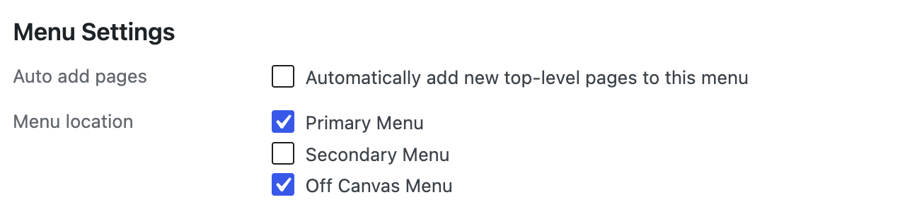
Under Menu Settings › Display location, tick Primary Menu. With GP Premium you’ll also see Secondary Menu (Secondary Navigation module) and Off Canvas Menu (Menu Plus, off-canvas panel on).
Adding custom classes
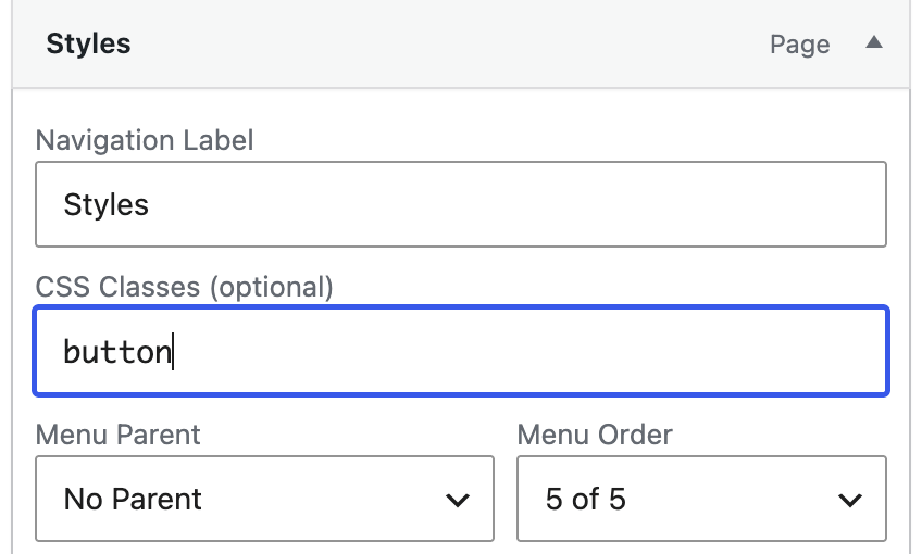
Open Screen Options at the top of Appearance → Menus and tick CSS Classes. Then expand a menu item and enter the class in CSS Classes (optional).

Opening a link in a new tab
Tick Link Target in Screen Options, then tick Open link in a new tab on the item.
Settings
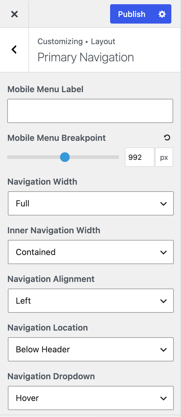
Navigation width & alignment
- Navigation Width — the outer container, which carries the background. Full (default) spans the screen; Contained matches your container width.
- Inner Navigation Width — the container holding the menu items. Contained (default) or Full.
- Navigation Alignment — Left (default), Center or Right.
Navigation location
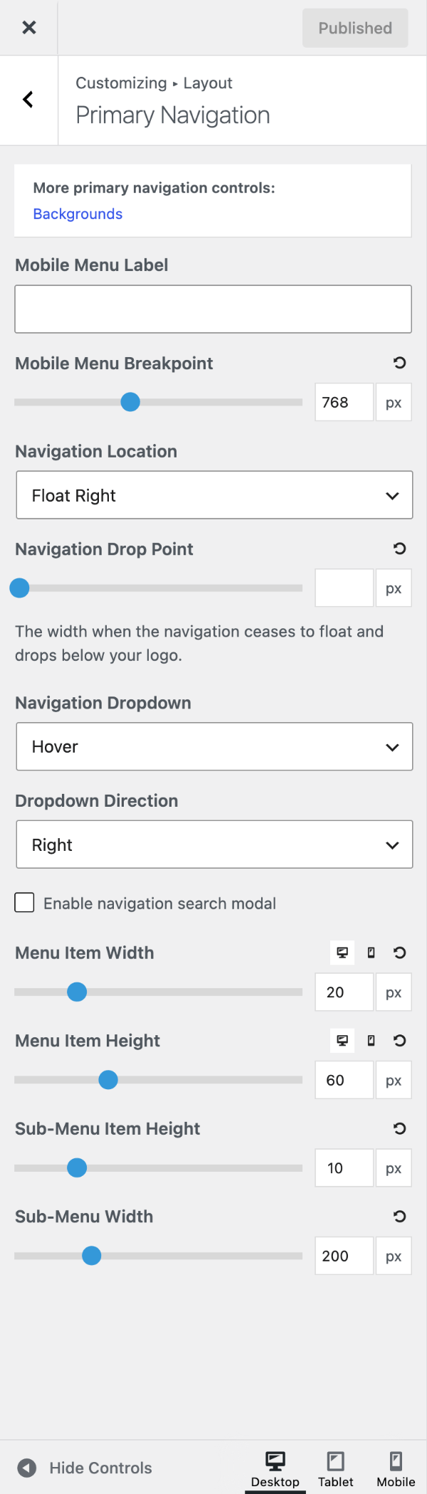
Navigation Location moves the navigation:
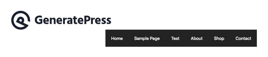
- Float Right (default) / Float Left — beside the logo, inside the header.
- Below Header / Above Header — a full-width bar under or over the header.
- Left Sidebar / Right Sidebar — at the top of a sidebar, which must be showing (Sidebars).
- No Navigation — hides the primary navigation.
For different locations on some pages, see the filter recipe.
Navigation drop point
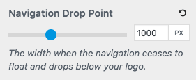
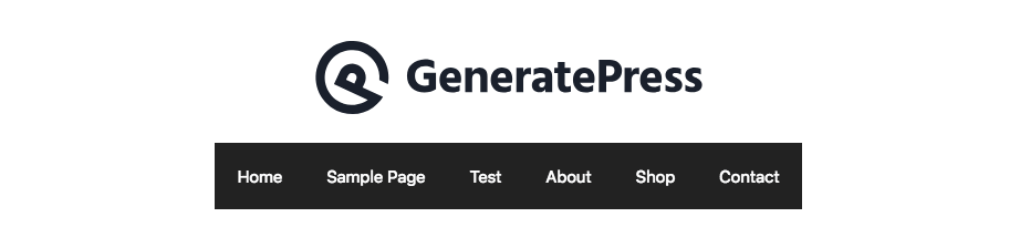
A floated navigation can wrap awkwardly under the logo on narrower screens. Navigation Drop Point sets a width (px) below which the navigation drops onto its own centred line. To find the value, resize your browser with developer tools open and note the width where the menu wraps.
Navigation dropdown
Navigation Dropdown sets how sub-menus open:
- Hover (default) — the sub-menu opens when you hover over the parent item.
- Click – Menu Item — click the parent item; it no longer works as a link.
- Click – Arrow — click the arrow; the parent item stays a link.
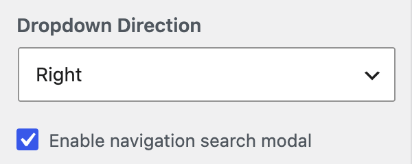
Dropdown Direction (Right or Left) sets which way deeper sub-menus open with Hover; use Left if they’d run off the screen. More tweaks: recipes.
Navigation search
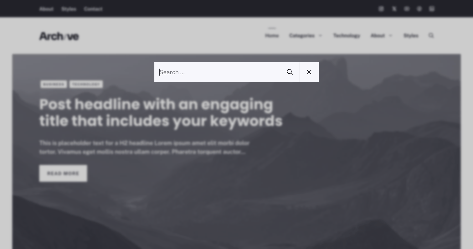
Enable navigation search modal adds a search icon that opens a full-screen search box. Its colours are in Colors → Search Modal.
Switching from the old navigation search
GeneratePress 3.3.0 replaced Navigation Search with the modal. If an older site still has it on, set it to Disable and the modal checkbox appears. See Legacy Features. More options: recipes.
Mobile menu label
Requires GP Premium — Menu Plus module.
Mobile Menu Label changes the Menu text beside the mobile menu icon; leave it empty for the icon only. Without GP Premium, use the generate_mobile_menu_label filter.
Mobile navigation
Below 768px the navigation becomes the mobile menu. To change this, set Mobile Menu Breakpoint (GP Premium — Menu Plus); it also controls the mobile header. Without GP Premium, use generate_mobile_menu_media_query.
Sub-menus on mobile open from the arrow beside the parent. To make the whole item tappable, either set Navigation Dropdown to Click – Menu Item (changes desktop too; parent stops linking), or make the parent a # custom link (desktop unchanged). For a separate mobile menu, see the recipe.
Menu item height & width
Requires GP Premium — Spacing module.
Use the device buttons for separate desktop and mobile values.
- Menu Item Width — space either side of each item’s text (px, default 20).
- Menu Item Height — item height (px, default 60). With navigation as header it also sets the header height and logo size.
- Sub-Menu Item Height — space above and below sub-menu text (px, default 10).
- Sub-Menu Width — dropdown width (px, default 200). To fit the content instead, see the recipe.
Recipes & customizations
Change the navigation location with a filter
Recipes add code as explained in Adding Custom Code.
Return a location from generate_navigation_location with a conditional tag. This floats it right on the front page and below the header on archives:
add_filter( 'generate_navigation_location', function( $location ) {
    if ( is_front_page() ) {
        return 'nav-float-right';
    }

    if ( is_archive() ) {
        return 'nav-below-header';
    }

    return $location;
} );
Locations: nav-below-header, nav-above-header, nav-float-right, nav-float-left, nav-left-sidebar, nav-right-sidebar. Return '' to remove the navigation.
Dropdown speed and direction
Open hover dropdowns instantly:
.main-navigation:not(.toggled) ul ul {
    transition: opacity 0ms linear;
}

.dropdown-hover .main-navigation:not(.toggled) ul li:hover > ul {
    transition-delay: 0ms;
}With a Click dropdown, deeper sub-menus open downwards. To open them sideways (set the background colour to match your sub-menu, as the theme makes deeper sub-menus transparent):
.dropdown-click .main-navigation ul ul li.sfHover > ul.toggled-on,
.dropdown-click .secondary-navigation ul ul li.sfHover > ul.toggled-on {
    left: 100%;
    top: 0;
    position: absolute;
    background-color: #444457; /* Use your Sub-Menu Background colour */
}

.dropdown-click .main-navigation ul ul .dropdown-menu-toggle .gp-icon svg {
    transform: rotate(-90deg);
}Add the class open-left to the item (usually the rightmost), then:
.dropdown-hover .main-navigation:not(.toggled) ul .open-left ul {
    left: auto;
    right: 0;
}

.dropdown-hover .main-navigation:not(.toggled) ul .open-left li:hover > ul {
    left: auto;
    right: 100%;
}

.dropdown-hover .open-left .sub-menu .dropdown-menu-toggle .gp-icon svg {
    transform: rotate(90deg);
}
Sub-menu width that fits its content
Match the longest item:
.main-navigation ul ul {
    width: auto;
    white-space: nowrap;
}
Match the parent item:
.main-navigation ul ul {
    width: 100%;
}
Search modal recipes
Move the search modal to the secondary navigation
Requires GP Premium — Secondary Navigation module.
With the search modal enabled, this moves its icon to the secondary navigation on desktop:
add_action( 'wp', function() {
    if ( generate_get_option( 'nav_search_modal' ) && ! wp_is_mobile() ) {
        remove_action( 'generate_menu_bar_items', 'generate_do_search_modal_trigger' );
        add_action( 'generate_inside_secondary_navigation', 'generate_do_search_modal_trigger' );
    }
}, 20 );
Open the search modal from your own button
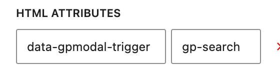
Any element with data-gpmodal-trigger="gp-search" opens the modal, for example:
<button data-gpmodal-trigger="gp-search">Search</button>With a GenerateBlocks button, add it under HTML Attributes.
Build your own search modal
Requires GP Premium — Elements module.
Create a Search Modal Block Element and add your own Search block or HTML to replace the modal’s contents.
Buttons in the navigation
Add the class nav-button to the item, then:
@media (min-width: 769px) {
    .main-navigation .main-nav ul li.nav-button a {
        background-color: #ffffff;
        border: 2px solid #000000;
        color: #000000;
        line-height: 35px; /* Adjust to suit your Menu Item Height */
    }
}
For the secondary navigation, use .secondary-navigation. Buttons in content: Adding buttons.
Menu hover animation
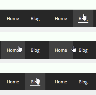
An underline that grows on hover and stays under the current page:
@media (min-width: 769px) {
    .main-navigation .menu > .menu-item > a::after {
        content: "";
        position: absolute;
        right: 0;
        left: 50%;
        bottom: 15px;
        transform: translate3d(-50%, 0, 0);
        display: block;
        width: 0;
        height: 2px;
        background-color: currentColor;
        transition: 0.3s width ease;
    }

    .main-navigation .menu > .menu-item.current-menu-item > a::after,
    .main-navigation .menu > .menu-item.current-menu-ancestor > a::after,
    .main-navigation .menu > .menu-item > a:hover::after {
        width: 50%;
    }
}
Building a simple mega menu
A simple mega menu needs CSS and a three-level menu.

- Add this CSS:
@media (min-width: 769px) {
    nav .main-nav .mega-menu {
        position: static;
    }

    nav .main-nav .mega-menu > ul {
        position: absolute;
        width: 100%;
        left: 0 !important;
        display: flex;
        flex-wrap: wrap;
    }

    nav .main-nav .mega-menu > ul > li > a {
        font-weight: bold;
    }

    nav .main-nav .mega-menu > ul > li {
        display: inline-block;
        width: 25%;
        vertical-align: top;
    }

    nav .main-nav .mega-menu.mega-menu-col-2 > ul > li {
        width: 50%;
    }

    nav .main-nav .mega-menu.mega-menu-col-3 > ul > li {
        width: 33.3333%;
    }

    nav .main-nav .mega-menu.mega-menu-col-5 > ul > li {
        width: 20%;
    }

    nav .main-nav .mega-menu > ul > li:hover > a,
    nav .main-nav .mega-menu > ul > li:focus > a,
    nav .main-nav .mega-menu > ul > li[class*="current-"] > a,
    nav .main-nav .mega-menu ul ul {
        background-color: transparent !important;
        color: inherit;
    }

    nav .main-nav .mega-menu ul .sub-menu {
        position: static;
        display: block;
        opacity: 1;
        visibility: visible;
        width: 100%;
        box-shadow: 0 0 0;
        left: 0;
        height: auto;
        pointer-events: auto;
        transform: scale(1);
    }

    nav .main-nav .mega-menu ul.toggled-on .sub-menu {
        pointer-events: auto;
    }

    nav .main-nav .mega-menu .sub-menu .menu-item-has-children .dropdown-menu-toggle {
        display: none;
    }
}- Build the menu: parent (in the bar) → children (column headings) → grandchildren (links).
- Give the parent the class
mega-menu.
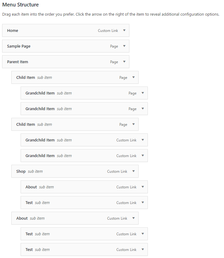
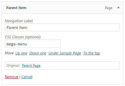
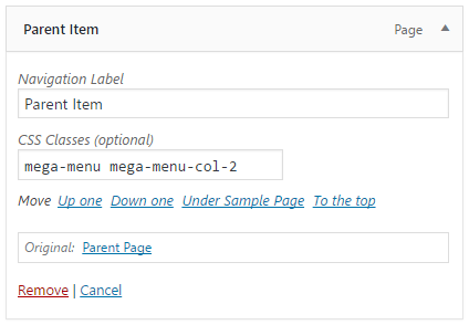
It has 4 columns; add mega-menu-col-2, -3 or -5 to the parent for others.
Centering your logo in the navigation

- Set Navigation Location to Float Right or Float Left, or use navigation as header.
- Add this CSS, changing
nth-child(3)to the first item right of the logo:
@media (min-width: 769px) {
    .inside-header > .site-branding,
    .inside-header > .navigation-branding,
    .inside-header > .site-logo,
    .site-branding-container,
    #site-navigation .navigation-branding .site-logo,
    #sticky-navigation .navigation-branding {
        position: absolute;
        left: 50%;
        transform: translateX(-50%);
        z-index: 1000;
    }

    #site-navigation {
        margin-left: unset !important;
        display: flex;
    }

    .site-header .main-navigation:not(#sticky-navigation) .inside-navigation {
        margin: unset;
    }

    #site-navigation,
    #primary-menu,
    .main-navigation .inside-navigation {
        flex: 1;
    }

    /* The first item to the right of the logo */
    .main-navigation ul li:nth-child(3) {
        margin-left: auto;
    }
}
Adding icons to menu items
The easiest way is the Menu Icons plugin. Without it, paste an inline SVG into the item’s Navigation Label:
<svg width="16" height="16" viewBox="0 0 24 24" fill="currentColor" aria-hidden="true"><path d="M12 3 2 12h3v8h6v-6h2v6h6v-8h3z"/></svg> HomeFor social icons, use Custom Links with the icon as Link Text. To push an item to the far right, give it the class menu-item-push-right:
@media (min-width: 769px) {
    .main-navigation .main-nav {
        flex-grow: 1;
    }

    .main-navigation .main-nav > ul > .menu-item-push-right {
        margin-left: auto;
    }
}
Font Awesome is no longer bundled; see Legacy Features.
Animated menu button
The mobile menu button switches straight to a close icon. To animate it, use the Hamburgers library.
- Load the library (this example uses the Collapse effect):
add_action( 'wp_enqueue_scripts', function() {
    wp_enqueue_style( 'hamburgers', 'https://cdnjs.cloudflare.com/ajax/libs/hamburgers/1.2.1/hamburgers.min.css', array(), '1.2.1' );
} );- Add the markup (use
generate_inside_mobile_header_menuwith the mobile header):
add_action( 'generate_inside_mobile_menu', 'example_animated_hamburger_markup' );

function example_animated_hamburger_markup() {
    ?>
    <span class="hamburger hamburger--collapse">
        <span class="hamburger-box">
            <span class="hamburger-inner"></span>
        </span>
    </span>
    <?php
}- Hide the theme icon and style the new one:
.menu-toggle .gp-icon,
.menu-toggle .mobile-menu {
    display: none;
}

body .hamburger {
    transform: scale(0.5);
    padding: 0;
    line-height: 0;
    vertical-align: middle;
}

body .hamburger-inner,
body .hamburger-inner::before,
body .hamburger-inner::after,
body .hamburger.is-active .hamburger-inner,
body .hamburger.is-active .hamburger-inner::before,
body .hamburger.is-active .hamburger-inner::after {
    background-color: currentColor;
}- Animate it on click:
add_action( 'wp_footer', function() {
    ?>
    <script>
    ( function() {
        var hamburgers = document.querySelectorAll( '.hamburger' ),
            menuToggles = document.querySelectorAll( '.menu-toggle' );

        var setActive = function( active ) {
            for ( var h = 0; h < hamburgers.length; h++ ) {
                hamburgers[ h ].classList.toggle( 'is-active', active );
            }
        };

        for ( var t = 0; t < menuToggles.length; t++ ) {
            menuToggles[ t ].addEventListener( 'click', function() {
                var nav = this.closest( 'nav' );
                // Read the theme's toggled class once its own click handler has run.
                setTimeout( function() {
                    setActive( nav && nav.classList.contains( 'toggled' ) );
                }, 0 );
            } );
        }

        // Reset if the window grows past the mobile breakpoint with the menu open.
        window.addEventListener( 'resize', function() {
            for ( var t = 0; t < menuToggles.length; t++ ) {
                if ( menuToggles[ t ].offsetParent === null ) {
                    setActive( false );
                }
            }
        } );
    } )();
    </script>
    <?php
} );
With the off-canvas panel, set Close Button to Inside and also add:
add_action( 'wp_enqueue_scripts', function() {
    wp_add_inline_script( 'generate-offside', "
        document.addEventListener( 'click', function( e ) {
            var hamburgers = document.querySelectorAll( '.hamburger' ),
                open = e.target.closest( '.slideout-toggle a' ),
                close = e.target.closest( '.slideout-overlay, .slideout-exit' );

            if ( open || close ) {
                for ( var h = 0; h < hamburgers.length; h++ ) {
                    hamburgers[ h ].classList.toggle( 'is-active', !! open );
                }
            }
        } );
    " );
} );
.slideout-toggle a .gp-icon,
.slideout-navigation button.slideout-exit .gp-icon {
display: none !important;
}Using a different menu on mobile
Requires GP Premium — Menu Plus module (Mobile Header).
- Turn on the Mobile Header.
- Register a Mobile Menu location for it:
add_action( 'init', function() {
    register_nav_menu( 'mobile-menu', __( 'Mobile Menu' ) );
} );

add_filter( 'generate_mobile_header_theme_location', function() {
    return 'mobile-menu';
} );- Create a menu and assign it to Mobile Menu.
All options
| Setting | Section | Choices | Default | Requires | Customizer option |
|---|---|---|---|---|---|
| Navigation Width | Primary Navigation | Full / Contained | Full | — | generate_settings[nav_layout_setting] |
| Inner Navigation Width | Primary Navigation | Contained / Full | Contained | — | generate_settings[nav_inner_width] |
| Navigation Alignment | Primary Navigation | Left / Center / Right | Left | — | generate_settings[nav_alignment_setting] |
| Navigation Location | Primary Navigation | Below Header · Above Header · Float Right · Float Left · Left Sidebar · Right Sidebar · No Navigation | Float Right | — | generate_settings[nav_position_setting] |
| Navigation Drop Point | Primary Navigation | 500–2000 px, step 10 | — (off) | — | generate_settings[nav_drop_point] |
| Navigation Dropdown | Primary Navigation | Hover · Click – Menu Item · Click – Arrow | Hover | — | generate_settings[nav_dropdown_type] |
| Dropdown Direction | Primary Navigation | Right / Left | Right | — | generate_settings[nav_dropdown_direction] |
| Navigation Search | Primary Navigation | Enable / Disable (shown only while enabled; replaced by the search modal) | Disable | — | generate_settings[nav_search] |
| Enable navigation search modal | Primary Navigation | On / Off | Off | — | generate_settings[nav_search_modal] |
| Mobile Menu Label | Primary Navigation | Text | Menu | GP Premium — Menu Plus | generate_menu_plus_settings[mobile_menu_label] |
| Mobile Menu Breakpoint | Primary Navigation | 0–2000 px, step 5 | 768 | GP Premium — Menu Plus | generate_menu_plus_settings[mobile_menu_breakpoint] |
| Menu Item Width | Primary Navigation | 0–100 px; desktop and mobile | 20 (desktop) | GP Premium — Spacing | generate_spacing_settings[menu_item], [mobile_menu_item] |
| Menu Item Height | Primary Navigation | 20–150 px; desktop and mobile | 60 (desktop) | GP Premium — Spacing | generate_spacing_settings[menu_item_height], [mobile_menu_item_height] |
| Sub-Menu Item Height | Primary Navigation | 0–50 px | 10 | GP Premium — Spacing | generate_spacing_settings[sub_menu_item_height] |
| Sub-Menu Width | Primary Navigation | px | 200 | GP Premium — Spacing | generate_spacing_settings[sub_menu_width] |
Settings can be changed in code with the option_generate_settings and option_generate_menu_plus_settings filters.
Related
- Header — use navigation as header, mobile header, header examples
- Colors and Typography — navigation colours and fonts
- Secondary Navigation and Sticky Navigation and Off-Canvas Panel — GP Premium navigation features
- Developer reference: Navigation and mobile menu hooks, Navigation and search filters, CSS classes and markup filters, Settings defaults filters