GeneratePress has a left and a right sidebar. Choose which appear, and where, for pages, the blog and single posts, then override the layout on individual pages when you need to. Add widgets to the sidebars under Appearance → Widgets.
Sidebar layouts are free. Sidebar widths and widget padding need GP Premium’s Spacing module; they’re marked below.
Site-wide: Appearance → Customize → Layout → Sidebars
Per page or post: the Sidebar Layout tab of the Layout meta box
Widgets: Appearance → Widgets
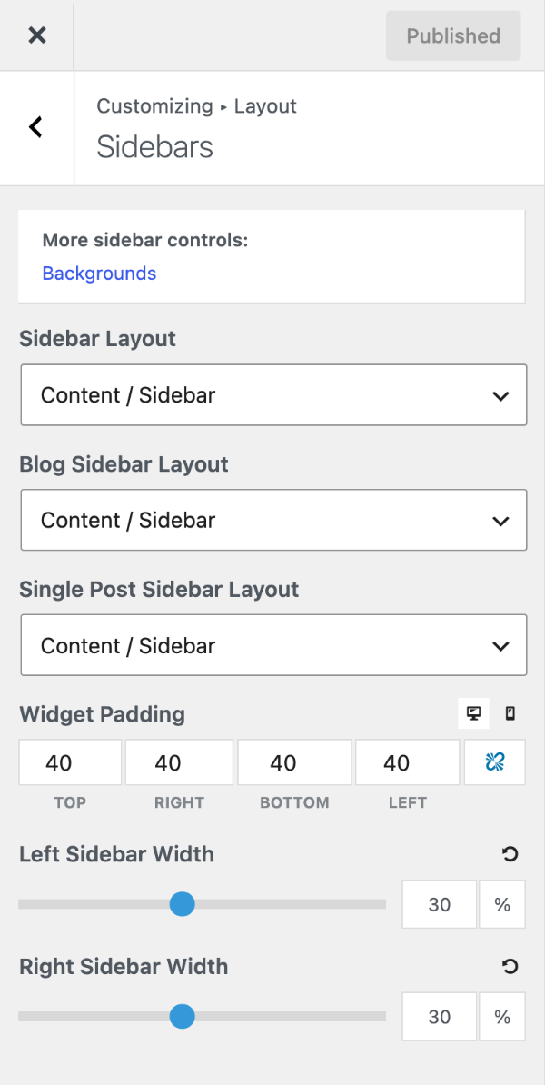
Settings
Sidebar layout
GeneratePress has two sidebars (left and right) and six layouts:
- Content / Sidebar (default)
- Sidebar / Content
- Content (no sidebars)
- Sidebar / Content / Sidebar
- Sidebar / Sidebar / Content
- Content / Sidebar / Sidebar
Set a layout for each type of page:
- Sidebar Layout — pages.
- Blog Sidebar Layout — the blog, archives and search results.
- Single Post Sidebar Layout — single posts, including custom post types.
To change the layout of one page or post, use the Layout meta box. For whole groups of pages — a category, a post type, WooCommerce — use a Layout Element (GP Premium) or the filter recipe below.
Default widgets. If a sidebar layout is selected but that sidebar has no widgets, GeneratePress shows a search box and an archives list so it isn’t empty. They disappear as soon as you add your own widgets under Appearance → Widgets. To remove the sidebar altogether, choose Content (no sidebars). To keep an empty sidebar, use the generate_show_default_sidebar_widgets filter.
Sidebar widths
Requires GP Premium — Spacing module.
Left Sidebar Width and Right Sidebar Width are percentages of the container (15–50%, default 30% each). The content area takes up whatever is left. For a fixed pixel width, see the recipe below.
Widget padding
Requires GP Premium — Spacing module.
Widget Padding is the space inside each sidebar widget, in pixels, with separate top, right, bottom and left values. Use the device buttons to set different padding for desktop and mobile. The default is 40px on every side on desktop and 30px on mobile.
Recipes & customizations
Set the sidebar layout with a filter
A Layout Element does this without code. To do it in PHP instead, use generate_sidebar_layout with a conditional tag. Add the PHP:
add_filter( 'generate_sidebar_layout', function( $layout ) {
    // WooCommerce pages: two sidebars on the left.
    if ( function_exists( 'is_woocommerce' ) && is_woocommerce() ) {
        return 'both-left';
    }

    // Category archives and search results: no sidebars.
    if ( is_category() || is_search() ) {
        return 'no-sidebar';
    }

    return $layout;
} );
Layout values: left-sidebar, right-sidebar, no-sidebar, both-sidebars, both-left, both-right.
Fixed-width sidebar
To give the right sidebar a fixed width on desktop and let the content fill the rest, add this CSS:
@media (min-width: 769px) {
    .right-sidebar .is-right-sidebar {
        width: 300px;
    }

    .right-sidebar .site-content .content-area {
        width: calc(100% - 300px);
    }
}
Change sidebar widths with a filter
To use a different sidebar width on some pages, return a whole-number percentage from generate_right_sidebar_width or generate_left_sidebar_width. This makes the right sidebar 40% wide on the front page and the left sidebar 40% wide on category archives. Add the PHP:
add_filter( 'generate_right_sidebar_width', function( $width ) {
    if ( is_front_page() ) {
        return 40;
    }

    return $width;
} );

add_filter( 'generate_left_sidebar_width', function( $width ) {
    if ( is_category() ) {
        return 40;
    }

    return $width;
} );
All options
| Setting | Section | Choices | Default | Requires | Customizer option |
|---|---|---|---|---|---|
| Sidebar Layout | Sidebars | Sidebar / Content · Content / Sidebar · Content (no sidebars) · Sidebar / Content / Sidebar · Sidebar / Sidebar / Content · Content / Sidebar / Sidebar | Content / Sidebar | — | generate_settings[layout_setting] |
| Blog Sidebar Layout | Sidebars | As Sidebar Layout | Content / Sidebar | — | generate_settings[blog_layout_setting] |
| Single Post Sidebar Layout | Sidebars | As Sidebar Layout | Content / Sidebar | — | generate_settings[single_layout_setting] |
| Widget Padding | Sidebars | Top / Right / Bottom / Left, px; desktop and mobile | 40 desktop, 30 mobile | GP Premium — Spacing | generate_spacing_settings[widget_top], [widget_right], [widget_bottom], [widget_left], [mobile_widget_top], [mobile_widget_right], [mobile_widget_bottom], [mobile_widget_left] |
| Left Sidebar Width | Sidebars | 15–50 %, step 5 | 30 | GP Premium — Spacing | generate_spacing_settings[left_sidebar_width] |
| Right Sidebar Width | Sidebars | 15–50 %, step 5 | 30 | GP Premium — Spacing | generate_spacing_settings[right_sidebar_width] |
Settings can be changed in code with the option_generate_settings filter.
Related
- Container — container width, content layout and the Layout meta box
- Elements — Layout Elements for sidebar layouts across many pages
- Footer — footer widgets
- Developer reference: Layout, sidebars, footer and widgets filters, Settings defaults filters