This page keeps the documentation for features that have been replaced or retired, for older sites that still use them. New sites don’t need anything here — each section links to what replaced it.
Mixed: the Page Header and Sections modules and the old GP Hooks module were part of GP Premium; the rest applies to the free theme.
| Legacy feature | Replaced by |
|---|---|
| GP Hooks and Page Header modules | Elements — see Moving to Elements |
| Float layout | Flexbox (GeneratePress 3.0) — see Switching from floats to flexbox |
| Font Awesome icons | SVG icons — see Typography › Icon type |
| Navigation Search | Navigation Search Modal (GeneratePress 3.3.0) |
| Sections module | The block editor and GenerateBlocks |
Moving to Elements
GP Premium 1.7 replaced the GP Hooks and Page Header modules with Elements: Hook Elements replace GP Hooks, and Header Elements replace Page Headers (see Page Hero). These videos walk through the move.
Migrating Page Headers to Page Heroes (about 45 minutes, by Mike Oliver of Zephyr Studio):
Switching to Elements — Page Headers from 0:00 to 6:36, Hooks from 6:36 to the end:
Switching from floats to flexbox
GeneratePress 3.0 introduced a flexbox layout, which changes the foundation your site is built on. It’s lighter and easier to customize, and all new sites use it. If you switch an older site from floats to flexbox in the Customizer, check these things, depending on how much you’ve customized it.
Box-sizing. Your site may get a little narrower. Flexbox uses box-sizing throughout, so padding and borders are included in the container width. With a Container Width of 1300px and 40px left and right content padding, the float version displays at 1300 + 40 + 40 = 1380px; the flexbox version displays at the 1300px you set.
Unsemantic Grid classes. Flexbox no longer includes Unsemantic Grid, so its classes (grid-50, grid-25 and so on) no longer work in your content.
menu-item-float-right. This utility class, used to push menu items to the far right of the navigation, no longer exists. Use the generate_menu_bar_items hook instead to add items that don’t belong with the menu. It’s more flexible, and the items show in the mobile bar rather than inside the mobile menu.
Footer widget widths. CSS that sets footer widget widths with width no longer works, because flexbox sizes the widgets automatically. For example, this float CSS:
.footer-widgets .footer-widget-1 {
    width: 56%;
}

.footer-widgets .footer-widget-2,
.footer-widgets .footer-widget-3 {
    width: 22%;
}
becomes:
.footer-widgets .footer-widget-1 {
    flex-basis: 56%;
}

.footer-widgets .footer-widget-2,
.footer-widgets .footer-widget-3 {
    flex-basis: 22%;
}
Top bar and footer bar. Floats built the layout of these bars’ widgets. Check whether the order of the widgets changes with flexbox, especially on mobile; you may need to reorder a couple.
Font Awesome
GeneratePress no longer includes Font Awesome. If you need it, add it with the official Font Awesome plugin. The theme’s own icons are SVG by default — see Typography › Icon type.
If your site still loads the Font Awesome 4 library that was included in older versions, go to Customize → General and tick Load essential icons only. Once saved, the option disappears the next time you open the Customizer.
Load essential icons only
This option is no longer available, as Font Awesome has been removed from the free theme and GP Premium. From GeneratePress 2.0, only the essential icons loaded by default instead of the whole Font Awesome library; sites updating from older versions were set to the full library so icons in their content didn’t break.
Navigation Search
Replaced by the Navigation Search Modal in GeneratePress 3.3.0.
The Navigation Search option, in Customize → Layout → Primary Navigation, adds a search icon to the navigation. Clicking it lays a semi-transparent search bar over the menu items.
Move it to the secondary navigation. The option must be on in Layout → Primary Navigation for this to work:
add_action( 'wp', function() {
    if ( 'enable' === generate_get_option( 'nav_search' ) ) {
        remove_action( 'generate_menu_bar_items', 'generate_do_navigation_search_button' );
        add_action( 'generate_secondary_menu_bar_items', 'generate_do_navigation_search_button' );
        remove_action( 'generate_inside_navigation', 'generate_navigation_search' );
        add_action( 'generate_inside_secondary_navigation', 'generate_navigation_search' );
    }
}, 20 );
Page Header module
The Page Header module added a hero section to your pages. It has been replaced by the Header Element — see Moving to Elements. If your site still uses it, the module must be active in Appearance → GeneratePress.
Video overview: https://vimeo.com/160180419
Content
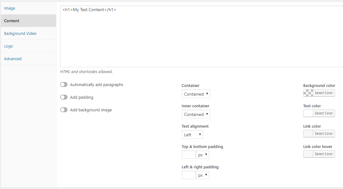
With no content, the Page Header shows only its image (if set). Once you add content, the image is replaced by your content and the options below work.
- Automatically add paragraphs — adds paragraph tags to your content, like a Text widget.
- Add padding — adds padding to the content, taken from your content padding.
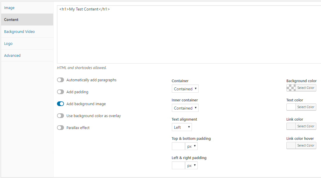
- Add background image — uses the image from the Image section (custom or featured) as the background. It also shows the two options below.
- Use background color as overlay — lays the background colour over the image.
- Parallax effect — the background image moves as you scroll.
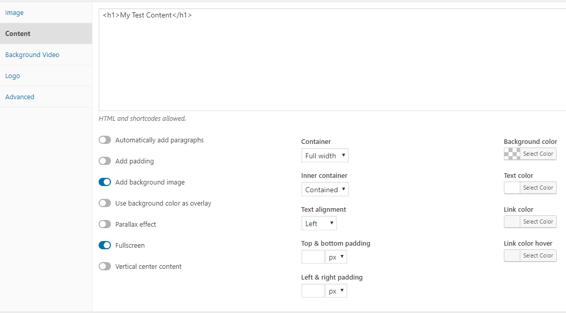
- Container — the outer container: Contained or Full width. Full width makes Fullscreen available.
- Inner container — Contained or Full width.
- Fullscreen — the Page Header fills the screen. If the header is showing and not merged, it fills the space below the header.
- Vertical center content — centres the content vertically. Requires Fullscreen.
- Text alignment — left, centre or right.
- Top/bottom & Left/right padding — in pixels or percent.
- Colors — the background, text and link colours.
Image
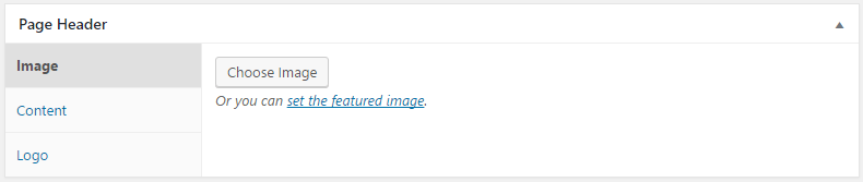
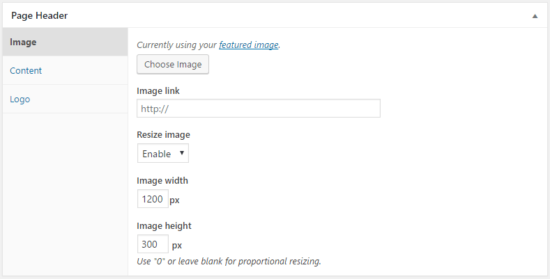
The Image section lets you use the featured image or upload a custom image. Use the featured image in most cases; a custom image is useful when the featured image is already used elsewhere and you want a different one here. Once an image is set, options appear to link and resize it.
Logo
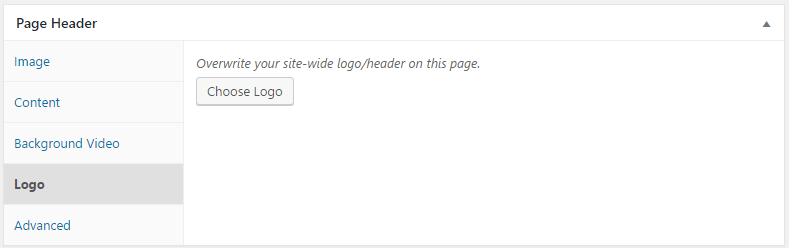
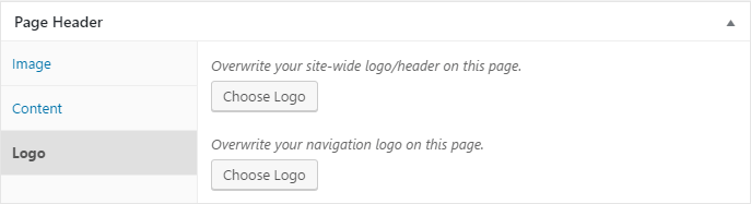
The Logo section lets you use a different logo on this page — for example a different colour when the header is merged with the Page Header. It only shows if a logo is set in Customize → Site Identity. If you have a Navigation Logo set, you can replace it here too.
Template tags
Template tags in the content show details of the page being viewed:
| Tag | Shows |
|---|---|
{{post_title}} | The page or post title, or the archive title on a category, tag or other archive |
{{post_date}} | The post’s published date |
{{post_author}} | The post’s author |
{{post_terms.taxonomy}} | The post’s terms in any taxonomy: {{post_terms.category}}, {{post_terms.post_tag}} or {{post_terms.product_cat}} |
{{custom_field.name}} | A custom field’s value, for example {{custom_field.description}}. {{custom_field._thumbnail_id}} prints the featured image |
Global locations
Page Headers → Global Locations applies a Page Header to areas you can’t normally edit:
- The posts page (blog), search results and the 404 template.
- Post Types – Single — every single post of a public post type (Posts, Pages, Media and any added by you or a plugin). With template tags, one Page Header can act as a template for all your posts.
- Post Types – Archives — archive pages of custom post types, such as the WooCommerce shop page, when a plugin adds them.
Merging with the site header
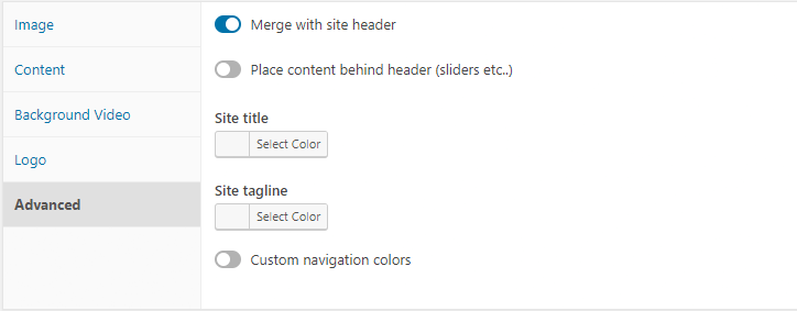
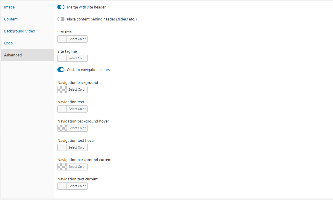
The Advanced section of the Page Header meta box merges the Page Header content with your site header and navigation. It needs content in the Content section.
- Merge with site header — turns merging on.
- Place content behind header (sliders etc.) — useful when the background comes from the content, such as a slider shortcode, rather than the image or background video.
- Site title and Site tagline — their colours.
- Custom Navigation Colors — navigation colours to match the Page Header; turning it on shows more options.
Merging with a page builder layout
To merge the header and navigation over a page built with a page builder, without using the Page Header’s content area:
- Go to Page Headers → Add New and name the Page Header.
- In the content area, add an HTML comment such as
<!-- page header -->to turn on the content options. - Set Container type to Full Width. Leave everything else as it is.
- In the Advanced tab, enable merging and tick Place content behind header (sliders etc.). Then style your site title and navigation to suit the page, and publish.
- Apply it to all pages in Page Headers → Global Locations (the Pages dropdown), or to one page by choosing it in that page’s editor.
Page Headers on categories and taxonomies
To use a Page Header on a category, tag or other taxonomy archive (such as WooCommerce product categories): create and publish the Page Header, then edit the term — for example Posts → Categories → Travel — and choose it in the Page Header dropdown.
Sections module
Deprecated and no longer supported since GP Premium 2.0. Use the block editor with GenerateBlocks instead.
Sections was a simple page builder for pages and posts. It doesn’t work with the block editor.
- Turning it on — open a page and click the Use Sections toggle at the top right. This replaces the editor and removes the sidebars.
- Adding sections — click Add Section, then click the section title or pencil icon to edit its content in a copy of the classic editor. Open a section’s settings from its Settings tab or the cog icon.
- Layout settings — Box type and Inner box type (full width or contained), Custom ID, Custom Classes, and top and bottom padding (pixels or percent).
- Colors — background, text, link and link hover.
- Background Image — an image, with an optional parallax effect.
If you must still turn the module on, this filter does it — but it may break with future WordPress versions:
add_filter( 'generate_premium_deprecated_modules', function( $modules ) {
    return array_diff( $modules, [ 'Sections' ] );
} );
Sections with sidebars
Sections are full width by default. To use them with your sidebar:
add_filter( 'generate_sections_sidebars', '__return_true' );Related
- Elements and Page Hero — what replaced GP Hooks and Page Headers
- Primary Navigation › Navigation search
- Typography › Icon type
- Container — container width and padding
- Developer reference: Navigation and mobile menu hooks