The secondary navigation is a second menu you can place above or below the header, beside the logo or in a sidebar — useful for account links, contact details or a small utility menu.
Requires GP Premium — Secondary Navigation module. The whole guide is a GP Premium feature; the menu item spacing controls also need the Spacing module.
To show it, create a menu and assign it to Secondary Menu under Appearance → Menus (see Setting a theme location). The Secondary Navigation section appears in the Customizer once the module is active.
Menu: Appearance → Menus → Display location Secondary Menu
Settings: Appearance → Customize → Layout → Secondary Navigation
Settings
Mobile menu label
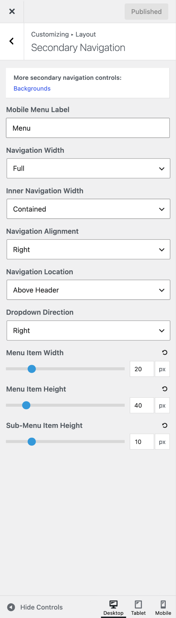
On mobile the secondary navigation collapses into its own menu button. Mobile Menu Label changes the Menu text beside the icon. To keep the links visible instead, see Disable the mobile menu.
Navigation width & alignment
- Navigation Width — the outer container, which carries the background. Full (default) spans the screen; Contained matches your container width.
- Inner Navigation Width — the container holding the menu items. Contained (default) or Full.
- Navigation Alignment — Left, Center or Right (default).
Navigation location
Navigation Location places the menu Above Header (default), Below Header, Float Right, Float Left, at the top of the Left Sidebar or Right Sidebar (the sidebar must be showing), or No Navigation.
Above the header, it can share a bar with the Top Bar widgets — see Merge with the secondary navigation. With both navigations set to Float Right, they stack beside the logo (Header example 9).
Dropdown Direction (Right or Left) sets which way deeper sub-menus open.
Menu item height & width
Requires GP Premium — Spacing module.
- Menu Item Width — space either side of each item’s text (px, default 20).
- Menu Item Height — item height (px, default 40).
- Sub-Menu Item Height — space above and below sub-menu text (px, default 10).
Colours and fonts are in Colors › Secondary Navigation and Typography; a background image in Background Images.
Recipes & customizations
Recipes add code as explained in Adding Custom Code.
Disable the mobile menu
A short secondary menu often doesn’t need to collapse on mobile. To keep its links visible, stop the mobile stylesheet loading:
add_action( 'wp_enqueue_scripts', function() {
    wp_dequeue_style( 'generate-secondary-nav-mobile' );
}, 999 );
Then hide the menu button and centre the links:
.secondary-navigation .menu-toggle {
    display: none;
}

@media (max-width: 768px) {
    .secondary-navigation .main-nav > ul {
        display: flex;
        flex-wrap: wrap;
        justify-content: center;
    }
}
Show it to logged-in users only
Hide the secondary navigation from visitors who aren’t logged in:
add_filter( 'has_nav_menu', function( $has_nav_menu, $location ) {
    if ( 'secondary' === $location && ! is_user_logged_in() ) {
        return false;
    }

    return $has_nav_menu;
}, 10, 2 );
For more recipes that work on both menus — buttons, dropdown direction, the search icon — see Primary Navigation; swap .main-navigation for .secondary-navigation.
All options
| Setting | Section | Choices | Default | Requires | Customizer option |
|---|---|---|---|---|---|
| Mobile Menu Label | Secondary Navigation | Text | Menu | GP Premium — Secondary Navigation | generate_secondary_nav_settings[secondary_nav_mobile_label] |
| Navigation Width | Secondary Navigation | Full / Contained | Full | GP Premium — Secondary Navigation | generate_secondary_nav_settings[secondary_nav_layout_setting] |
| Inner Navigation Width | Secondary Navigation | Contained / Full | Contained | GP Premium — Secondary Navigation | generate_secondary_nav_settings[secondary_nav_inner_width] |
| Navigation Alignment | Secondary Navigation | Left / Center / Right | Right | GP Premium — Secondary Navigation | generate_secondary_nav_settings[secondary_nav_alignment] |
| Navigation Location | Secondary Navigation | Below Header · Above Header · Float Right · Float Left · Left Sidebar · Right Sidebar · No Navigation | Above Header | GP Premium — Secondary Navigation | generate_secondary_nav_settings[secondary_nav_position_setting] |
| Dropdown Direction | Secondary Navigation | Right / Left | Right | GP Premium — Secondary Navigation | generate_secondary_nav_settings[secondary_nav_dropdown_direction] |
| Menu Item Width | Secondary Navigation | 0–100 px | 20 | GP Premium — Secondary Navigation, Spacing | generate_secondary_nav_settings[secondary_menu_item] |
| Menu Item Height | Secondary Navigation | 20–150 px | 40 | GP Premium — Secondary Navigation, Spacing | generate_secondary_nav_settings[secondary_menu_item_height] |
| Sub-Menu Item Height | Secondary Navigation | 0–50 px | 10 | GP Premium — Secondary Navigation, Spacing | generate_secondary_nav_settings[secondary_sub_menu_item_height] |
Settings can be changed in code with the option_generate_secondary_nav_settings filter.
Related
- Primary Navigation — menu builder, theme locations and navigation recipes
- Top Bar — merging the top bar with the secondary navigation
- Header — header examples using both menus
- Colors, Typography, Background Images — styling
- Developer reference: Navigation and mobile menu hooks, Settings defaults filters