The header holds your logo, site title and header widget area. This guide covers its layout, the mobile header and using the navigation as your header. Logo and title are set in Site Identity & Logo; colours in Colors.
Most options are free. Header padding needs GP Premium’s Spacing module; Use Navigation as Header and the Mobile Header need Menu Plus.
Header: Appearance → Customize → Layout → Header
Header widget area: Appearance → Widgets → Header
Header settings
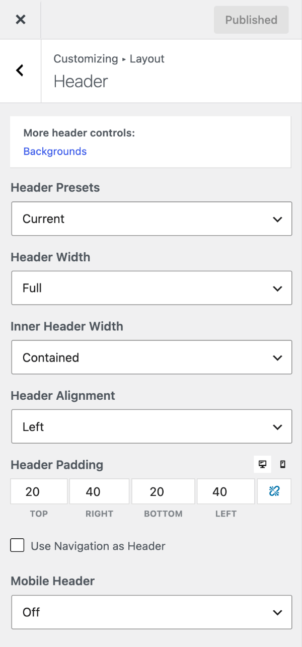
Header presets
Header Presets set the header and navigation layout in one go:
- Default — logo left, navigation floating right.
- Classic — logo left, navigation below the header.
- Navigation Before / Navigation After — the navigation above or below the header.
- Navigation Before – Centered / Navigation After – Centered — as above, with the header and navigation centred.
- Navigation Left — the navigation floating left of the logo.
Current is your own settings. Presets only change layout controls, so you can fine-tune afterwards.
Header width & alignment
- Header Width — the outer container, which carries the background. Full (default) spans the screen; Contained matches your container width.
- Inner Header Width — the container holding logo, title and widget. Contained (default) or Full.
- Header Alignment — Left (default), Center or Right.
Header padding
Requires GP Premium — Spacing module.
Header Padding is the space inside the header, per side, in pixels. Use the device buttons for separate desktop and mobile values. Defaults: 20px top/bottom and 40px left/right on desktop; 30px left/right on mobile.
Use navigation as header
Requires GP Premium — Menu Plus module.
Use Navigation as Header puts your logo or site title inside the primary navigation and removes the separate header, giving a slim single-row header.

Basic setup
- Make sure you have a logo or site title in Site Identity.
- Tick Use Navigation as Header in Customize → Layout → Header.
- Set the bar’s height (and logo size) with Menu Item Height in Primary Navigation.
The tagline is hidden in this layout; see Add the tagline.
Sticky navigation with a height transition
To shrink the header as you scroll, in Sticky Navigation:
- Set Sticky Navigation to Desktop only or On.
- Set Transition to None.
- Set the sticky Menu Item Height lower than the normal one.
Merge with a Page Hero
To lay it over a hero image, follow Transparent header and navigation.
A different logo and colours on one page
In a Page Hero Header Element, use the Site Header tab to set a Site Logo and Navigation Colors for that page.
Mobile header
Requires GP Premium — Menu Plus module.
The Mobile Header replaces the header on phones with a slim bar: a small logo or site title and the menu button.
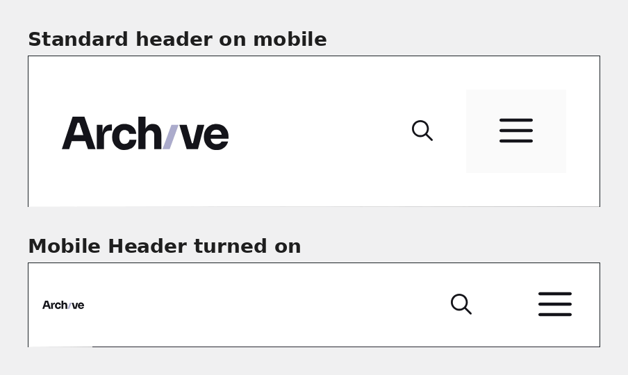
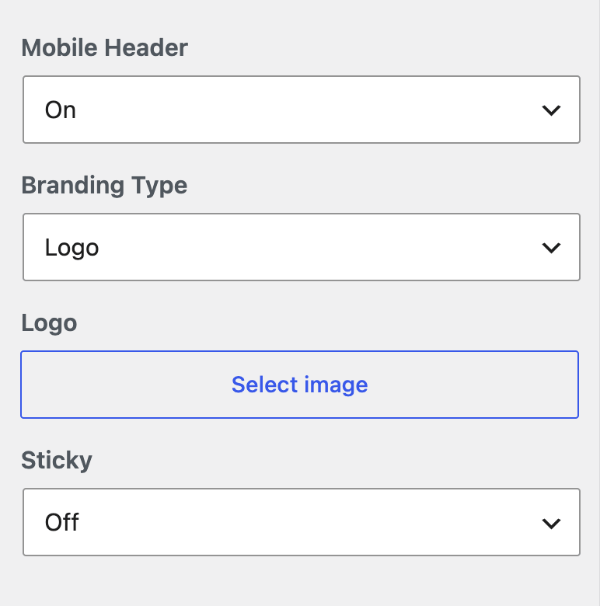
Set Mobile Header to On, then choose:
- Branding Type — show a Logo or the Site Title.
- Logo — keep it small, like an icon. Its height follows the mobile Menu Item Height in Primary Navigation; see also Mobile header logo size.
- Sticky — fix the mobile header to the top of the screen.
- Hide when scrolling down (with Sticky on) — hide it while scrolling down; it returns when scrolling up.
It uses the Primary Navigation colours and appears below the Mobile Menu Breakpoint (768px by default). To add content such as a phone number, use a Hook Element on generate_inside_mobile_header.
Header widget
The header widget area sits beside your logo and title (on the right with left alignment). Add widgets such as search, a button or contact details under Appearance → Widgets → Header. On mobile it stacks below the logo and title; to change its width or order, see the recipe.
Recipes & customizations
Header examples
Recipes add code as explained in Adding Custom Code.
Example 1: Off-canvas menu only

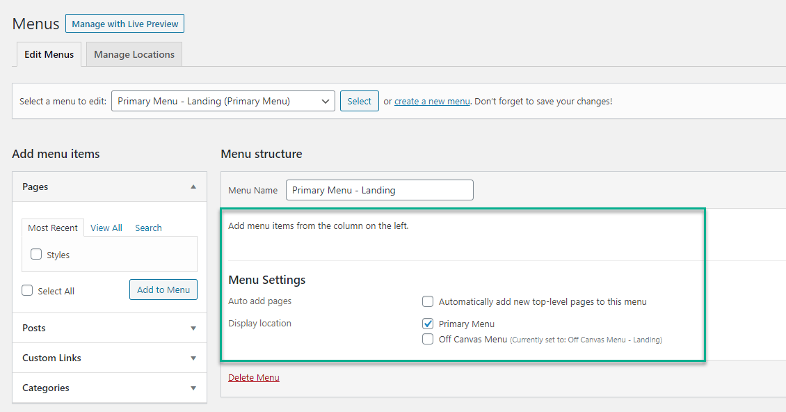
Just an off-canvas menu button. Requires GP Premium (Menu Plus).
- Turn on the Off-Canvas Panel for Desktop only or On.
- Create a menu with no items and assign it to Primary Menu.
- Create a second menu with your items and assign it to Off Canvas Menu.
- Choose where the toggle appears with Navigation Location.
Example 2: Menu and social icons in the top bar

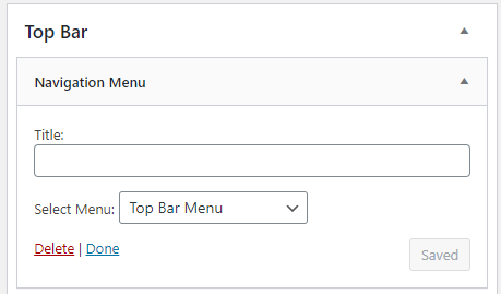
- Create two menus.
- Assign the main menu (below the logo) to Primary Menu and set Navigation Location to Below Header.
- Add the other menu to the Top Bar with a Navigation Menu widget.
- Add a Social Icons block to the Top Bar as the second widget.
For more styling control (GP Premium), assign the top menu to Secondary Menu instead, set its location to Above Header and turn on Merge with Secondary Navigation.
Example 3: Logo in the middle of the navigation

See Centering your logo in the navigation.
Example 4: Vertical side navigation
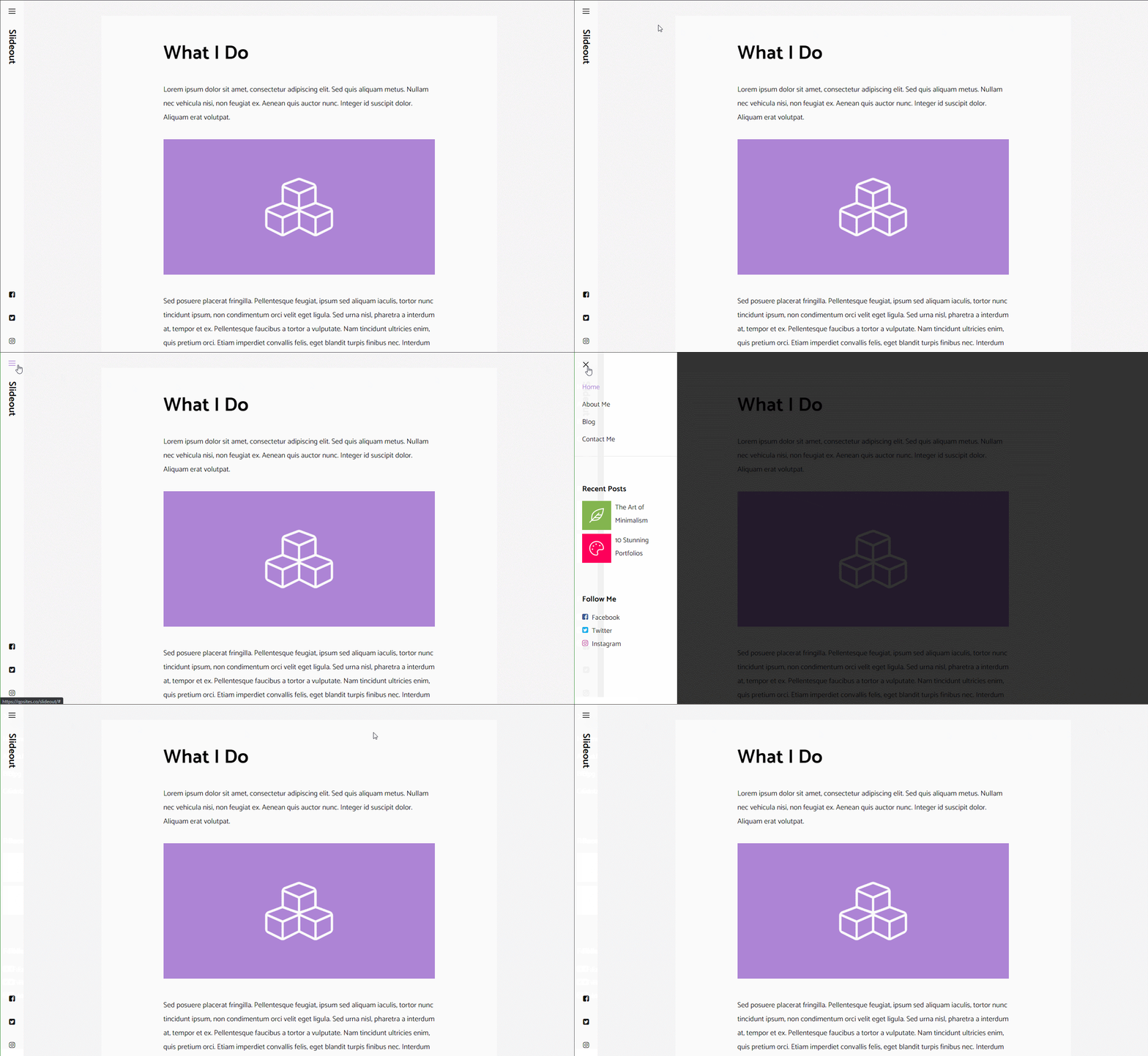
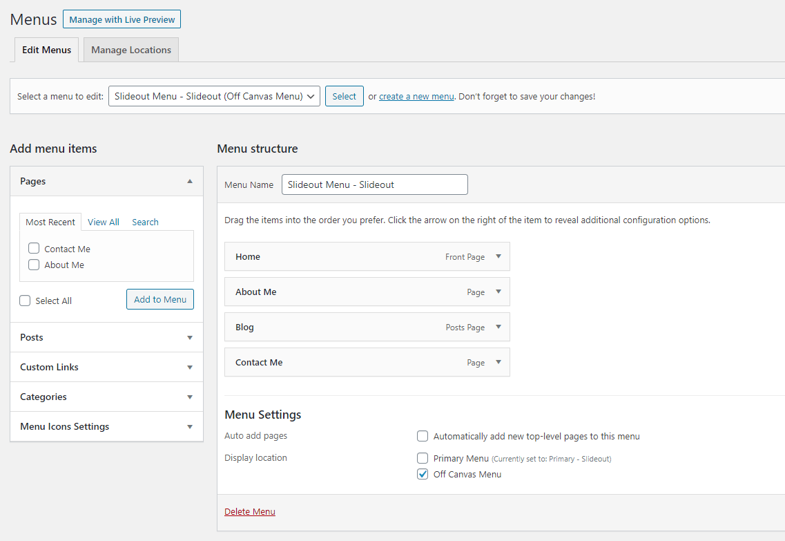
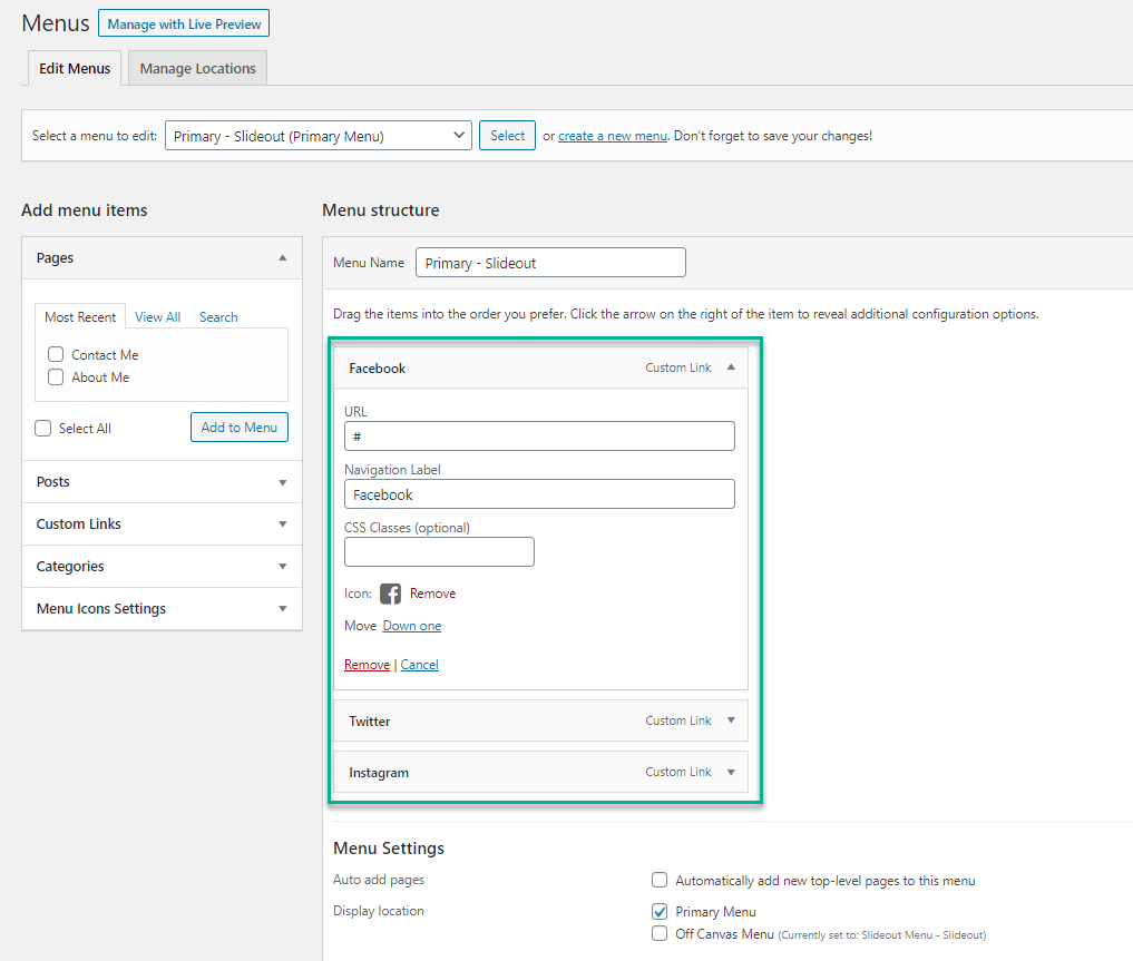
A slim icon bar down the left, with an off-canvas panel. Requires GP Premium (Menu Plus).
- Turn on the Off-Canvas Panel for Desktop only or On.
- Create a menu with your items and assign it to Off Canvas Menu.
- Install Menu Icons, create a menu of icons and assign it to Primary Menu.
- Optionally add content to the off-canvas widget area.
- Add this CSS:
/* Side menu */
@media (min-width: 769px) {
    body {
        padding-left: 60px;
    }
}

#site-navigation {
    position: fixed;
    left: 0;
    min-height: 100vh;
    max-width: 60px;
    overflow: hidden;
}

#site-navigation .inside-navigation {
    flex-direction: column;
    flex-wrap: nowrap;
    min-height: 100vh;
}

.admin-bar #site-navigation .inside-navigation {
    min-height: calc(100vh - 32px);
}

#site-navigation .navigation-branding {
    transform: rotate(90deg);
    display: block;
    height: 100%;
    margin: 30px 0 auto;
}

#content {
    padding: 40px;
}

#main,
.sidebar > .inside-right-sidebar,
.sidebar > .inside-left-sidebar {
    margin-top: 0;
    margin-bottom: 0;
}

#site-navigation .main-nav > ul {
    flex-direction: column;
}

.menu-bar-items {
    order: -10;
}

#site-navigation .rotate {
    transform: rotate(90deg);
    margin-bottom: auto;
    white-space: nowrap;
}

@media (max-width: 768px) {
    #site-navigation .menu-toggle {
        display: none;
    }
}

.site-footer {
    padding: 0 40px;
}
Example 5: Off-canvas menu with search
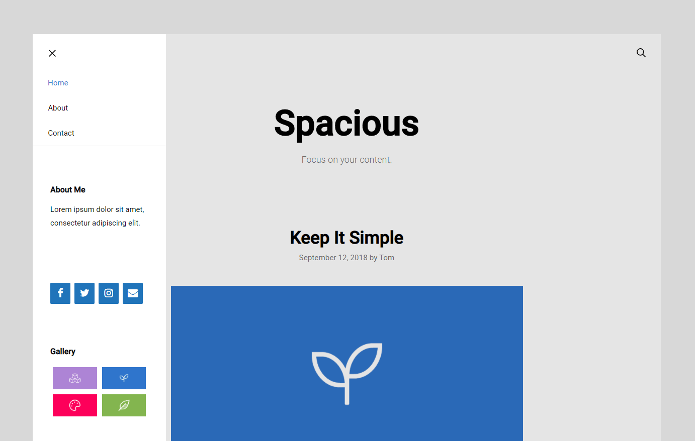
Requires GP Premium (Menu Plus).
- Turn on the Off-Canvas Panel for Desktop only or On.
- Create a menu with no items and assign it to Primary Menu.
- Create a second menu with your items and assign it to Off Canvas Menu.
- Optionally turn on the navigation search.
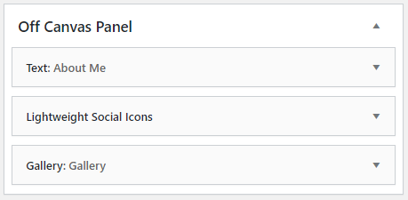
- Add content to the off-canvas widget area, such as an About paragraph and Social Icons block.
- Add this CSS:
/* Off-canvas panel */
.slideout-navigation button.slideout-exit {
    font-size: 18px;
    margin-top: 5px;
}

.slide-opened .main-navigation.offside {
    transform: initial;
    position: absolute;
    top: 0;
    left: 0;
    height: 100%;
    z-index: 100 !important;
}

.slideout-overlay {
    background-color: rgba(0, 0, 0, 0.1);
    z-index: 99;
}

#generate-slideout-menu .close-slideout.sfHover a {
    color: inherit;
}

.slideout-navigation .main-nav {
    border-bottom: 1px solid rgba(0, 0, 0, 0.1);
}

.slideout-navigation .slideout-widget {
    padding: 15px 15px 0;
    font-size: 15px;
}

.main-navigation .menu-bar-items {
    flex-grow: 1;
}

.main-navigation .menu-bar-item.search-item {
    order: 2;
    margin-left: auto;
}
Example 6: Logo left, menu centred, icons right

Requires GP Premium (Menu Plus).
- Turn on Use Navigation as Header.
- Set Navigation Alignment to Right.
- Optionally turn on the navigation search and WooCommerce cart. Add other right-hand items with
generate_menu_bar_items. - Add this CSS:
/* Centre the primary menu */
.main-navigation:not(.toggled) .main-nav > ul {
    position: absolute;
    top: 0;
    left: 50%;
    transform: translateX(-50%);
}
Example 7: Sidebar-style header
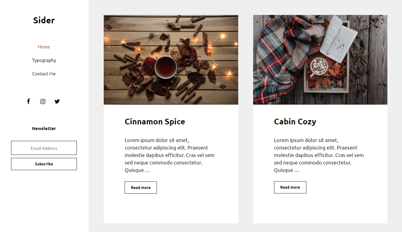
A fixed header down the left of the page.
- Create a menu and assign it to Primary Menu.
- Add anything else to the header widget area, such as Social Icons or a Mailchimp for WordPress form.
- Add this CSS:
@media (min-width: 1000px) {
    body {
        padding: 0 50px 50px;
        margin-left: 300px;
    }

    .site-header {
        position: fixed;
        left: 0;
        top: 0;
        width: 300px;
        z-index: 300;
        height: 100%;
        overflow: auto;
        overflow-x: hidden;
        -webkit-overflow-scrolling: touch;
        transition: 0.1s ease;
    }

    .admin-bar .site-header {
        top: 32px;
    }
}

.inside-header {
    flex: 1;
    flex-direction: column;
}

.header-widget {
    order: 3;
    text-align: center;
}

.nav-float-right .inside-header .main-navigation {
    order: 2;
    margin-top: 50px;
    margin-bottom: 50px;
}

.dropdown-click .site-header .main-navigation ul ul {
    position: relative;
}

.main-navigation .main-nav > ul {
    flex-direction: column;
}

.nav-float-right .header-widget {
    margin-left: 0;
}

.nav-float-right .header-widget .widget {
    margin-bottom: 50px;
}

.nav-float-right #site-navigation {
    margin-right: auto;
}
Example 8: Header widget and navigation both on the right

- Set Navigation Location to Float Right.
- Add your header widgets, for example search.
- Add this PHP to wrap the header widget and navigation together:
add_action( 'wp', function() {
    remove_action( 'generate_after_header_content', 'generate_do_header_widget' );
    add_action( 'generate_before_navigation', 'generate_do_header_widget', 20 );
} );

add_action( 'generate_before_navigation', function() {
    echo '<div class="primary-navigation-wrapper">';
}, 15 );

add_action( 'generate_after_navigation', function() {
    echo '</div>';
} );- Add this CSS:
.nav-float-right .primary-navigation-wrapper {
    margin-left: auto;
    text-align: right;
}

@media (max-width: 768px) {
    .primary-navigation-wrapper {
        flex-basis: 100%;
    }
}
Example 9: Primary and secondary navigation on the right

Requires GP Premium (Secondary Navigation). Set both the primary and secondary navigation locations to Float Right; they stack beside the logo. To space them apart:
@media (min-width: 769px) {
    .main-navigation {
        margin-bottom: 10px;
    }
}
Split the header into three sections
The easiest way is a Site Header Block Element, laid out with blocks. With a Hook Element instead (GP Premium — Elements module):
- Create a Hook Element, set the hook to
generate_header, and tick Disable Site Header. - Add this HTML, replacing the placeholders:
<div class="header-section">
    <div class="header-section-1">
        <div class="site-logo">
            <a href="URL TO YOUR WEBSITE" title="YOUR SITE NAME" rel="home">
                <img class="header-image" src="URL TO LOGO IMAGE" alt="YOUR SITE NAME">
            </a>
        </div>
    </div>

    <div class="header-section-2">
        Header center content
    </div>

    <div class="header-section-3">
        Header right content
    </div>
</div>- Add this CSS:
.header-section {
    display: flex;
    flex-wrap: wrap;
}

.header-section > div {
    width: calc(100% / 3);
}

@media (max-width: 768px) {
    .header-section > div {
        width: 100%;
        text-align: center;
    }
}
Centre the logo in the mobile header
Requires GP Premium — Menu Plus module.
Logo in the centre, menu button on the left:
#mobile-header .inside-navigation {
    position: relative;
}

#mobile-header .mobile-header-logo {
    position: absolute;
    left: 50%;
    transform: translateX(-50%);
}

#mobile-header .menu-toggle {
    order: -1;
}
Mobile header logo size
Requires GP Premium — Menu Plus module.
To size the logo independently of the mobile Menu Item Height:
.site-logo.mobile-header-logo img {
    height: 60px;
}
To remove its default 10px top and bottom padding:
.site-logo.mobile-header-logo img {
    padding: 0;
}
Add the tagline with navigation as header
Requires GP Premium — Menu Plus module.
To show a tagline after the site title:
add_filter( 'generate_site_title_output', function( $output ) {
    return $output . '<div class="site-description">Your tagline here</div>';
} );
Header widget width and mobile order
Widget area width on desktop:
@media (min-width: 769px) {
    .header-widget {
        max-width: 40%;
    }
}
Order on mobile (default: logo, title, widget):
@media (max-width: 768px) {
    .inside-header .site-branding {
        order: 1;
    }

    .inside-header .site-logo {
        order: 2;
    }

    .inside-header .header-widget {
        order: 3;
    }
}
All options
| Setting | Section | Choices | Default | Requires | Customizer option |
|---|---|---|---|---|---|
| Header Presets | Header | Current · Default · Classic · Navigation Before · Navigation After · Navigation Before – Centered · Navigation After – Centered · Navigation Left | Current | — | generate_header_helper |
| Header Width | Header | Full / Contained | Full | — | generate_settings[header_layout_setting] |
| Inner Header Width | Header | Contained / Full | Contained | — | generate_settings[header_inner_width] |
| Header Alignment | Header | Left / Center / Right | Left | — | generate_settings[header_alignment_setting] |
| Header Padding | Header | Top / Right / Bottom / Left, px; desktop and mobile | Desktop 20 top/bottom, 40 left/right; mobile 30 left/right | GP Premium — Spacing | generate_spacing_settings[header_top], [header_right], [header_bottom], [header_left], [mobile_header_top], [mobile_header_right], [mobile_header_bottom], [mobile_header_left] |
| Use Navigation as Header | Header | On / Off | Off | GP Premium — Menu Plus | generate_menu_plus_settings[navigation_as_header] |
| Mobile Header | Header | On / Off | Off | GP Premium — Menu Plus | generate_menu_plus_settings[mobile_header] |
| Branding Type | Header | Logo / Site Title (shown when Mobile Header is on) | Logo | GP Premium — Menu Plus | generate_menu_plus_settings[mobile_header_branding] |
| Logo | Header | Image (shown when Mobile Header is on) | — | GP Premium — Menu Plus | generate_menu_plus_settings[mobile_header_logo] |
| Sticky | Header | On / Off (shown when Mobile Header is on) | Off | GP Premium — Menu Plus | generate_menu_plus_settings[mobile_header_sticky] |
| Hide when scrolling down | Header | On / Off (shown when Sticky is on) | Off | GP Premium — Menu Plus | generate_menu_plus_settings[mobile_header_auto_hide_sticky] |
Settings can be changed in code with the option_generate_settings and option_generate_menu_plus_settings filters.
Related
- Top Bar — the widget bar above the header
- Site Identity & Logo — logo, site title and tagline
- Primary Navigation — navigation location, menu item height, mobile breakpoint
- Colors — header colours
- Sticky Navigation and Off-Canvas Panel
- Block Elements — build a site header with blocks; transparent header
- Page Hero — merge the header with a hero section
- Legacy Features — merging the header with the old Page Header module
- Developer reference: Header hooks, Logo and site title filters, Navigation and mobile menu hooks, Settings defaults filters