The container sets the overall shape of your site: how wide it is, whether the content sits in one box or separate boxes, and how it lines up with the header and footer. Set site-wide defaults in the Customizer, then override them on individual pages and posts with the Layout meta box.
Width, content layout and alignment are free. Spacing controls (separating space, content padding) need GP Premium’s Spacing module, and hiding elements per page needs its Disable Elements module; both are marked below.
The Layout panel in the Customizer also holds the Top Bar, Header, Navigation, Sidebars, Footer and Blog sections. Each has its own guide: Header, Primary Navigation, Sidebars, Footer and Blog.
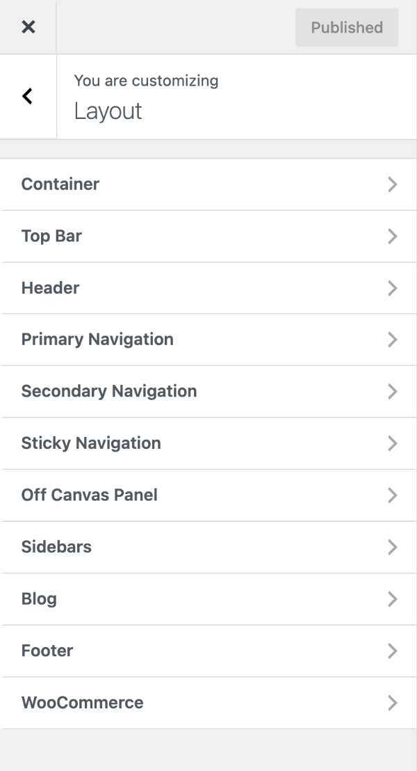
Site-wide: Appearance → Customize → Layout → Container
Per page or post: the Layout meta box in the editor
Settings
Container width
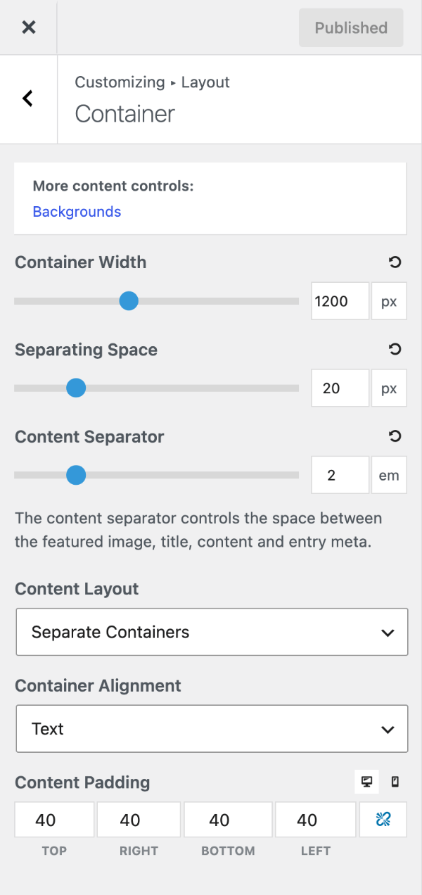
Container Width sets the maximum width of your site’s content, in pixels (700–2000, default 1200). Drag the slider or type a value. On screens narrower than the setting, the site simply fills the screen.
For a full-width look, set the header, navigation and footer to Full width in their sections rather than making the container very wide — long lines of text get hard to read.
Content layout
Content Layout decides how the content area, sidebars and other parts sit on the page:
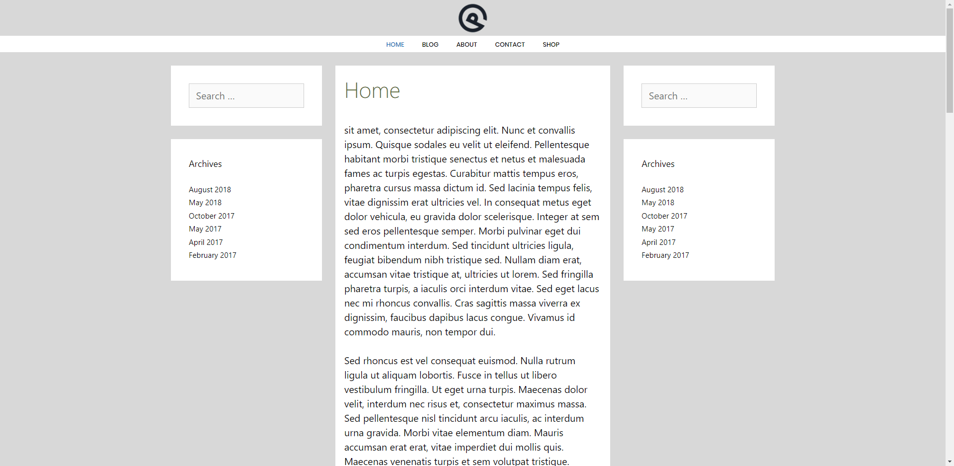
- Separate Containers (default) — each part is its own box, with space between them. Shows off a body background colour.
- One Container — everything sits inside one continuous box.
Container alignment
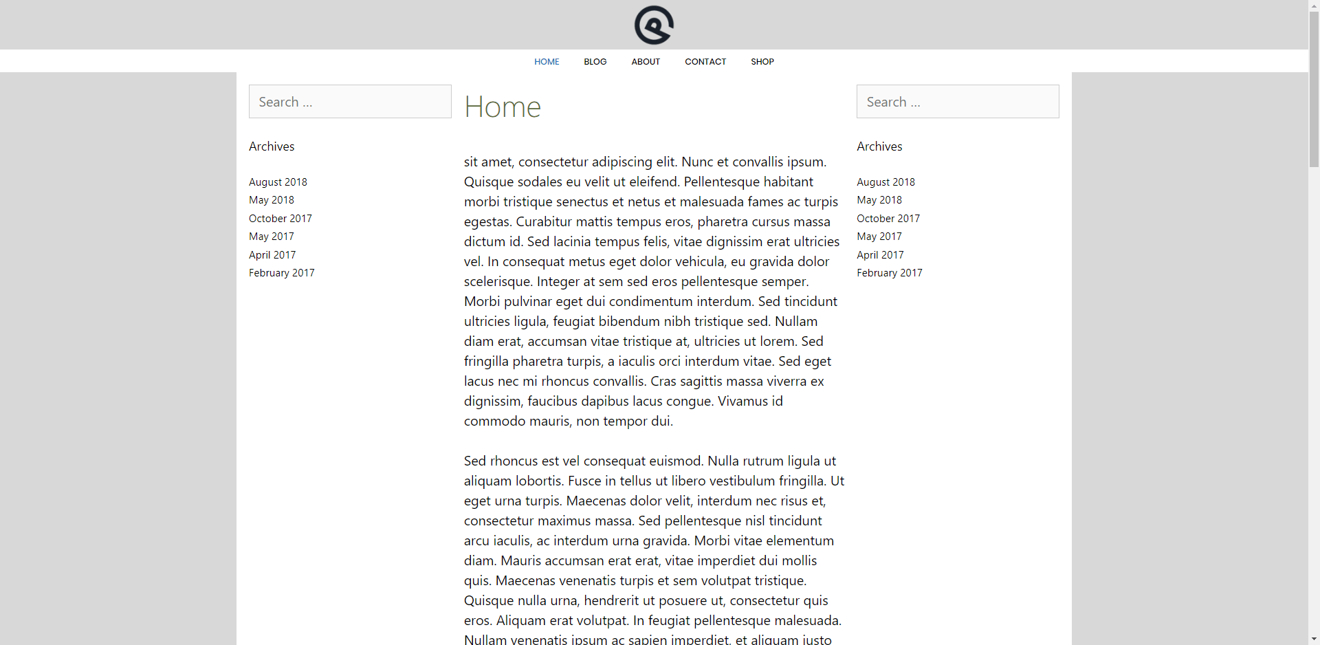
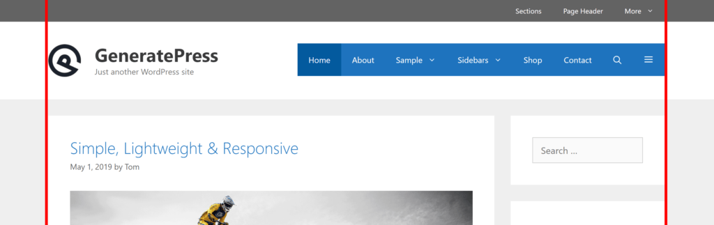
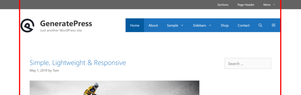
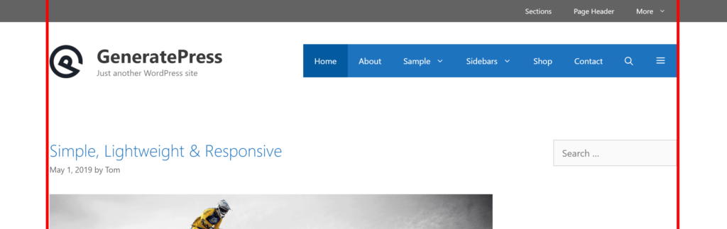
Container Alignment controls what lines up with the edges of your header and footer:
- Text (default) — the text inside your content and sidebars lines up with the header and footer content. Best when the body and content backgrounds are the same colour.
- Boxes — the edges of the content and sidebar boxes line up with the header and footer. Best with separate containers on a contrasting background.
Separating space
Requires GP Premium — Spacing module.
Separating Space is the gap between elements (20px by default) when Content Layout is Separate Containers — for example between the content and the sidebar. It also sets the gap between posts in blog columns and masonry, whatever your content layout.
Content padding
Requires GP Premium — Spacing module.
Content Padding is the space between the edge of the content container and the content inside it, in pixels, with separate top, right, bottom and left values. Use the device buttons to set different padding for desktop and mobile. The default is 40px on every side on desktop and 30px on mobile.
Padding not working? Check whether the page’s Content Container is set to Full Width or Contained in the Layout meta box or a Layout Element. Both remove content padding on purpose.
The Content Separator control in this section spaces out the parts of a post (title, content, meta). See Content.
Per-page layout: the Layout meta box
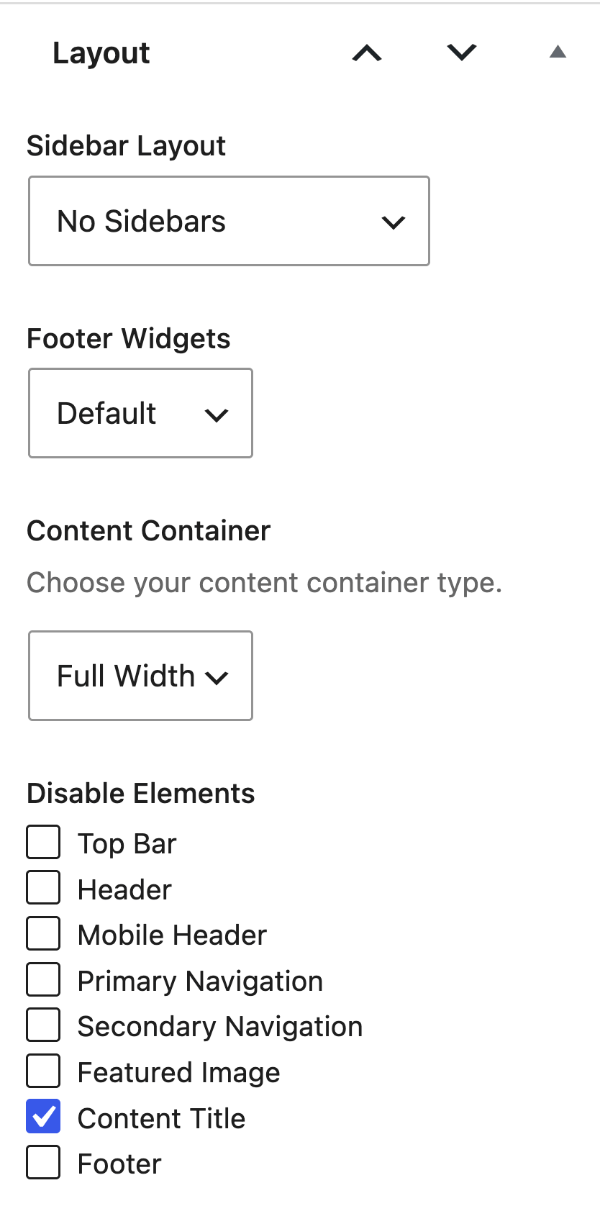
The Layout meta box overrides your Customizer layout for a single page or post. It has tabs for Sidebar Layout, Footer Widgets, Content Container and Disable Elements (GP Premium). Sidebar Layout is covered in Sidebars and Footer Widgets in Footer.
It only works on single pages and posts. WordPress ignores meta box settings on the blog page, archives and search results; use the Customizer or a Layout Element for those.
Where is it?
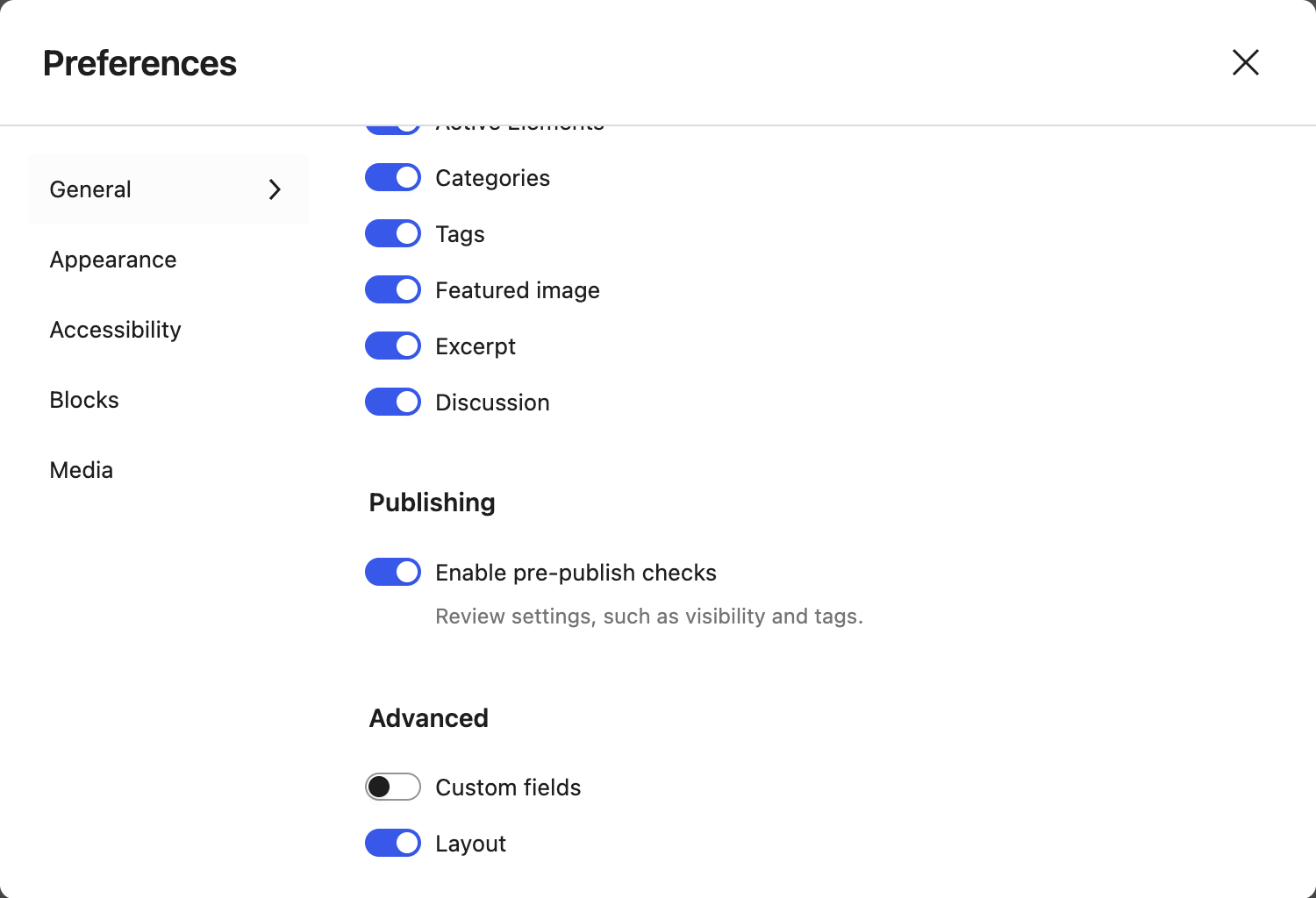
In the block editor, the Layout meta box sits in the meta box area below the content. If it’s missing, open the editor’s ⋮ menu → Preferences → General, and under Advanced switch on Layout.
Content container
The Content Container tab sets how the page’s content area behaves:
- Default — uses your Customizer Content Padding.
- Full Width — the content area spans the full screen width and has no padding. Use this for full-width sections built with GenerateBlocks or a page builder.
- Contained — keeps the container width but removes the padding, so your blocks control the spacing.
To apply a content container to many pages at once, or site-wide, use a Layout Element.
Formerly “Page Builder Container”
GeneratePress 3.0 renamed the Page Builder Container option to Content Container. It works the same way.
Disable elements
Requires GP Premium — Disable Elements module.
On the Disable Elements tab, tick any part of the site to hide it on that page or post: Top Bar, Header, Mobile Header, Primary Navigation, Secondary Navigation, Featured Image, Content Title and Footer.
To hide elements on many pages at once, or site-wide, use a Layout Element.
Responsive display
GeneratePress uses these breakpoints:
| Device | Width |
|---|---|
| Mobile | up to 768px |
| Tablet | 769px to 1024px |
| Desktop | 1025px and up |
Target one device in your CSS with a media query:
@media (max-width: 768px) {
    /* Mobile only */
}

@media (min-width: 769px) and (max-width: 1024px) {
    /* Tablet only */
}

@media (min-width: 1025px) {
    /* Desktop only */
}
Using our hide-on classes
Add one of these classes to hide something on a device:
hide-on-mobilehide-on-tablethide-on-desktop
For example:
- A menu item: add
hide-on-mobileto the item’s CSS Classes field in Appearance → Menus (see Using the WordPress menu builder). - A block: open Advanced in the block’s settings and add the class under Additional CSS class(es).
Recipes & customizations
Adding a container wrapper
Requires GP Premium — Elements module.
GeneratePress has no single element wrapped around the whole site. To add a border or shadow around everything, wrap it with two Hook Elements:
- Create a Hook Element with this content, set the hook to
generate_before_header, and set the display rules to Entire Site:
<div class="site-wrapper">- Create a second Hook Element with this content, set the hook to
generate_after_footer, and use the same display rules:
</div><!-- .site-wrapper -->- Style the wrapper with CSS:
.site-wrapper {
    box-shadow: 0 0 5px 5px rgba(0, 0, 0, 0.1);
}
This suits a contained site, so set:
- Layout → Container → Content Layout: One Container
- Layout → Header → Header Width: Contained
- Layout → Primary Navigation → Navigation Width: Contained
- Layout → Footer → Footer Width: Contained
All options
| Setting | Section | Choices | Default | Requires | Customizer option |
|---|---|---|---|---|---|
| Container Width | Container | 700–2000 px, step 5 | 1200 | — | generate_settings[container_width] |
| Separating Space | Container | 0–100 px | 20 | GP Premium — Spacing | generate_spacing_settings[separator] |
| Content Layout | Container | Separate Containers / One Container | Separate Containers | — | generate_settings[content_layout_setting] |
| Container Alignment | Container | Boxes / Text | Text | — | generate_settings[container_alignment] |
| Content Separator | Container | 0–10 em, step 0.1 | 2 | GP Premium — Spacing | generate_spacing_settings[content_element_separator] |
| Content Padding | Container | Top / Right / Bottom / Left, px; desktop and mobile | 40 desktop, 30 mobile | GP Premium — Spacing | generate_spacing_settings[content_top], [content_right], [content_bottom], [content_left], [mobile_content_top], [mobile_content_right], [mobile_content_bottom], [mobile_content_left] |
Settings can be changed in code with the option_generate_settings filter.
Related
- Sidebars — sidebar layouts and widths
- Header, Primary Navigation, Footer — the other sections of the Layout panel
- Elements — Layout Elements for content container and disabled elements across many pages
- Blog — blog columns and masonry
- Content — content separator
- Developer reference: Settings defaults filters