Set your site’s colours in one place: a small Global Colors palette, then the colours of each part of the site — body, header, navigation, content, buttons, forms, widgets and footer. Element colours usually point at palette colours, so changing the palette restyles the whole site.
All colours are free. The Secondary Navigation and Off Canvas Panel groups only appear with their GP Premium modules. WooCommerce colours are in the WooCommerce panel — see WooCommerce.
Appearance → Customize → Colors
WooCommerce colours: Appearance → Customize → WooCommerce → Colors (GP Premium)
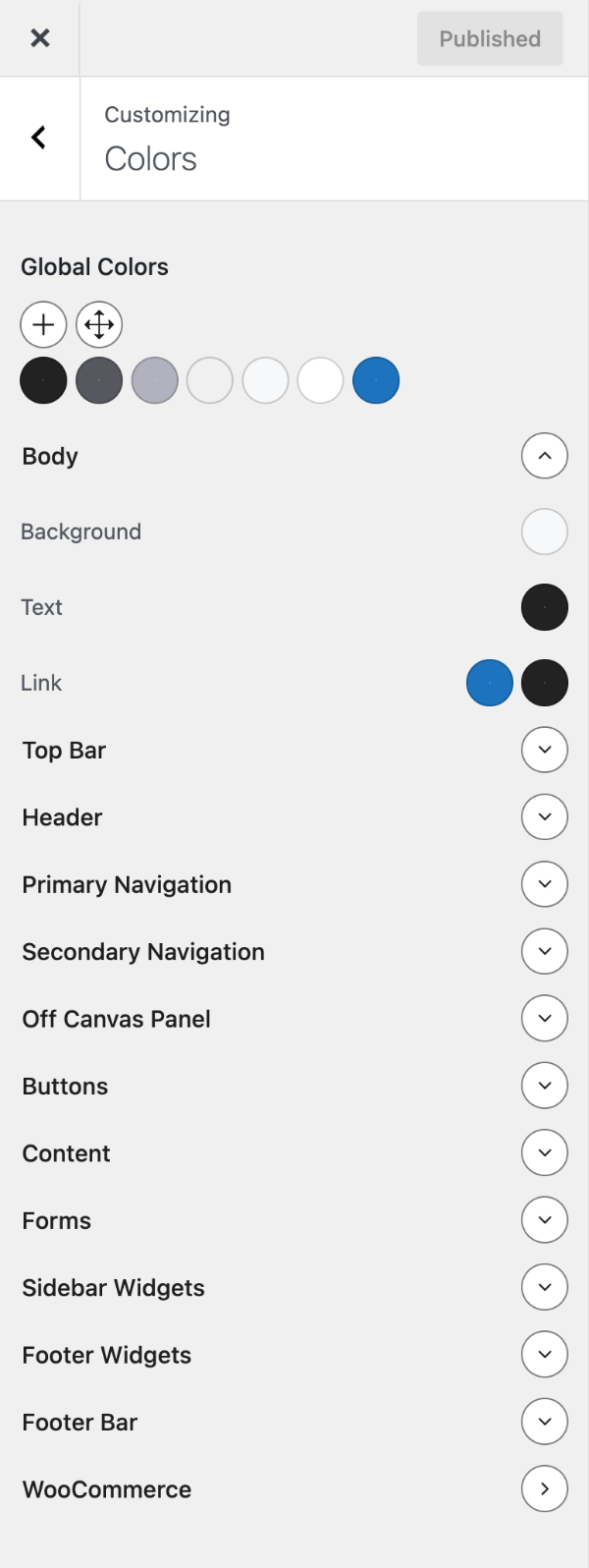
Global Colors
The palette at the top of Colors holds the colours you reuse across the site. New sites start with seven:
| Colour | Default | Use |
|---|---|---|
| Contrast | #222222 | Strongest text colour |
| Contrast 2 | #575760 | Lighter text |
| Contrast 3 | #b2b2be | Lightest text and borders |
| Base | #f0f0f0 | Darkest background (text still readable) |
| Base 2 | #f7f8f9 | Lighter background |
| Base 3 | #ffffff | Lightest background |
| Accent | #1e73be | Main brand colour — links, buttons, highlights |
- Contrast colours are for text and borders, Base colours for backgrounds — keep enough contrast between them for readable text. Accent colours are used sparingly, to draw attention.
- Click a colour to change it; every element using it updates. Add as many colours as you need, but keep the palette small.
- Each colour becomes a CSS variable (
var(--accent)), which you can use in your own CSS and in the block editor’s colour pickers.
Note
You can rename or delete palette colours, but any element using a renamed or deleted colour loses its value. Update those element colours afterwards.
To change the palette new sites start with, see the recipe.
Element colours
Below the palette, each part of the site has a colour group. Open a group and click a swatch to pick a palette colour or any other colour. Hover over a swatch to see what it controls. Empty swatches inherit from the group above (usually Body).
Groups, in Customizer order: Body, Header, Primary Navigation, Navigation Search (only while the old navigation search is on), Search Modal, Top Bar (only once it has a widget), Content, Buttons, Forms, Sidebar Widgets, Footer Widgets, Footer Bar and Back to Top. Most have Background, Text, Link and Link Hover; some add their own, such as Site Title and Tagline in Header or Heading 1–6 and Entry Meta in Content. The full list with defaults is in All options.
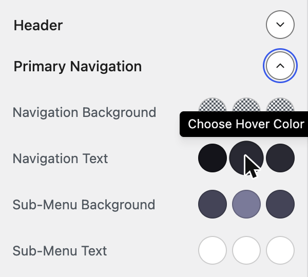
Navigation colours
The Primary Navigation group has separate colours for each state:
- Navigation Background and Navigation Text — normal, Hover and Current (the page you’re on).
- Sub-Menu Background and Sub-Menu Text — the same three states for dropdowns.
The mobile header and sticky navigation use these colours too.
GP Premium colour groups
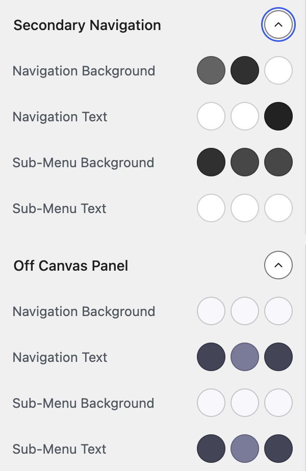
- Secondary Navigation — Requires GP Premium — Secondary Navigation module. The same states as Primary Navigation, for the secondary menu.
- Off Canvas Panel — Requires GP Premium — Menu Plus module. Navigation and sub-menu colours for the off-canvas panel. With the Overlay style, Set Overlay Defaults fills these in for you.
Recipes & customizations
Recipes add code as explained in Adding Custom Code.
Define your default Global Colors
To start sites with your own palette — for example on sites you build for clients — set the default Global Colors with option_generate_settings. Keep the slugs so existing element colours still match:
add_filter( 'option_generate_settings', function( $settings ) {
    $settings['global_colors'] = array(
        array(
            'name'  => __( 'Contrast', 'generatepress' ),
            'slug'  => 'contrast',
            'color' => '#333333',
        ),
        array(
            'name'  => sprintf( __( 'Contrast %s', 'generatepress' ), '2' ),
            'slug'  => 'contrast-2',
            'color' => '#555555',
        ),
        array(
            'name'  => sprintf( __( 'Contrast %s', 'generatepress' ), '3' ),
            'slug'  => 'contrast-3',
            'color' => '#b4b4b4',
        ),
        array(
            'name'  => __( 'Base', 'generatepress' ),
            'slug'  => 'base',
            'color' => '#f1f1f1',
        ),
        array(
            'name'  => sprintf( __( 'Base %s', 'generatepress' ), '2' ),
            'slug'  => 'base-2',
            'color' => '#f5f5f5',
        ),
        array(
            'name'  => sprintf( __( 'Base %s', 'generatepress' ), '3' ),
            'slug'  => 'base-3',
            'color' => '#ffffff',
        ),
        array(
            'name'  => __( 'Accent', 'generatepress' ),
            'slug'  => 'accent',
            'color' => '#1e73be',
        ),
        // Add more colours here.
    );

    return $settings;
} );
Note
This filter overrides the palette saved in the Customizer. While it’s active, changes to Global Colors in Customize → Colors won’t take effect — edit the colours in the snippet instead.
All options
| Setting | Section | Choices | Default | Requires | Customizer option |
|---|---|---|---|---|---|
| Global Colors | Colors | Palette of named colours | Contrast, Contrast 2, Contrast 3, Base, Base 2, Base 3, Accent (see above) | — | generate_settings[global_colors] |
| Background | Colors › Body | Colour | var(--base-2) | — | generate_settings[background_color] |
| Text | Colors › Body | Colour | var(--contrast) | — | generate_settings[text_color] |
| Link | Colors › Body | Colour | var(--accent) | — | generate_settings[link_color] |
| Link Hover | Colors › Body | Colour | var(--contrast) | — | generate_settings[link_color_hover] |
| Background | Colors › Header | Colour | var(--base-3) | — | generate_settings[header_background_color] |
| Text | Colors › Header | Colour | — (inherits) | — | generate_settings[header_text_color] |
| Link | Colors › Header | Colour | — (inherits) | — | generate_settings[header_link_color] |
| Link Hover | Colors › Header | Colour | — (inherits) | — | generate_settings[header_link_hover_color] |
| Site Title | Colors › Header | Colour | var(--contrast) | — | generate_settings[site_title_color] |
| Tagline | Colors › Header | Colour | var(--contrast-2) | — | generate_settings[site_tagline_color] |
| Navigation Background | Colors › Primary Navigation | Colour | var(--base-3) | — | generate_settings[navigation_background_color] |
| Navigation Background Hover | Colors › Primary Navigation | Colour | — (inherits) | — | generate_settings[navigation_background_hover_color] |
| Navigation Background Current | Colors › Primary Navigation | Colour | — (inherits) | — | generate_settings[navigation_background_current_color] |
| Navigation Text | Colors › Primary Navigation | Colour | var(--contrast) | — | generate_settings[navigation_text_color] |
| Navigation Text Hover | Colors › Primary Navigation | Colour | var(--accent) | — | generate_settings[navigation_text_hover_color] |
| Navigation Text Current | Colors › Primary Navigation | Colour | var(--accent) | — | generate_settings[navigation_text_current_color] |
| Sub-Menu Background | Colors › Primary Navigation | Colour | var(--base) | — | generate_settings[subnavigation_background_color] |
| Sub-Menu Background Hover | Colors › Primary Navigation | Colour | — (inherits) | — | generate_settings[subnavigation_background_hover_color] |
| Sub-Menu Background Current | Colors › Primary Navigation | Colour | — (inherits) | — | generate_settings[subnavigation_background_current_color] |
| Sub-Menu Text | Colors › Primary Navigation | Colour | — (inherits) | — | generate_settings[subnavigation_text_color] |
| Sub-Menu Text Hover | Colors › Primary Navigation | Colour | — (inherits) | — | generate_settings[subnavigation_text_hover_color] |
| Sub-Menu Text Current | Colors › Primary Navigation | Colour | — (inherits) | — | generate_settings[subnavigation_text_current_color] |
| Navigation Background | Colors › Secondary Navigation | Colour | #636363 | GP Premium — Secondary Navigation | generate_secondary_nav_settings[navigation_background_color] |
| Navigation Background Hover | Colors › Secondary Navigation | Colour | #303030 | GP Premium — Secondary Navigation | generate_secondary_nav_settings[navigation_background_hover_color] |
| Navigation Background Current | Colors › Secondary Navigation | Colour | #ffffff | GP Premium — Secondary Navigation | generate_secondary_nav_settings[navigation_background_current_color] |
| Navigation Text | Colors › Secondary Navigation | Colour | #ffffff | GP Premium — Secondary Navigation | generate_secondary_nav_settings[navigation_text_color] |
| Navigation Text Hover | Colors › Secondary Navigation | Colour | #ffffff | GP Premium — Secondary Navigation | generate_secondary_nav_settings[navigation_text_hover_color] |
| Navigation Text Current | Colors › Secondary Navigation | Colour | #222222 | GP Premium — Secondary Navigation | generate_secondary_nav_settings[navigation_text_current_color] |
| Sub-Menu Background | Colors › Secondary Navigation | Colour | #303030 | GP Premium — Secondary Navigation | generate_secondary_nav_settings[subnavigation_background_color] |
| Sub-Menu Background Hover | Colors › Secondary Navigation | Colour | #474747 | GP Premium — Secondary Navigation | generate_secondary_nav_settings[subnavigation_background_hover_color] |
| Sub-Menu Background Current | Colors › Secondary Navigation | Colour | #474747 | GP Premium — Secondary Navigation | generate_secondary_nav_settings[subnavigation_background_current_color] |
| Sub-Menu Text | Colors › Secondary Navigation | Colour | #ffffff | GP Premium — Secondary Navigation | generate_secondary_nav_settings[subnavigation_text_color] |
| Sub-Menu Text Hover | Colors › Secondary Navigation | Colour | #ffffff | GP Premium — Secondary Navigation | generate_secondary_nav_settings[subnavigation_text_hover_color] |
| Sub-Menu Text Current | Colors › Secondary Navigation | Colour | #ffffff | GP Premium — Secondary Navigation | generate_secondary_nav_settings[subnavigation_text_current_color] |
| Navigation Background | Colors › Off Canvas Panel | Colour | — (inherits) | GP Premium — Menu Plus | generate_settings[slideout_background_color] |
| Navigation Background Hover | Colors › Off Canvas Panel | Colour | — (inherits) | GP Premium — Menu Plus | generate_settings[slideout_background_hover_color] |
| Navigation Background Current | Colors › Off Canvas Panel | Colour | — (inherits) | GP Premium — Menu Plus | generate_settings[slideout_background_current_color] |
| Navigation Text | Colors › Off Canvas Panel | Colour | — (inherits) | GP Premium — Menu Plus | generate_settings[slideout_text_color] |
| Navigation Text Hover | Colors › Off Canvas Panel | Colour | — (inherits) | GP Premium — Menu Plus | generate_settings[slideout_text_hover_color] |
| Navigation Text Current | Colors › Off Canvas Panel | Colour | — (inherits) | GP Premium — Menu Plus | generate_settings[slideout_text_current_color] |
| Sub-Menu Background | Colors › Off Canvas Panel | Colour | — (inherits) | GP Premium — Menu Plus | generate_settings[slideout_submenu_background_color] |
| Sub-Menu Background Hover | Colors › Off Canvas Panel | Colour | — (inherits) | GP Premium — Menu Plus | generate_settings[slideout_submenu_background_hover_color] |
| Sub-Menu Background Current | Colors › Off Canvas Panel | Colour | — (inherits) | GP Premium — Menu Plus | generate_settings[slideout_submenu_background_current_color] |
| Sub-Menu Text | Colors › Off Canvas Panel | Colour | — (inherits) | GP Premium — Menu Plus | generate_settings[slideout_submenu_text_color] |
| Sub-Menu Text Hover | Colors › Off Canvas Panel | Colour | — (inherits) | GP Premium — Menu Plus | generate_settings[slideout_submenu_text_hover_color] |
| Sub-Menu Text Current | Colors › Off Canvas Panel | Colour | — (inherits) | GP Premium — Menu Plus | generate_settings[slideout_submenu_text_current_color] |
| Background | Colors › Navigation Search | Colour (shown while the old Navigation Search is on) | — (inherits) | — | generate_settings[navigation_search_background_color] |
| Text | Colors › Navigation Search | Colour (shown while the old Navigation Search is on) | — (inherits) | — | generate_settings[navigation_search_text_color] |
| Field Background | Colors › Search Modal | Colour | var(--base-3) | — | generate_settings[search_modal_bg_color] |
| Field Text | Colors › Search Modal | Colour | var(--contrast) | — | generate_settings[search_modal_text_color] |
| Overlay Background | Colors › Search Modal | Colour | rgba(0,0,0,0.2) | — | generate_settings[search_modal_overlay_bg_color] |
| Background | Colors › Top Bar | Colour (shown when the Top Bar has a widget) | #636363 | — | generate_settings[top_bar_background_color] |
| Text | Colors › Top Bar | Colour (shown when the Top Bar has a widget) | #ffffff | — | generate_settings[top_bar_text_color] |
| Link | Colors › Top Bar | Colour (shown when the Top Bar has a widget) | #ffffff | — | generate_settings[top_bar_link_color] |
| Link Hover | Colors › Top Bar | Colour (shown when the Top Bar has a widget) | #303030 | — | generate_settings[top_bar_link_color_hover] |
| Background | Colors › Content | Colour | var(--base-3) | — | generate_settings[content_background_color] |
| Text | Colors › Content | Colour | — (inherits) | — | generate_settings[content_text_color] |
| Link | Colors › Content | Colour | — (inherits) | — | generate_settings[content_link_color] |
| Link Hover | Colors › Content | Colour | — (inherits) | — | generate_settings[content_link_hover_color] |
| Content Title | Colors › Content | Colour | — (inherits) | — | generate_settings[content_title_color] |
| Archive Content Title | Colors › Content | Colour | var(--contrast) | — | generate_settings[blog_post_title_color] |
| Archive Content Title Hover | Colors › Content | Colour | var(--contrast-2) | — | generate_settings[blog_post_title_hover_color] |
| Entry Meta Text | Colors › Content | Colour | var(--contrast-2) | — | generate_settings[entry_meta_text_color] |
| Entry Meta Links | Colors › Content | Colour | — (inherits) | — | generate_settings[entry_meta_link_color] |
| Entry Meta Links Hover | Colors › Content | Colour | — (inherits) | — | generate_settings[entry_meta_link_color_hover] |
| Heading 1 (H1) Color | Colors › Content | Colour | — (inherits) | — | generate_settings[h1_color] |
| Heading 2 (H2) Color | Colors › Content | Colour | — (inherits) | — | generate_settings[h2_color] |
| Heading 3 (H3) Color | Colors › Content | Colour | — (inherits) | — | generate_settings[h3_color] |
| Heading 4 (H4) Color | Colors › Content | Colour | — (inherits) | — | generate_settings[h4_color] |
| Heading 5 (H5) Color | Colors › Content | Colour | — (inherits) | — | generate_settings[h5_color] |
| Heading 6 (H6) Color | Colors › Content | Colour | — (inherits) | — | generate_settings[h6_color] |
| Background | Colors › Buttons | Colour | #55555e | — | generate_settings[form_button_background_color] |
| Background Hover | Colors › Buttons | Colour | #3f4047 | — | generate_settings[form_button_background_color_hover] |
| Text | Colors › Buttons | Colour | #ffffff | — | generate_settings[form_button_text_color] |
| Text Hover | Colors › Buttons | Colour | #ffffff | — | generate_settings[form_button_text_color_hover] |
| Background | Colors › Forms | Colour | var(--base-2) | — | generate_settings[form_background_color] |
| Background Focus | Colors › Forms | Colour | var(--base-2) | — | generate_settings[form_background_color_focus] |
| Text | Colors › Forms | Colour | var(--contrast) | — | generate_settings[form_text_color] |
| Text Focus | Colors › Forms | Colour | var(--contrast) | — | generate_settings[form_text_color_focus] |
| Border | Colors › Forms | Colour | var(--base) | — | generate_settings[form_border_color] |
| Border Focus | Colors › Forms | Colour | var(--contrast-3) | — | generate_settings[form_border_color_focus] |
| Background | Colors › Sidebar Widgets | Colour | var(--base-3) | — | generate_settings[sidebar_widget_background_color] |
| Text | Colors › Sidebar Widgets | Colour | — (inherits) | — | generate_settings[sidebar_widget_text_color] |
| Link | Colors › Sidebar Widgets | Colour | — (inherits) | — | generate_settings[sidebar_widget_link_color] |
| Link Hover | Colors › Sidebar Widgets | Colour | — (inherits) | — | generate_settings[sidebar_widget_link_hover_color] |
| Widget Title | Colors › Sidebar Widgets | Colour | — (inherits) | — | generate_settings[sidebar_widget_title_color] |
| Background | Colors › Footer Widgets | Colour | var(--base-3) | — | generate_settings[footer_widget_background_color] |
| Text | Colors › Footer Widgets | Colour | — (inherits) | — | generate_settings[footer_widget_text_color] |
| Link | Colors › Footer Widgets | Colour | — (inherits) | — | generate_settings[footer_widget_link_color] |
| Link Hover | Colors › Footer Widgets | Colour | — (inherits) | — | generate_settings[footer_widget_link_hover_color] |
| Widget Title | Colors › Footer Widgets | Colour | — (inherits) | — | generate_settings[footer_widget_title_color] |
| Background | Colors › Footer Bar | Colour | var(--base-3) | — | generate_settings[footer_background_color] |
| Text | Colors › Footer Bar | Colour | — (inherits) | — | generate_settings[footer_text_color] |
| Link | Colors › Footer Bar | Colour | — (inherits) | — | generate_settings[footer_link_color] |
| Link Hover | Colors › Footer Bar | Colour | — (inherits) | — | generate_settings[footer_link_hover_color] |
| Background | Colors › Back to Top | Colour | rgba( 0,0,0,0.4 ) | — | generate_settings[back_to_top_background_color] |
| Background Hover | Colors › Back to Top | Colour | rgba( 0,0,0,0.6 ) | — | generate_settings[back_to_top_background_color_hover] |
| Text | Colors › Back to Top | Colour | #ffffff | — | generate_settings[back_to_top_text_color] |
| Text Hover | Colors › Back to Top | Colour | #ffffff | — | generate_settings[back_to_top_text_color_hover] |
Settings can be changed in code with the option_generate_settings and option_generate_secondary_nav_settings filters.
Related
- Typography — fonts and sizes
- Background Images — background images (GP Premium)
- WooCommerce — shop colours (GP Premium)
- Content › Adding buttons — extra button styles
- Developer reference: Settings defaults filters, Icons and fonts filters