This is a feature in our pro version only.
The Tabs block can be used to create tabbed content. It allows you to divide content into multiple tabs, making it easier to organize and present information to the reader. The Tabs block provides a way to arrange content in a visually appealing and easily accessible manner, making it a useful tool for creating engaging and interactive content.
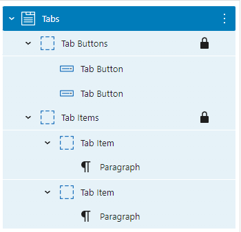
A default Tabs block is built with a Tab Buttons (Container) block with two Tab Button (Button) blocks and a Tab Items (Container) block with Tab Item (Container) blocks:
Adding a Tab Button and a Tab Item
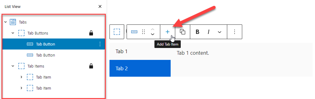
To add a Tab Item with a corresponding Tab Button in a Tabs, simply click the + icon in the toolbar when selecting any of the Tabs components:
Tab Button and Tab Item Order
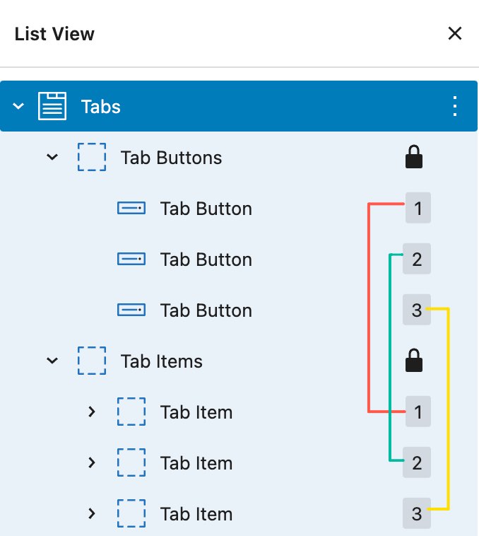
The order of tab buttons and tab items needs to match to ensure the proper connection between them.
For example, the first tab button controls the first tab item, the second tab button controls the second tab item, and so on.
Block Settings – Tabs
The Tab’s block settings allow you to set certain attributes and styles to the tabs.
Default Opened Tab
This option allows you to select one tab to be opened by default. If you prefer none of the tabs to be opened by default, leave the field blank.
Transition
This option allows you to add a transition effect when switching tabs.
Sync tab item styles
When this option is toggled, the style changes made to one of the Tab Buttons/Tab Items will be synced to all Tab Buttons/Tab Items. This option helps you work more efficiently.
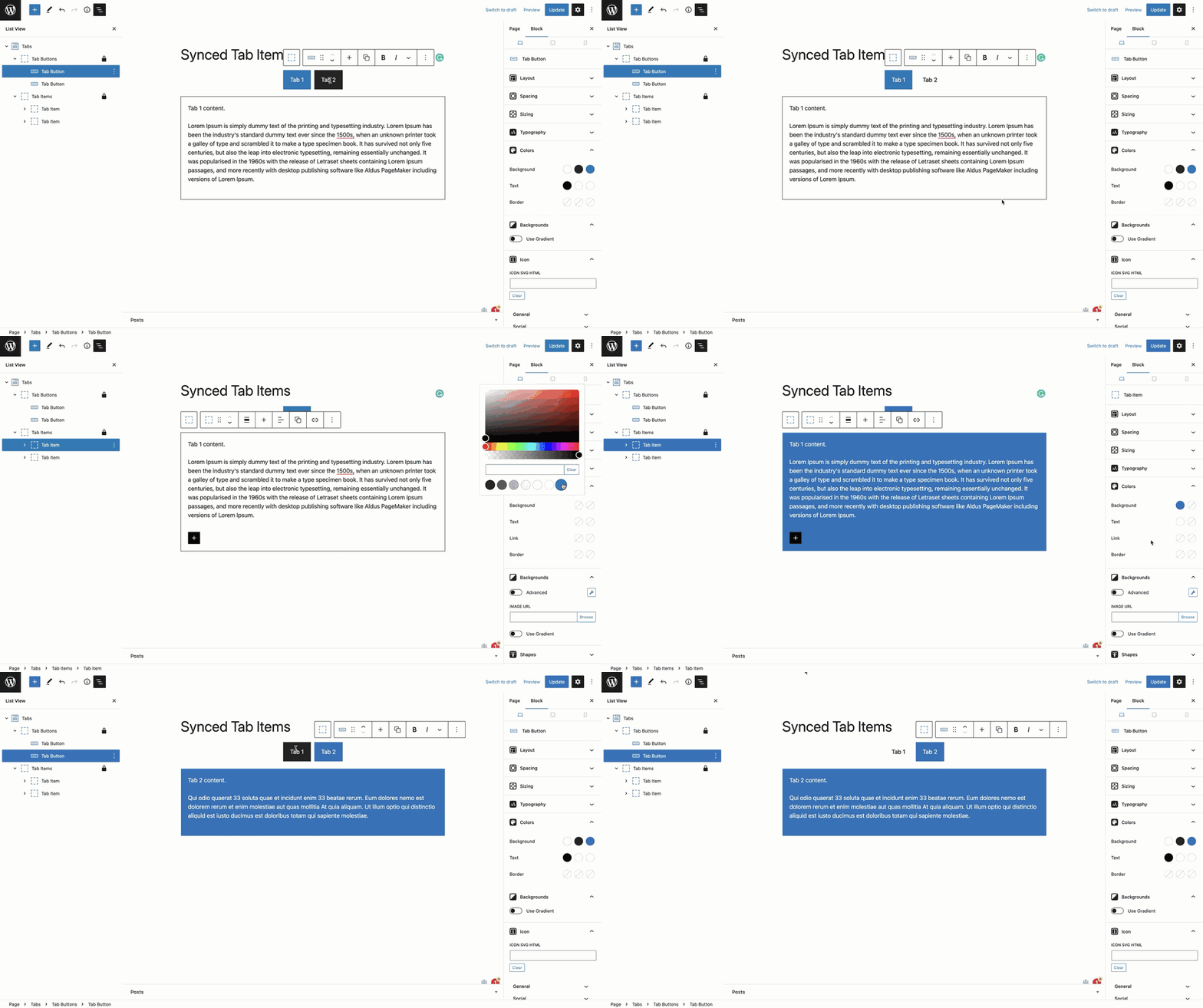
Un-toggle the option if you want to add a unique style to individual Tab Buttons/Tab Items.
Tab button type
You can choose the Tab Button to be either a simple Button or a Container with a more advanced layout.
Adding HTML Anchors for Tabs
This is a feature in our pro version only.
By setting HTML anchors within GenerateBlocks tabs, you can provide users with convenient navigation within the tabbed content. Once the anchors are in place, you can create links that will take users directly to specific tab items, and the tabs will automatically open the corresponding tab for them.
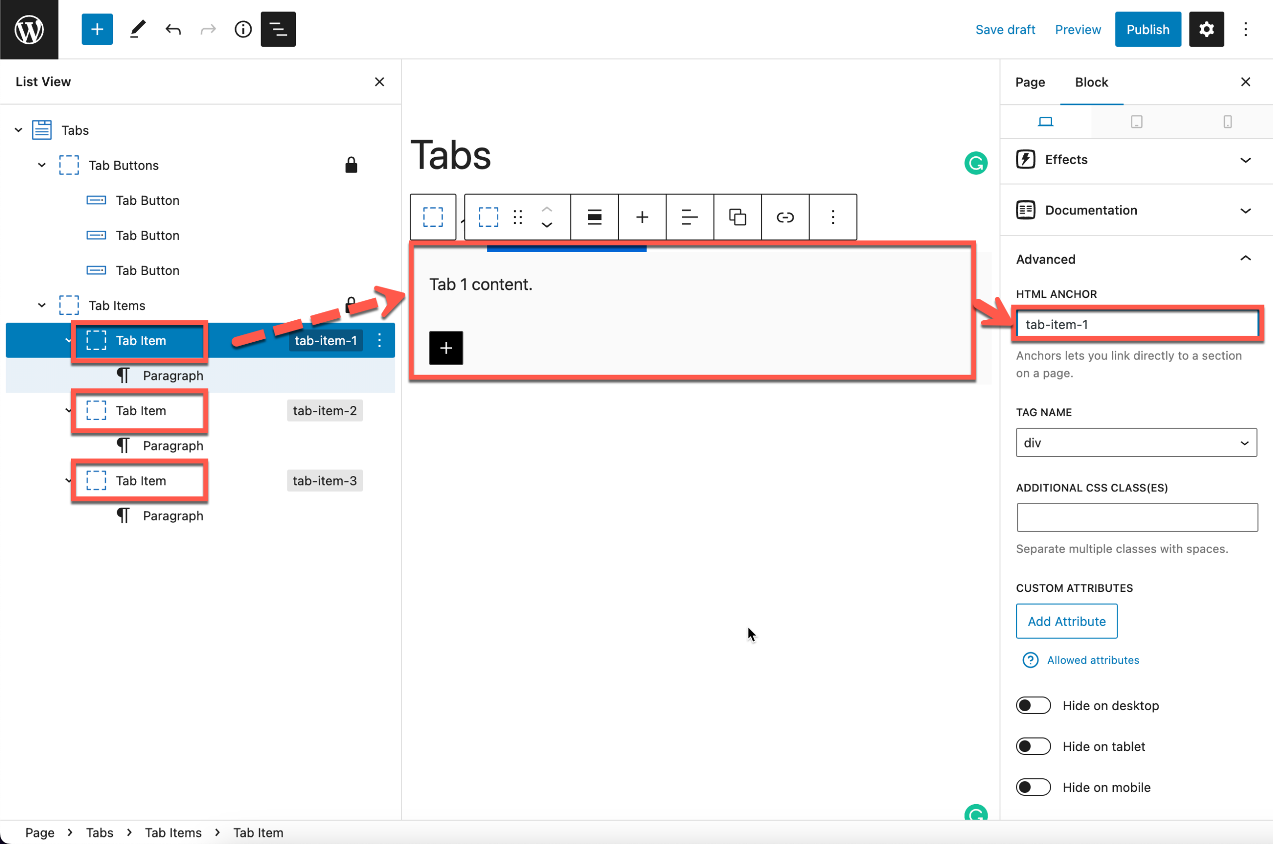
1. Add the anchors to the tab items
Add HTML anchors to all tab item containers via the Advanced panel > HTML Anchor.
2. Add the anchors to links
After adding the HTML anchors, you can include the anchor in the page link by appending # followed by the anchor name.
For example, if the page link is your-domain.com/page-1, and the anchor name is tab-item-1, the complete link with anchor would be your-domain.com/page-1/#tab-item-1.
Examples
Check the below links with anchor:
</v1-blocks/layout/>
</v1-blocks/layout/>