This is a feature in our pro version only.
Demos of the patterns in our library can be found on our Pattern Library site.
Our Pattern Library block allows you to insert pre-made blocks directly into your content.
To use it, go to add a new block like you would any other block in the location where you want to add the template. In the “GenerateBlocks” category, choose the “Pattern Library” block.
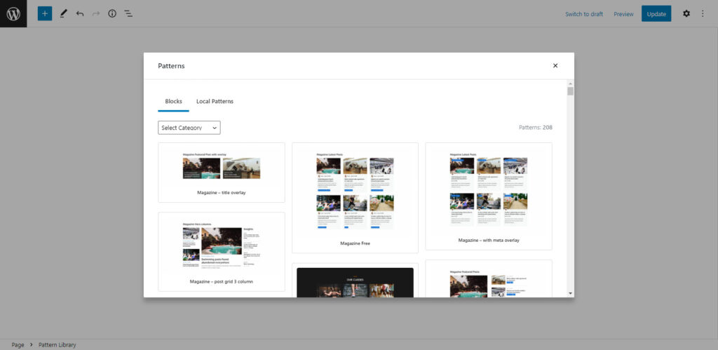
Adding this block will automatically open the Pattern Library modal. To choose from our templates, simply click one of them and it will automatically replace the Pattern Library block you added with the imported block.
At this time, we do not import images during the insert process, so be sure to replace any images or background images with your own, or re-upload them to your Media Library.
Local Patterns
You can also build your very own patterns which are accessible via the Local Patterns tab in the Pattern Library modal.
Local Patterns can be added in GenerateBlocks > Local Patterns.
To include a featured image in the Pattern Library modal, you can add a featured image to the local patterns while creating/editing it.
Local Patterns do not update automatically. For example, if you insert a Local Patterns to your page, then change the original or source Local Patterns, changes will not be reflected to the previously inserted pattern.
Pattern Library
GenerateBlocks has its own Pattern Library, which is separate from the Pattern Library found in core WordPress.
Opening the Pattern Library
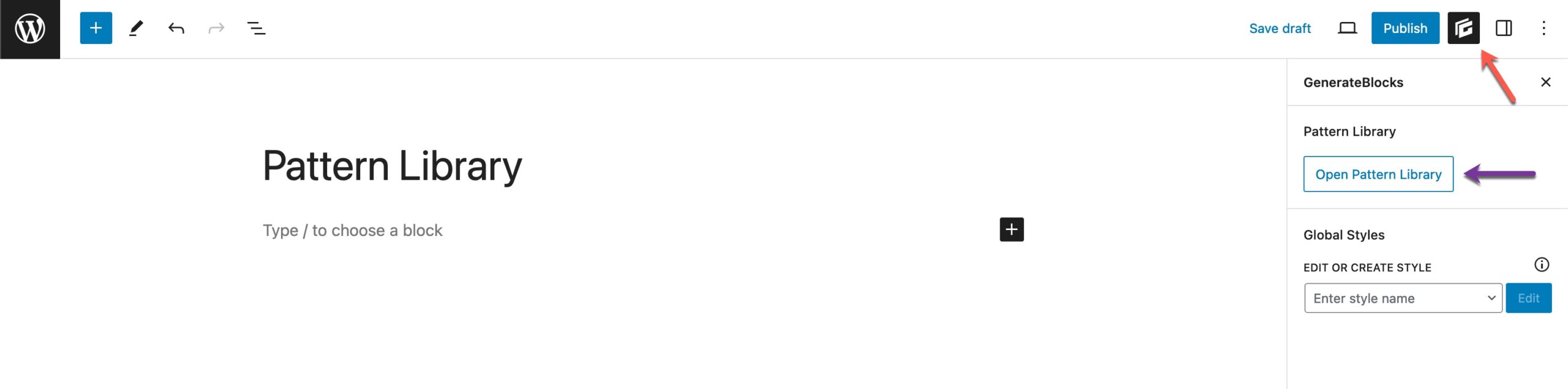
To open the Pattern Library, open the GenerateBlocks editor sidebar (red arrow below). Then, click the “Open Pattern Library” button (purple arrow below).
Explore the Pattern Library
Once the Pattern Library modal is empty, you’ll see something like the following.
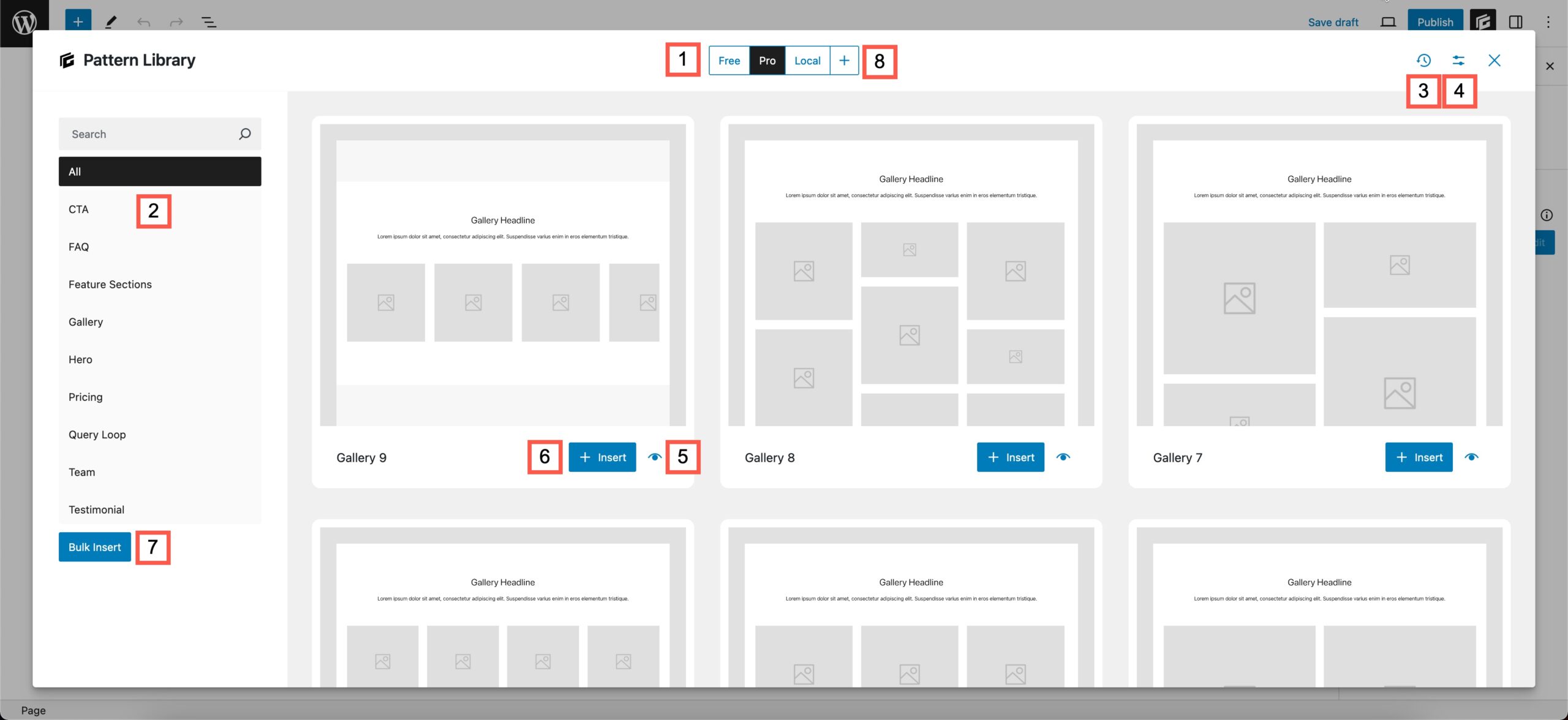
I’ve added some red boxes with numbers to highlight a few areas.
- These are your libraries. By default, there is a “Free” library for free GenerateBlocks users. If you have GenerateBlocks Pro activated, you will see a “Pro” library with pro patterns that use our Global Styles feature. The “Local” library you see in the screenshot above is a local collection of patterns I’ve added on my local site. When adding local patterns, you will see a “Collection” taxonomy. If you create and add patterns to a collection, they will show as a library.
- These are categories. You can categorize your local patterns using the Category taxonomy.
- This icon is the cache if the library you’re viewing is being loaded remotely. You can click this icon to clear the cache and fetch the latest patterns from the remote library. It can be clicked every 5 minutes.
- This button will open a modal that allows you to enable or disable libraries from showing the Library.
- This button will open a larger preview of the pattern.
- The Insert button will insert the individual pattern onto the page. It will insert the pattern wherever your cursor currently is.
- The bulk insert button enables you to select multiple patterns at once to insert into your page.
- The + button allows you to add remote libraries. This feature will only be useful once we release our GenerateCloud plugin, which will allow you to host your own remote libraries.
Manage Libraries
When you click the #4 button as shown above, you will see the following modal.
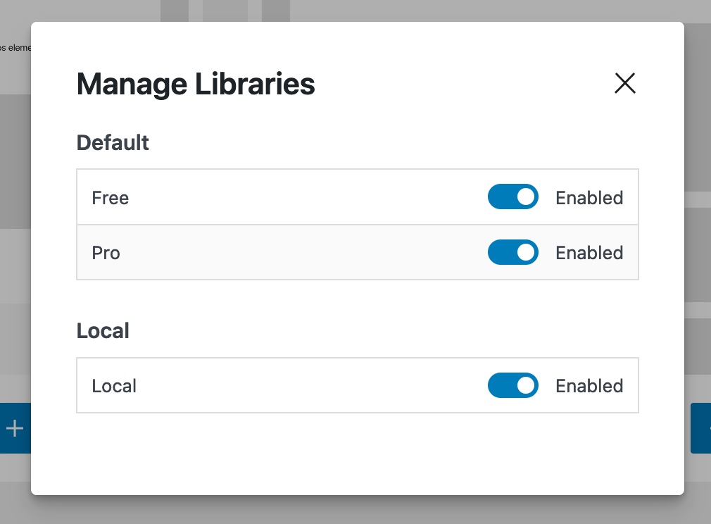
You will see all registered libraries in the modal. You can easily enable or disable them from showing up in the library with the toggles.
Pattern Global Styles
The New Patterns Library provides over 200 mid-fidelity wireframe patterns. With minimal block styles these patterns can be integrated into any existing design. Built to a standardised framework each Pattern attracts its styles from 3 places:
Theme Styles Local Block Styles Global Styles
Theme Styles
The Patterns will inherit the following styles from Theme:
All Font Families Typography for Sections: H1, H2 and Paragraph. Typography Colors except where it is positioned over a Dark Background
Local Block Styles
Local styles on the block are used in very limited scenarios.
Sections Background Images and their Text and Link Colors Section Inner uses Global Max Width to set its Sizing > Max Width.
Global Styles
Global Styles are where the majority of Pattern Styles are defined.
Buttons
There are two pre-defined Button Styles:
.gbp-button--primary
.gbp-button--primary {
    display: inline-flex;
    font-size: 1rem;
    padding: 0.75rem 1.5rem;
    border: 1px solid;
    background-color: #000000;
    color: #ffffff;
}
.gbp-button--primary:hover {
    background-color: #000000;
    color: #ffffff;
}
.gbp-button--secondary
.gbp-button--secondary {
    display: inline-flex;
    font-size: 1rem;
    padding: 0.75rem 1.5rem;
    border: 1px solid #000000;
    color: currentColor;
}
.gbp-button--secondary:hover {
    color: currentColor;
}
Sections
.gbp-section
.gbp-section {
    padding: 7rem 40px;
}
@media (max-width: 1024px) {
    .gbp-section {
        padding: 6rem 30px;
    }
}
@media (max-width: 767px) {
    .gbp-section {
        padding: 4rem 20px;
    }
}
.gbp-section__inner
.gbp-section__inner {
    margin-left: auto;
    margin-right: auto;
    position: relative;
    z-index: 1;
}
.gbp-section__headline
.gbp-section__headline {
    margin-bottom: 1.5rem;
}
@media (max-width: 767px) {
    .gbp-section__headline {
        margin-bottom: 1.25rem;
    }
}
.gbp-section__text
.gbp-section__text {
    font-size: 1.125rem;
}
.gbp-section__tagline
.gbp-section__tagline {
    font-size: 1rem;
    font-weight: 600;
    margin-bottom: 0.75rem;
}
Cards
.gbp-card
.gbp-card {
    padding: 1.5rem;
}
@media (max-width: 767px) {
    .gbp-card {
        padding: 1.25rem;
    }
}
.gbp-card__title
.gbp-card__title {
    font-size: 1.25rem;
    margin-bottom: 0.5rem;
}
.gbp-section__text
.gbp-section__text {
    font-size: 1.125rem;
}
.gbp-card__meta-text
.gbp-card__meta-text {
    font-size: 0.875rem;
    margin-bottom: 0.5rem;
}
.gbp-card--border
.gbp-card--border {
    border: 1px solid #000000;
}
Visual Pattern Index
1  .gbp-button--primary
2  .gbp-button--secondary

3  .gbp-section
4  .gbp-section__inner
5  .gbp-section__tagline
6  .gbp-section__headline
7  .gbp-section__text

8  .gbp-card
9  .gbp-card__title
10 .gbp-card__text
11 .gbp-card__meta-text
12 .gbp-card--border

Asset Library
This is a feature in our pro version only.
Our Asset Library provides an area in your Dashboard where you can add your own SVG icons and SVG shapes for use in our blocks.
To access it, go to GenerateBlocks > Asset Library.
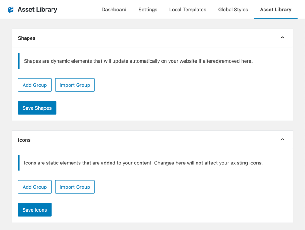
Shapes
In GenerateBlocks, Shapes are dynamic elements. This means they aren’t saved as content in the editor when you add them, they’re saved as a unique name, and then generated dynamically on the front-end of your website when you load a page. This means when you remove or change a Shape in the Asset Library, it will automatically update that same Shape throughout your website.
Add Shape Group
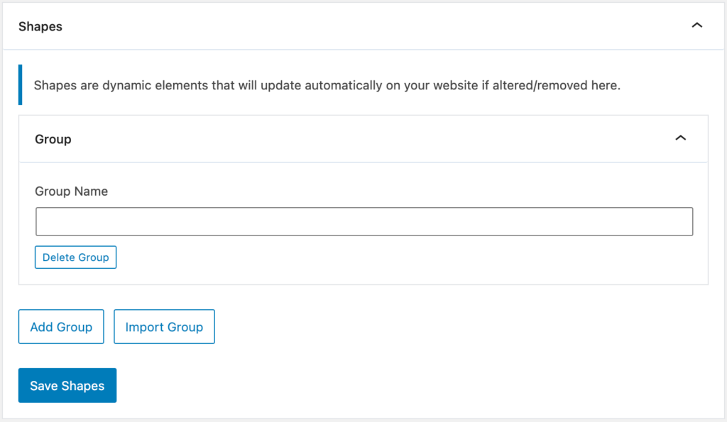
When you click the Add Group button, it will add a new panel and ask you to add a Group Name. This Group Name should be unique.
Adding Shapes
Once we add a Group Name, an Add Shape button will appear. You can add as many Shapes to this group as you like.
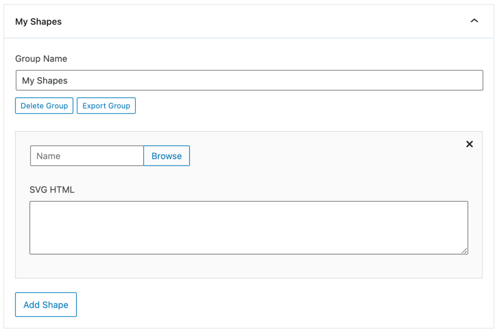
First, we give our Shape a name. This name will be used to create a unique ID for the Shape that’s used when you use it on a page. This means you can change the name in the Asset Library and it won’t break the Shape if it’s been added to your pages.
If you’re using the Safe SVG WordPress plugin, a Browse button will appear that allows you to upload an .svg file, and it will grab the SVG HTML for you automatically.
Now we can add our SVG HTML. It’s always a good idea to optimize your SVGs before adding them.
By default, we’re very strict with how we sanitize your SVG HTML, as SVGs can be dangerous. However, if you use the Safe SVG plugin, we use their built-in sanitizing feature, which is solid and much more lenient.
Icons
In GenerateBlocks, Icons are saved as content when you save or update your page – they are static elements, not dynamic elements like Shapes. This means once you add an icon to your content, you need to manually update it if you ever want to change it. Changing or removing it in the Asset Library will have no effect on the front-end of your website.
Adding Icon Groups and Icons work exactly like the Shape Groups we outlined above.
Exporting Groups
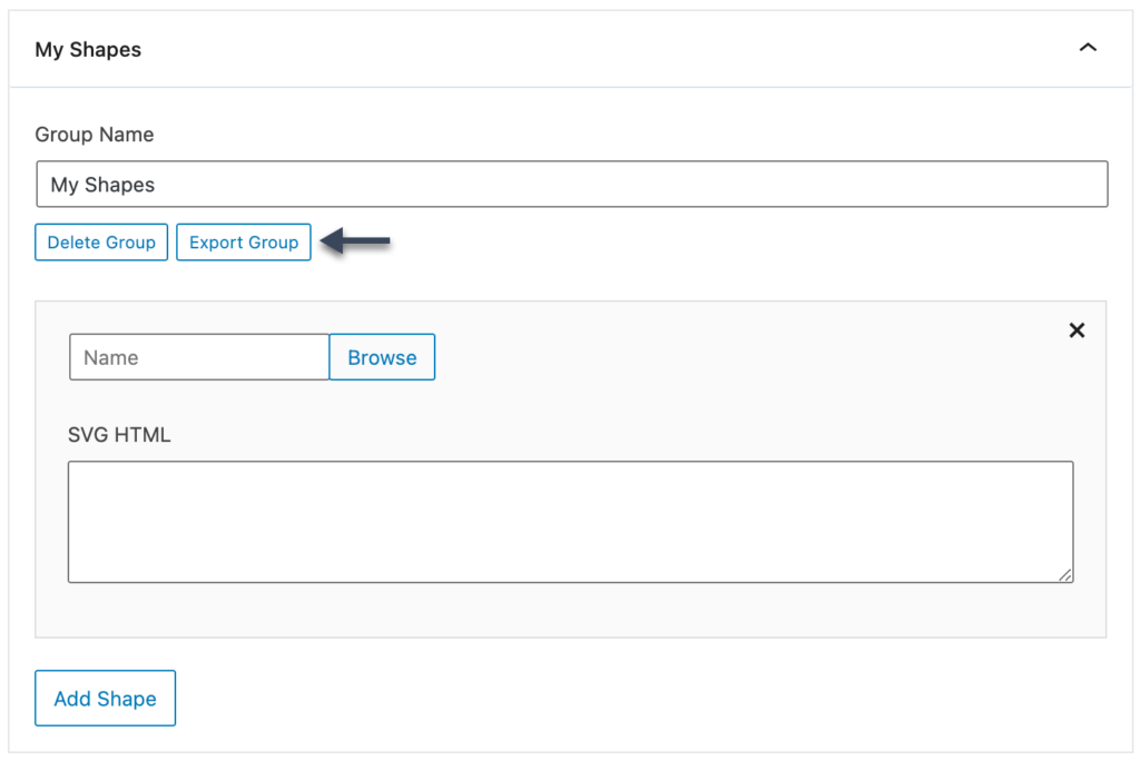
When you add a new Group, you’ll see an Export Group button appear.
Export Group
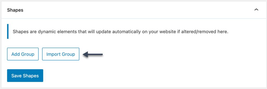
This button will export all of the SVGs in the group into a JSON file. Once you have this file, you can import it into another site using the Import Group button.
Import Group