This article is currently under construction.
Global Styles are new in GenerateBlocks Pro 1.7.0, which is currently in public testing. They require GenerateBlocks 1.9.0 (also in public testing).
Global styles consist of a collection of CSS classes that are loaded globally across your entire website. You can create a class, add styles to it, and then use this class throughout your site.
This allows you to reuse the same CSS class in multiple places, reducing the amount of CSS your website requires.
It also means any changes made to that single class will reflect across your entire site, without having to edit every single block using those styles.
Articles
Creating a Global Style
There are two places where you can create a Global Style (listed below).
The style name will be converted to a valid CSS class name. You can prepend your style name with a . if you like. If you don’t, we will add it for you.
As you type a style name, the button will say “Create” if the style name does not exist. Once you’re happy with the name, click the “Create” button.
Block
When editing a block, you can create a Global Style using the Add or Create Style dropdown.
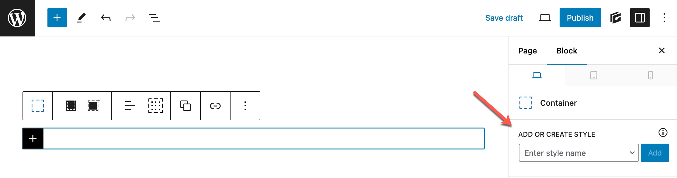
Creating a Global Style within the block like this will automatically add the new style to the selected block.
Editor Sidebar
You can also create a new Global Style by clicking on the “GenerateBlocks” logo at the top right.
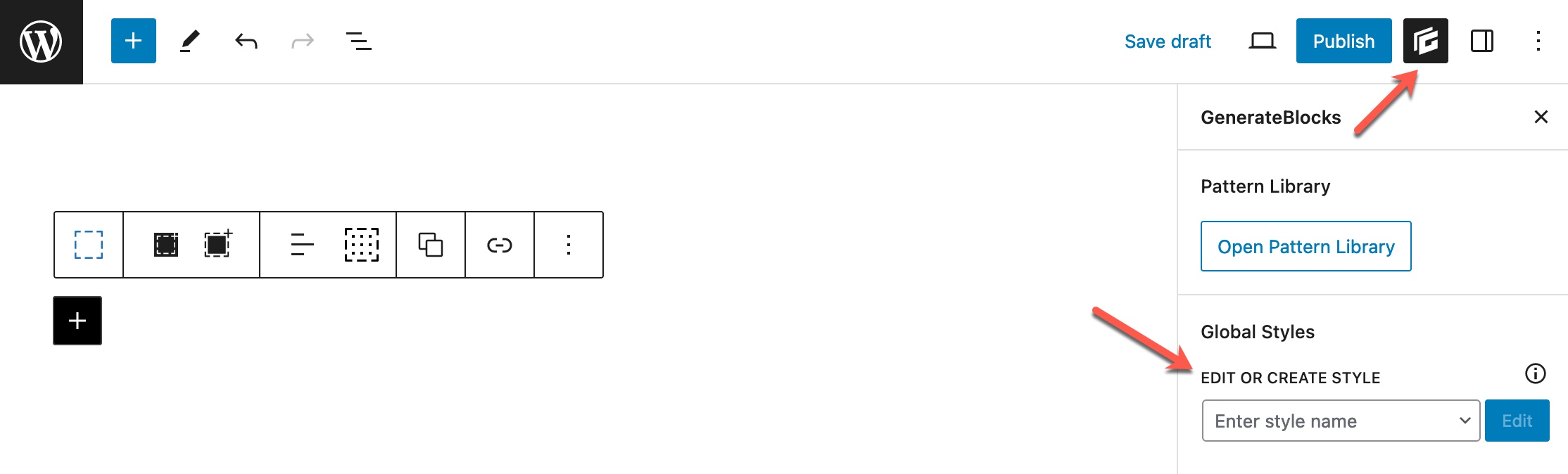
Creating the Global Style within the sidebar like this will not affect any selected blocks. You will need to manually add the newly created style to any blocks that require it.
Onboarding
Once you’ve clicked the “Create” button, you will be presented with some choices on how to create this new style.
If you do not have a block selected, or the block you do have selected has no local styles, you will be presented with two options.
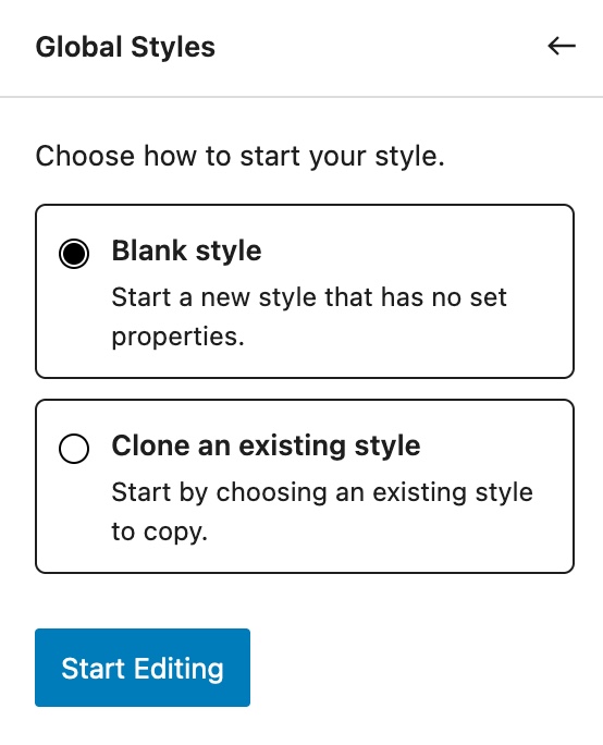
The Blank style option will create a fresh style for you that contains no CSS by default.
Clone an existing style allows you to choose from an existing style you’ve created. This will populate your new style with any CSS applied to the selected existing style.
If you have a block selected that has existing local block styles, you’ll see two additional options.
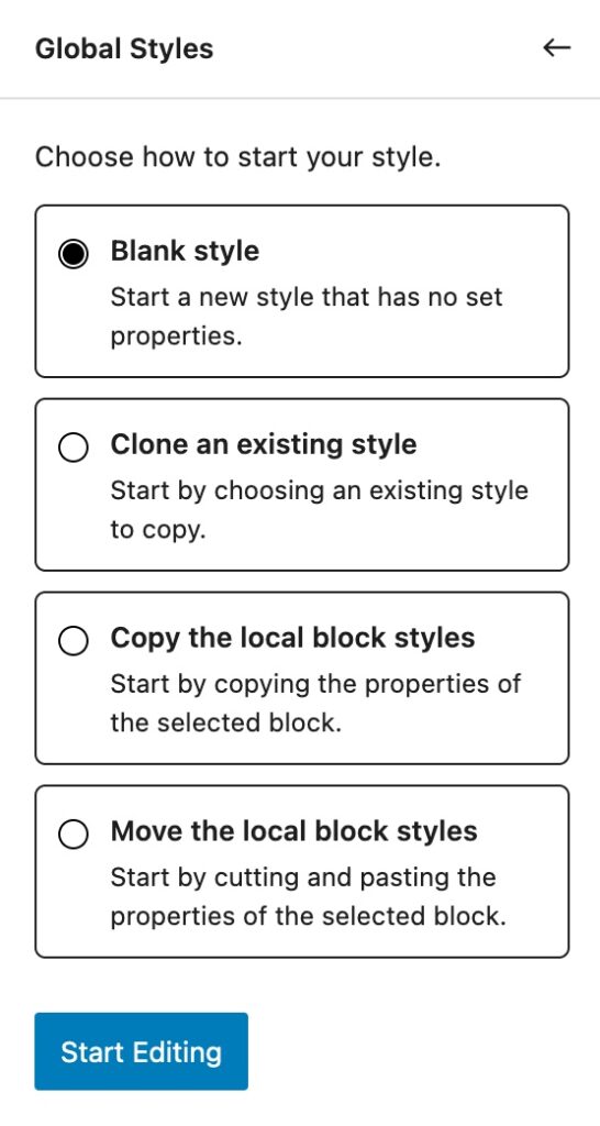
Copy the local block styles will take any local block styles and apply them to your new Global Style. Those existing local block styles will be left alone on the local block.
Move the local block styles will take any local block styles and apply them to your new Global Style. Those existing local block styles will be cleared from the local block.
Editing a Global Style
To edit an existing Global Style, you have two choices (listed below).
Find your style name in the dropdown, and simply select it to edit that style.
Block
If you’re editing a block that has the Global Style you wish to edit, you can simply click on its name to edit it.
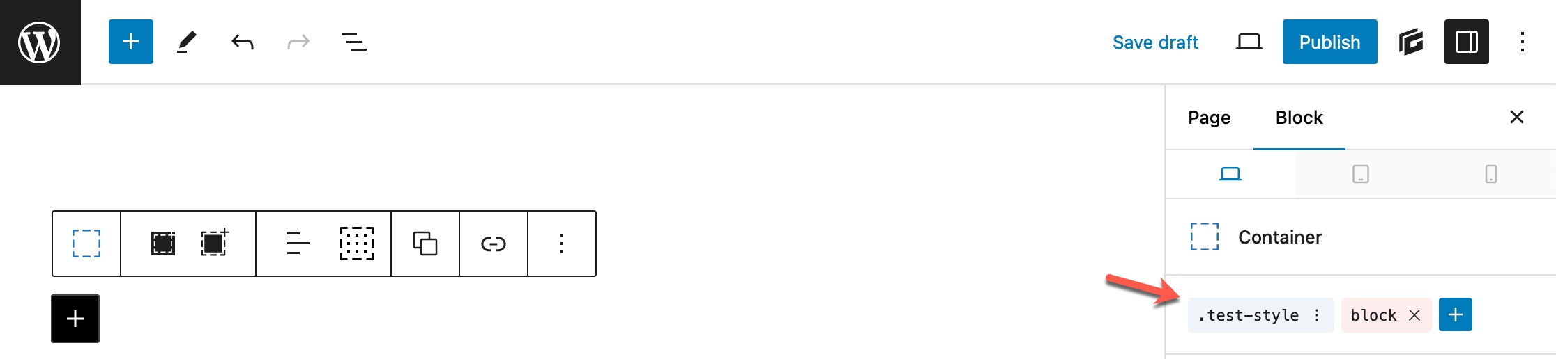
You can also click the three dots next to the name, and click “Edit”.
Editor Sidebar
If you want to edit an existing Global Style without finding the block it’s attached to, you can click on the “GenerateBlocks” logo at the top right of the editor, then find the style in the dropdown and select it.
Style Selectors
Global Styles themselves are a collection of CSS selectors.
When you create a Global Style, you’re creating a new CSS class selector, like this: .my-new-style
This is your main selector. By default, any styles you configure will be applied to this selector.
However, you can configure more selectors inside of your Global Style.
A great example of this is if you want to add styles to your element when it is hovered. This is the “Hover” selector.
By default, we expose the “Hover” selector right below your Global Style name.
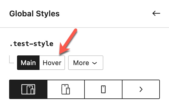
When you click this “Hover” selector, you’ll see it appended to your Global Style name.
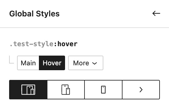
Now all of the styling you add will be applied only when the user hovers over the element this style is applied to.
We also expose a “Links” option if a Container or Headline block is selected while editing the Global Style. This will change the selector to: .test-style a
This will then apply your styling to all links inside of this Global Style.
If you have a Headline or Button block selected, and you have an icon set, you will also see an “Icon” selector you can click. This will change the selector to: .test-style .gb-icon svg
This will then apply your styling to all icons inside of this Global Style.
More Selectors
By clicking the “More” button, you open our selector builder. This is an advanced area where you can build your own custom selectors.
By default, we’ll show you some more shortcuts you can click on to start editing some popular selectors right away.
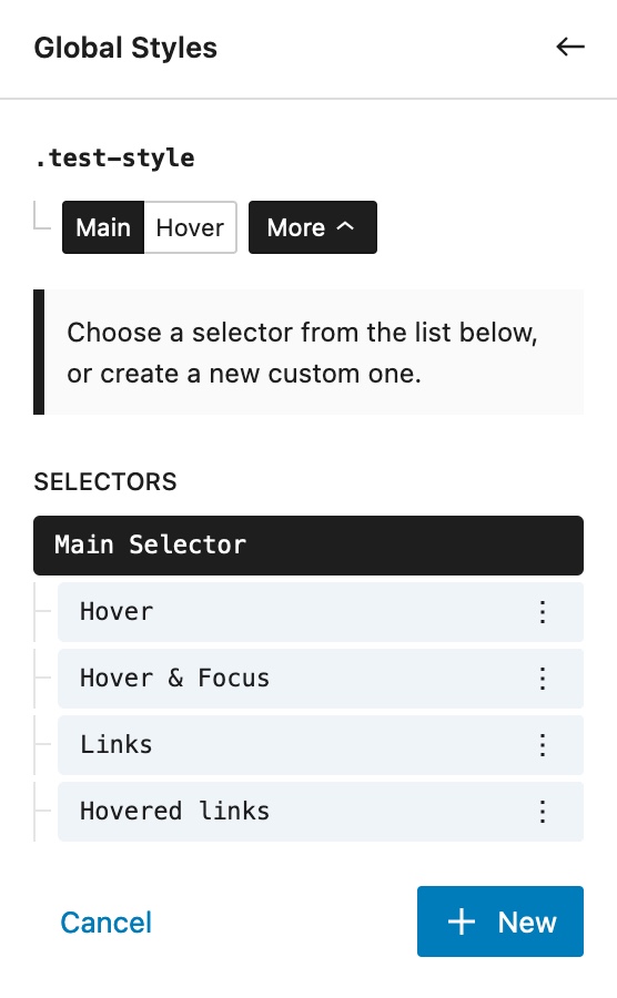
If a selector has styles applied to it, you’ll see an orange dot next to their name.
All custom selectors that you build will display in this list.
To create a new selector, click the “New” button.
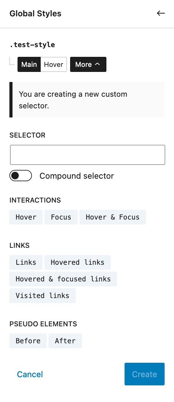
You can see here we have a text field with a “Compound selector” toggle under it.
Regular selector
Anything you type into this field will be appended to your main selector after a space. For example, if we typed h2 into this field, the result would be .test-style h2
This will target all h2 elements inside an element with this Global Style.
Compound selector
By toggling the “Compound selector” toggle, we can remove this space. Here are some examples of a compound selector:
:hover– The hover selector compounds the main selector:.test-style:hover:before– The before pseudo selector compounds the main selector:.test-style:before:hover h2– This will target allh2elements inside our Global Style when it is hovered.
When we click the “Compound selector” toggle, you’ll see our text field starts with a & character. This is so our system understands that you do not want a space to appear after the main selector.
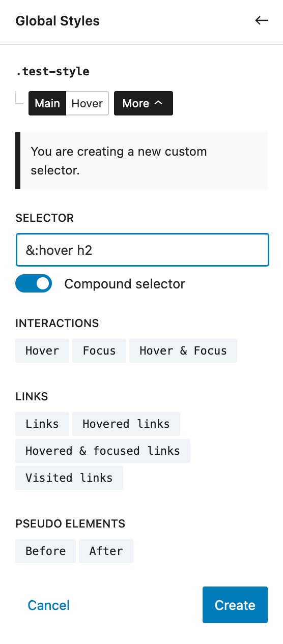
If your text field does not start with the & symbol, there will be a space between the main selector and your custom selector.
For example, if we had this in our text field: :hover h2 The resulting selector would look like this: .test-style :hover h2 (not the space after our main selector)
Migrating from Legacy Global Styles
Our new Global Styles feature (released in 1.7.0) is a complete rewrite of the existing Global Styles system. For that reason, there is no automatic way to migrate from the old system to the new system. This would require us to mass auto-replace data in your content, which we don’t like doing.
It’s important to note that legacy Global Styles are not going anywhere. You are in no rush to migrate all of them – they will continue to work as they always have.
However, if you want to move them to the new system slowly, there is a simple process.
First, navigate to your legacy Global Styles page. You can do this by going to GenerateBlocks > Global Styles.
This page is now for our new Global Style system, but if you have any legacy Global Styles, you will see a button at the top that will take you to the legacy page.

This will take you to the standard legacy Global Styles dashboard page. You can now open the legacy Global Style that you want to convert to the new system.
Once editing the legacy Global Style, you’ll see the familiar section on the right. The arrow is pointing to the current legacy Global Style name.
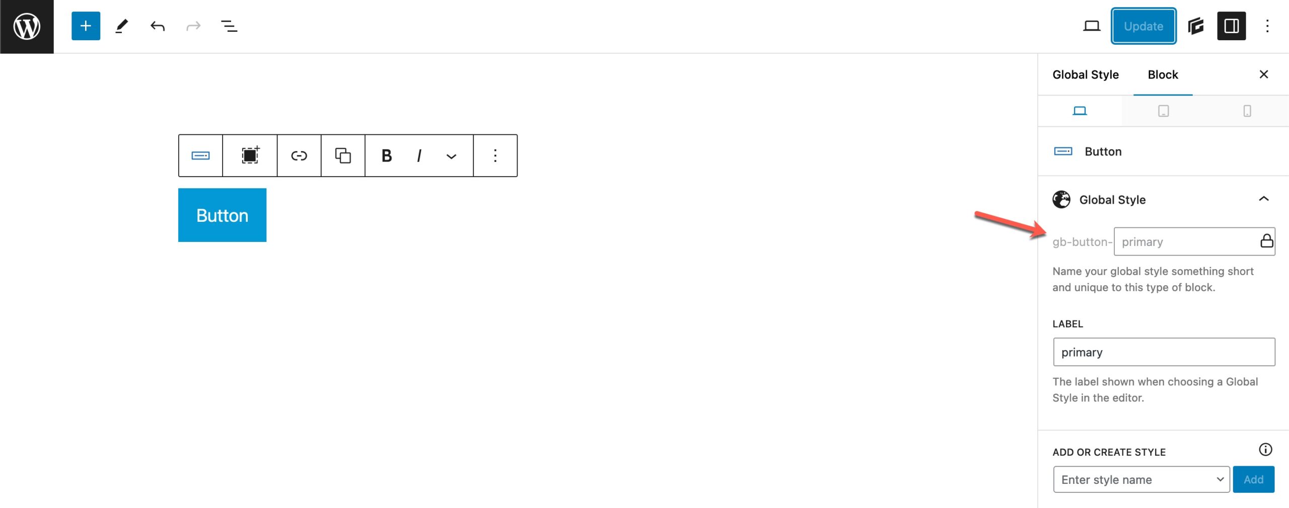
In this case, the class name that my legacy Global Style uses is: .gb-button-primary
You can keep this class name, or you can create a new one. It doesn’t matter, as you will need to manually add the new class to your existing blocks.
To create a new Global Style from this legacy Global Style, you can use the “Add or Create Style” dropdown.
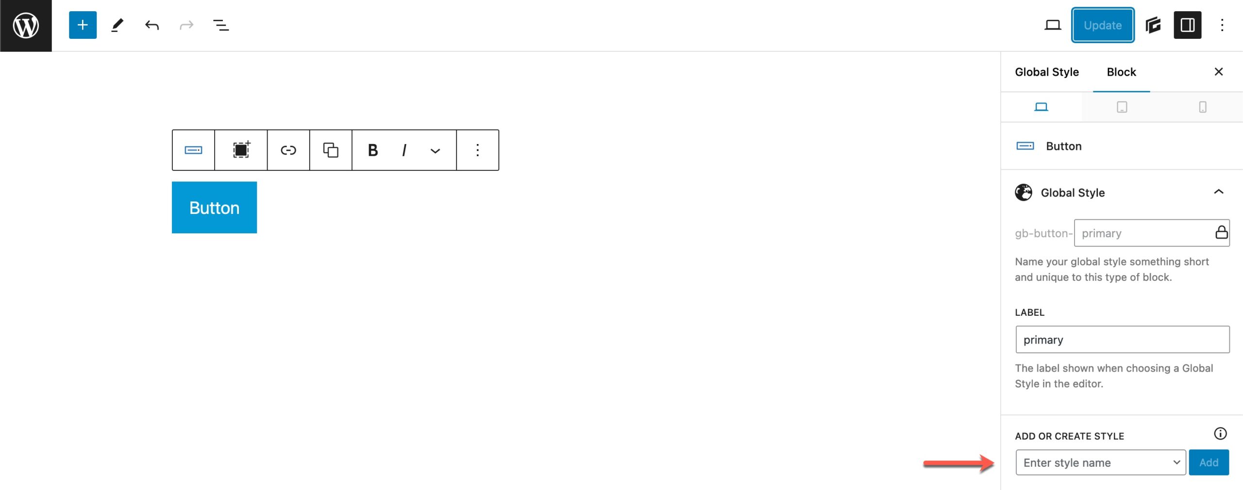
You can learn more about creating Global Styles here.
Once you’ve chosen a style name and clicked “Create”, you will be taken to the onboarder.
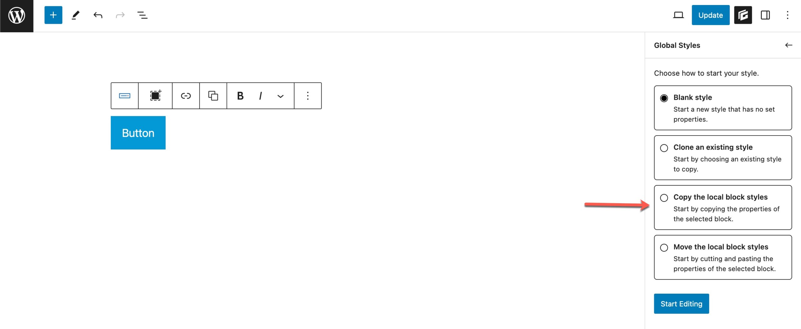
You want to choose the Copy the local block styles option. This is essential, as it will copy all of your legacy Global Styles and paste them into the new Global Style automatically.
You do not want to use the “Move” option, as your legacy Global Style needs to keep all of its styles until you’ve removed it from all existing blocks on your website.
You can now click the “Update” button at the top of the editor to save your new Global Style.
You can now begin replacing the legacy Global Style with the new Global Style in your content.
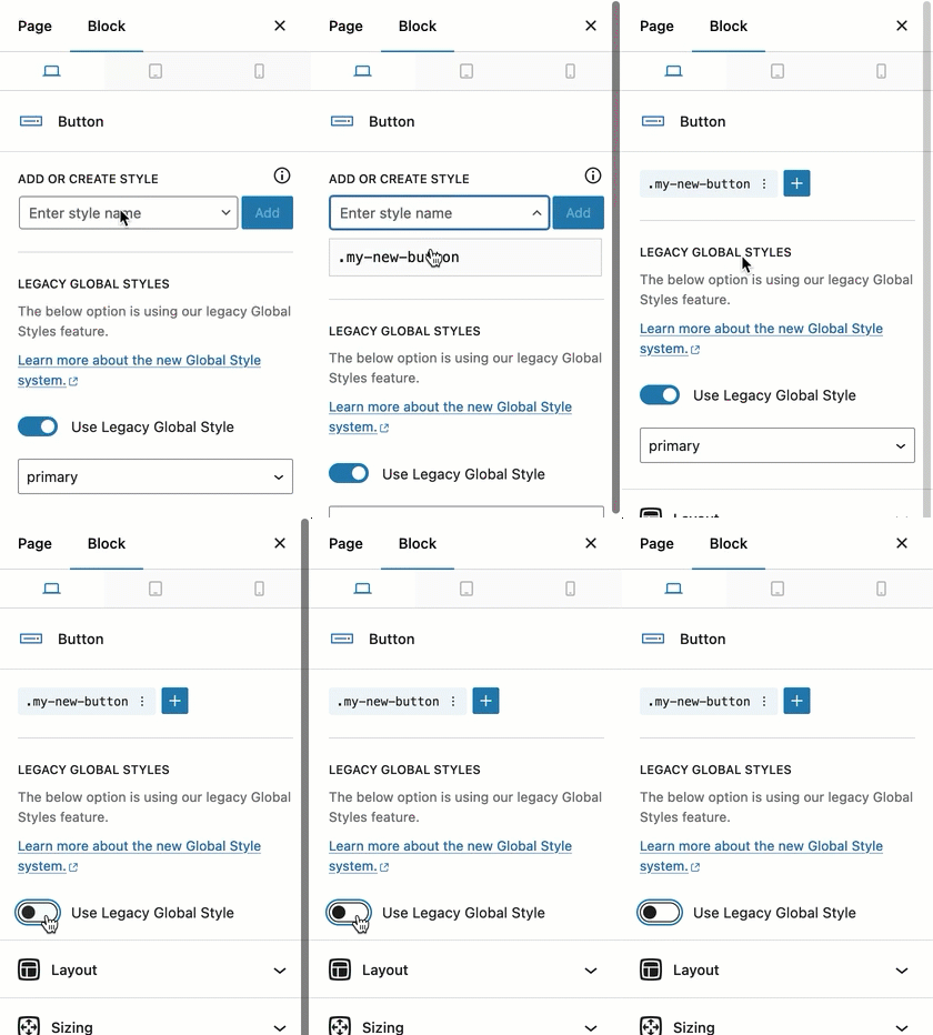
This block is now using your new Global Style.
Once you have replaced all instances of the legacy Global Style, you can safely delete it in the legacy Global Style dashboard.
Legacy Global Styles
This is a feature in our pro version only.
Global Styles are an awesome way to build re-usable styles that you can use throughout your website. This has a couple of advantages:
- It writes the CSS for the element once. For example, if you have a page with 10 containers, all with the style styles (padding, for example), the Global Style will write the CSS for that block once, and re-use it for every Container using that style. So instead of writing the same CSS 10 times, we only write it once.
- If you ever need to change a style, for example, your primary button style, you can do it in one place and have that style update throughout your entire site instantly.
Another cool thing about Global Styles is that you can still set block-specific styles in blocks that are using a Global Style.
For example, let’s say you build a primary button Global Style, but for one button on your about page you want to make the font size a little larger – you can still use the Global Style and only up the font size for this one button.
Note: Please read the Things you shouldn’t do at the end of the article to avoid unpleasant issues while using the global styles.
Adding a Global Style
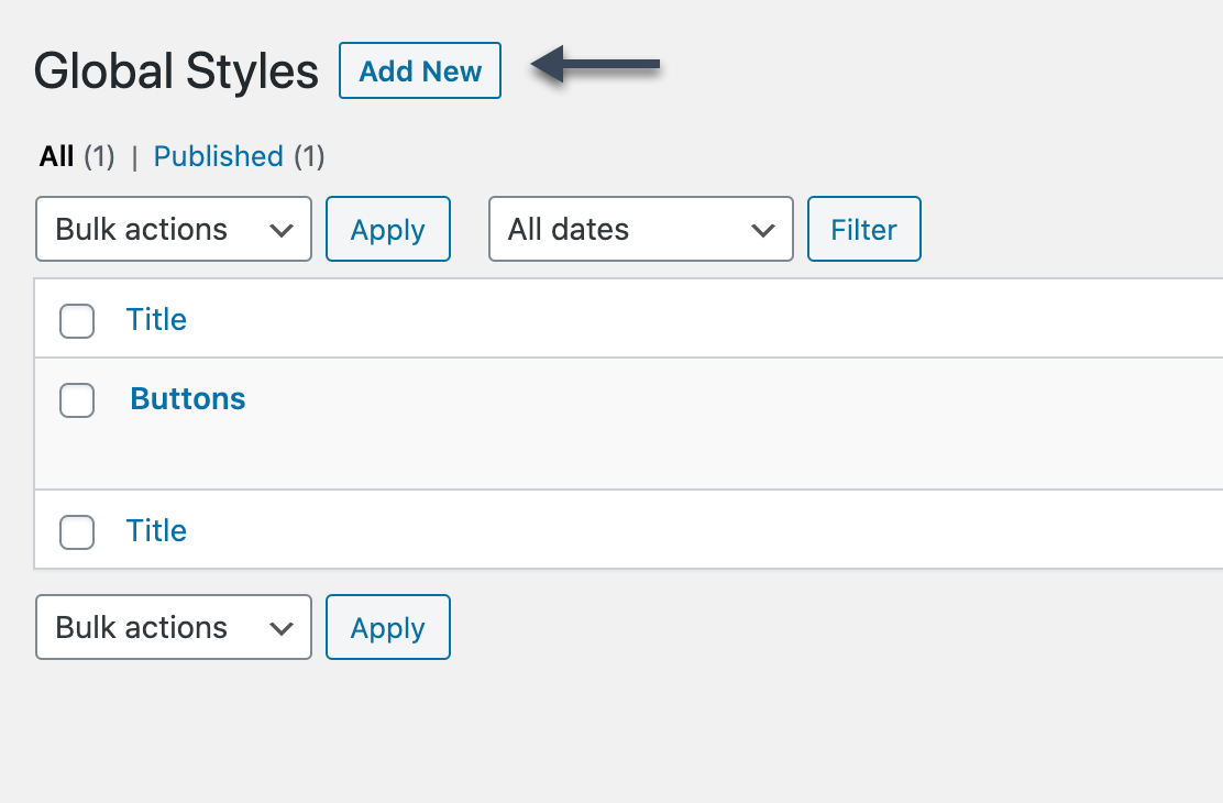
To add a new Global Style, go to GenerateBlocks > Global Styles, and click the Add New button at the top.
Now, add a GenerateBlocks block to the page, and you’ll see a Global Styles panel in the block settings.
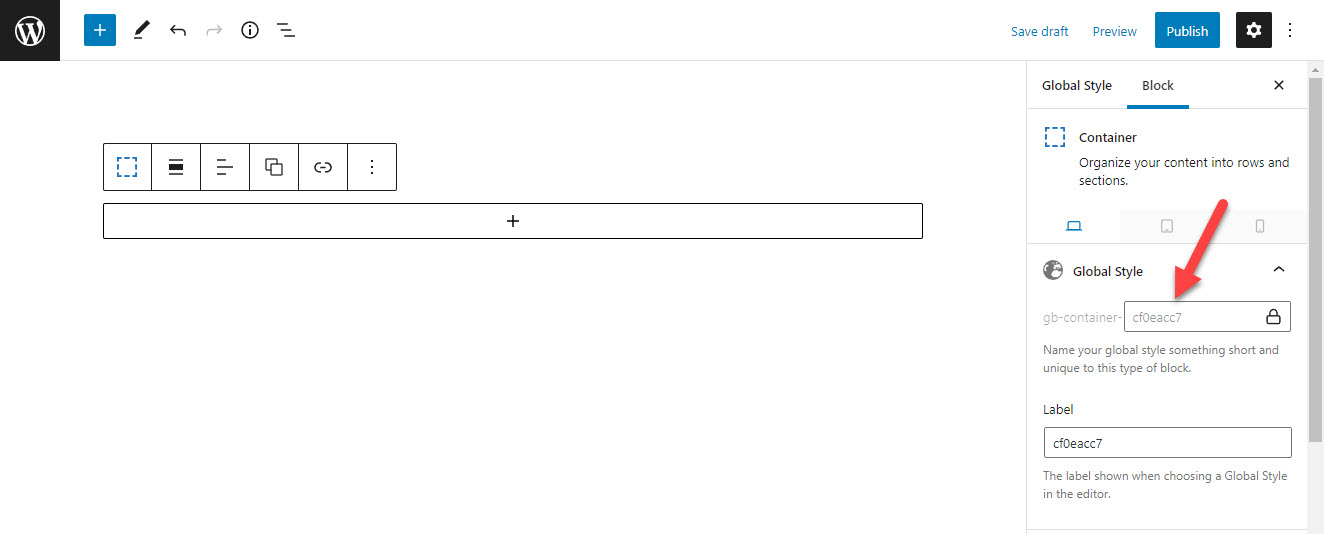
You’ll see that a unique ID is generated for this block by default. This is how all of our blocks work. What makes Global Styles unique is that you get to change the unique ID.
For this example, we’re creating a Container Global Style, which will be the main container on our website. So, I’ll rename our unique ID to something short, but descriptive, like main.
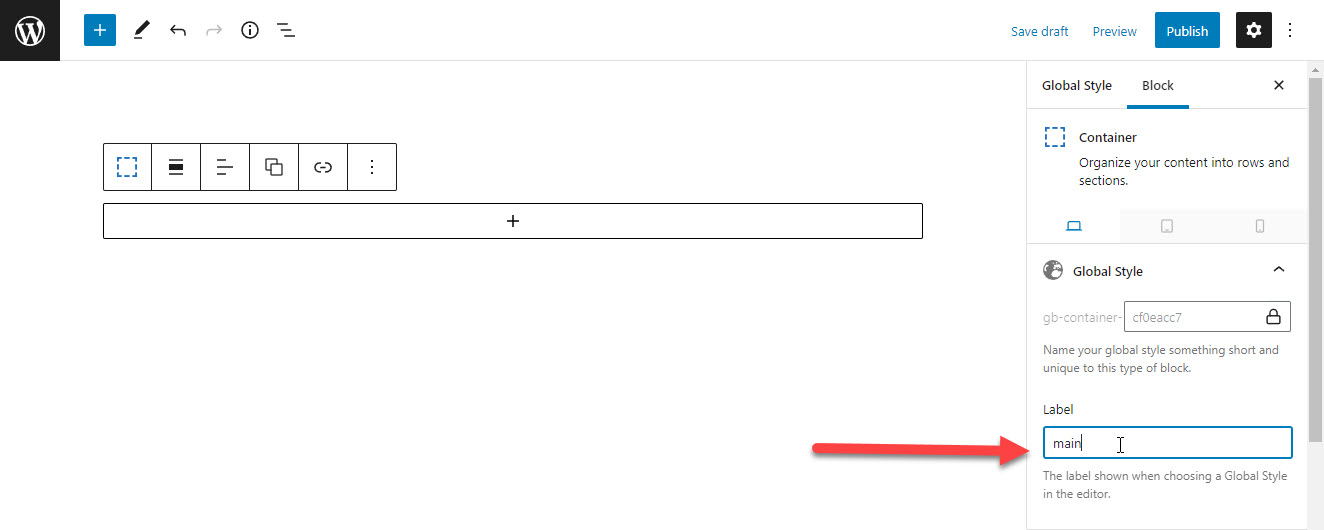
Now we can design this Container and save it.
Multiple Blocks Inside One Style
You can use this one Global Style and add multiple GenerateBlocks blocks to it without any issues. They will all be registered as Global Styles and be usable as you build your content.
The only reason you would want to create more than one Global Style post is for organizational purposes. For example, this would be a decent setup:
- Buttons – this Global Style has all of the button we’re going to use on our website.
- Containers – this Global Style has all of the containers we’re going to use on our website.
- Headlines – this Global Style has all of the headlines we’re going to use on our website.
Using a Global Style
Now that we have added a Global Style, we can use it in our content.
In our example above, we created a Container block and named it main. Now when we go into a page and add a Container block, we can choose a Global Style from the dropdown.
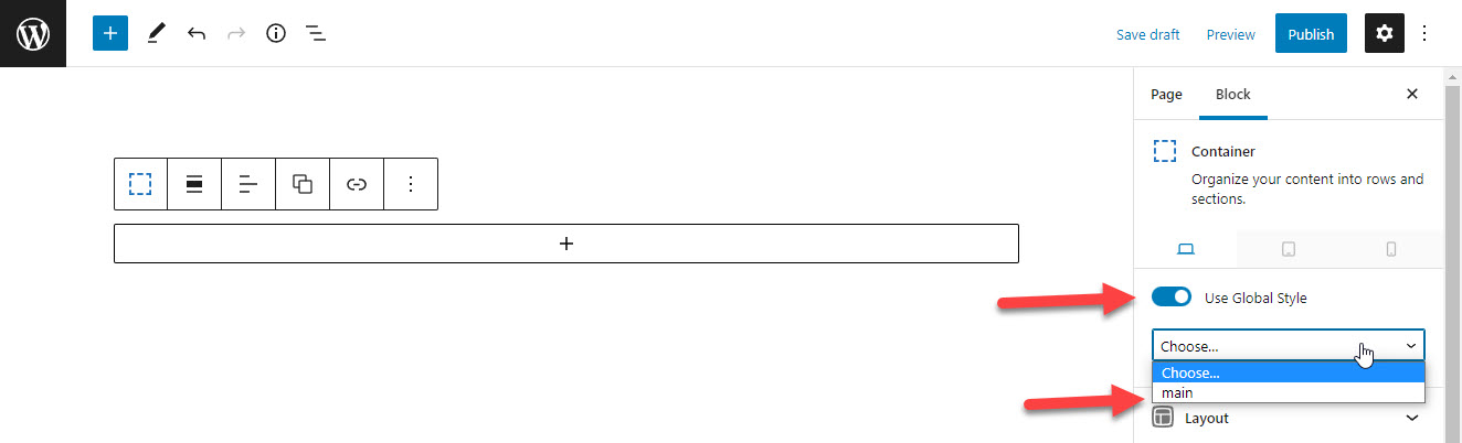
You’ll see in the screenshot above that the main Global Style is appearing in our dropdown.
If we choose this style, our block will immediately update to use the styles from that Global Style. Global Styles are grouped by block type, so only Container Global Styles will appear in the dropdown for the Container Block.
How Does It All Work?
The system we’ve developed is very simple, which we’re very proud of. Here’s how it works.
When you add a new Global Style, the content of that Global Style is saved to the database, just like a regular post.
Now when we view a page on our website, GenerateBlocks processes that saved content through our CSS generator, so CSS is built for the blocks in the Global Style, even though they aren’t actually rendering on the page.
In the example above, we named our Container Global Style main. GenerateBlocks will now generate CSS for that style like this:
.gb-container-main {
    /* CSS properties */
}
This CSS is generated on all pages that contain GenerateBlocks.
Now when we choose a Global Style for one of our blocks, it adds the above class to that block:
<div class="gb-container gb-container-main">
    ...
</div>
This applies the CSS to the block.
Global Styles do not apply to content, including things like icons and shapes. They only apply to the CSS generated by the blocks.
Things You Shouldn’t Do
There are a couple of things you should avoid with this system.
- Don’t copy blocks from Global Styles and paste them into a page or post. This will bring along their attributes, and that page will now generate CSS for that individual block. Remember, this system works by using CSS that’s already been generated – the blocks on your page should have no settings at all (unless you want to customize it individually).
- Don’t bloat your Global Styles. Try to keep things simple – every GenerateBlocks block inside a Global Style will generate CSS on your pages, so “Draft” un-used Global Styles in a single Global Style entry if needed.