These options require GenerateBlocks 1.7.
The layout options are the fundamentals of how the block is displayed.
Note that these options are available for Container, Headline and Button block. The Grid block has its own Layout options.
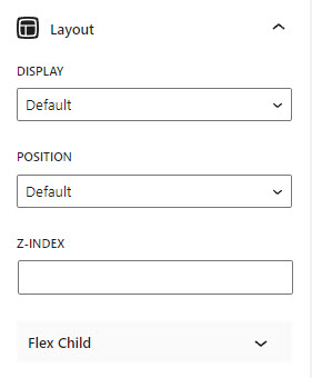
Display
The display property specifies the display behavior (the type of rendering box) of an element.
Default
the default display property value is taken from the HTML specifications or from the browser/user default style sheet. The default value in XML is inline, including SVG elements.
Block
Displays an element as a block. It starts on a new line, and takes up the whole width.
Inline Block
Displays an element as an inline-level block container. The element itself is formatted as an inline element, but you can apply height and width values.
Flex
Displays an element as a block-level flex container. See details here.
The flex-direction property specifies the direction of the flexible items.
Row: Default value. The flexible items are displayed horizontally, as a row.
Row + ⬅ (reverse): Same as row, but in reverse order.
Column: The flexible items are displayed vertically, as a column.
Column + ⬆ (reverse): Same as column, but in reverse order.
The align-items property specifies the default alignment for items inside a flexbox or grid container.
flex-start: Items are positioned at the beginning of the container.
center: Items are positioned at the center of the container.
flex-end: Items are positioned at the end of the container.
stretch: Items are stretched to fit the container.
baseline: Items are positioned at the baseline of the container.
The justify-content property aligns the flexible container’s items when the items do not use all available space on the main-axis (horizontally).
flex-start: Default value. Items are positioned at the beginning of the container.
center: Items are positioned at the center of the container.
flex-end: Items are positioned at the end of the container.
space-between: Items will have space between them.
space-around: Items will have space before, between, and after them.
The flex-wrap property specifies whether the flexible items should wrap or not.
No Wrap: Default value. Specifies that the flexible items will not wrap.
Wrap: Specifies that the flexible items will wrap if necessary.
Reverse Wrap: Specifies that the flexible items will wrap, if necessary, in reverse order.
Column Gap: Specifies the gap between the columns in flexbox.
Row Gap: Specifies the gap between the rows in flexbox.
Inline flex
Displays an element as an inline-level flex container.
The flex-direction property specifies the direction of the flexible items.
Row: Default value. The flexible items are displayed horizontally, as a row.
Row + ⬅ (reverse): Same as row, but in reverse order.
Column: The flexible items are displayed vertically, as a column.
Column + ⬆ (reverse): Same as column, but in reverse order.
The align-items property specifies the default alignment for items inside a flexbox or grid container.
Start: Items are positioned at the beginning of the container.
Center: Items are positioned at the center of the container.
End: Items are positioned at the end of the container.
Stretch: Items are stretched to fit the container.
Baseline: Items are positioned at the baseline of the container.
The justify-content property aligns the flexible container’s items when the items do not use all available space on the main-axis (horizontally).
Start: Default value. Items are positioned at the beginning of the container.
Center: Items are positioned at the center of the container.
End: Items are positioned at the end of the container.
Space Between: Items will have space between them.
Space Around: Items will have space before, between, and after them.
The flex-wrap property specifies whether the flexible items should wrap or not.
No Wrap: Default value. Specifies that the flexible items will not wrap.
Wrap: Specifies that the flexible items will wrap if necessary.
Reverse Wrap: Specifies that the flexible items will wrap, if necessary, in reverse order.
Column Gap: Specifies the gap between the columns in flexbox.
Row Gap: Specifies the gap between the rows in flexbox.
Inline
Displays an element as an inline element (like ). Any height and width properties will have no effect.
Position
The position property specifies the type of positioning method used for an element.
Default: Does not specify a value to the position property.
Relative: The element is positioned relative to its normal position.
Overflow-X/Overflow-Y
The overflow property specifies what should happen if content overflows an element’s box. It only works for elements with a specified height/width.
Default: Does not specify a value to the overflow property.
Visible: Default value. The content is not clipped, and it may be rendered outside the left and right edges.
Hidden: The content is clipped and no scrolling mechanism is provided.
Scroll: The content is clipped and a scrolling mechanism is provided.
Auto: Should cause a scrolling mechanism to be provided for overflowing boxes.
Z-Index
The z-index property specifies the stack order of an element.
Flex Child
Flex
The flex property sets the flexible length on flexible items.
Grow: The flex-grow property specifies how much the item will grow relative to the rest of the flexible items.
Shrink: The flex-shrink property specifies how much the item will shrink relative to the rest of the flexible items. Check out the demo here.
Basis: The flex-basis property specifies the length of the item. Legal values: auto, inherit, or a number followed by %, px, em or any other length unit. Check out the demo here.
Order
The order property specifies the order of a flexible item relative to the rest of the flexible items inside the same container.
Visit MDN Web Docs, W3Schools, and CSS-TRICKS to learn more about the options.
Flexbox Alignment Matrix
This option is available in the Container block’s floating toolbar, it provides a quick flexbox alignment and helps users to create layout more efficiently. It is a shortcut for the display and flexbox alignment options available in the Layout Panel.
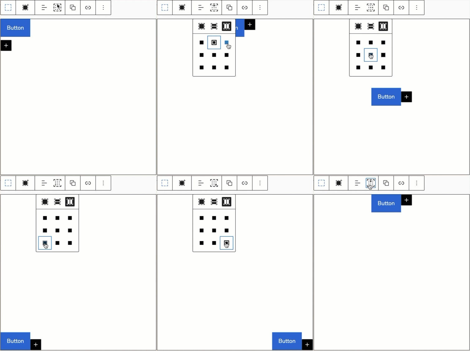
Default Display
This is the default state of a Container block’s display setting.
Vertical Flexbox Display
This option is a shortcut to set the below settings in the Layout Panel.
- display:flex;
- flex-direction: row;
All the blocks within this Container will be displayed in rows.
Horizontal Flexbox Display
This option is a shortcut to set the below settings in the Layout Panel.
- display:flex;
- flex-direction: column;
All the blocks within this Container will be displayed in columns.
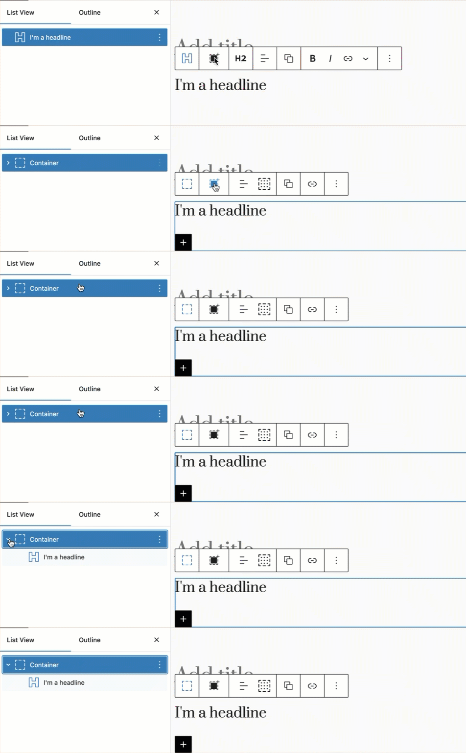
Add To Container
This option allows you to quickly wrap a Container outside the selected block.
Add to Container
Add to Row & Add to Stack
When multiple same blocks are selected by pressing the Shift button on your keyboard, you will also see the Add to Row and the Add to Stack options.
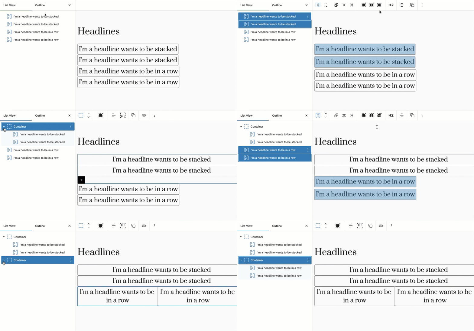
These two options are the shortcuts to set the Add to Row wrapping container to be:
- display: flex;
- flex-direction: row;
And the Add to Stack wrapping container to be:
- display: flex;
- flex-direction: column;