This is a feature in our pro version only.
The Accordion block can be used to create an accordion-style display of collapsible content. An accordion allows users to toggle between hiding and showing content. Each accordion content is a section that can be expanded or collapsed by clicking the accordion title. The Accordion block can be useful for organizing content and making it easier to navigate.
Click on the accordion title to expand the associated accordion content.
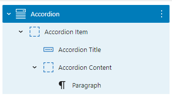
A default Accordion block is built with an Accordion Item (Container) block, an Accordion Title (Button) block, an Accordion Content (Container) block, and a paragraph block:
Adding an Accordion Item
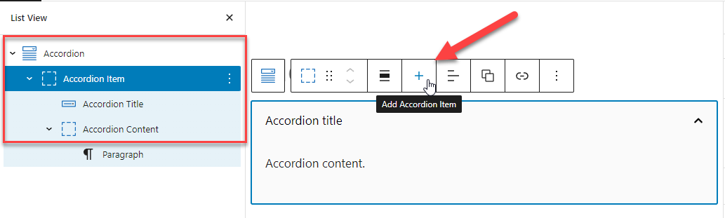
To add more Accordion Items in an Accordion, simply click the + icon in the toolbar when selecting any of the Accordion components:
Block Settings – Accordion
The Accordion Block Settings allow you to set certain attributes and styles to the accordions.
Keep Multiple Items Open
By default, when you click open one accordion item, the other accordion items collapse:
The Keep Multiple Items Open option allows you to keep multiple accordion items open at the same time.
Sync Accordion Item Styles
When this option is toggled, the style changes made to one of the accordion items/accordion titles/accordion contents will be synced to all accordion items/accordion titles/accordion contents. This option helps you work more efficiently.
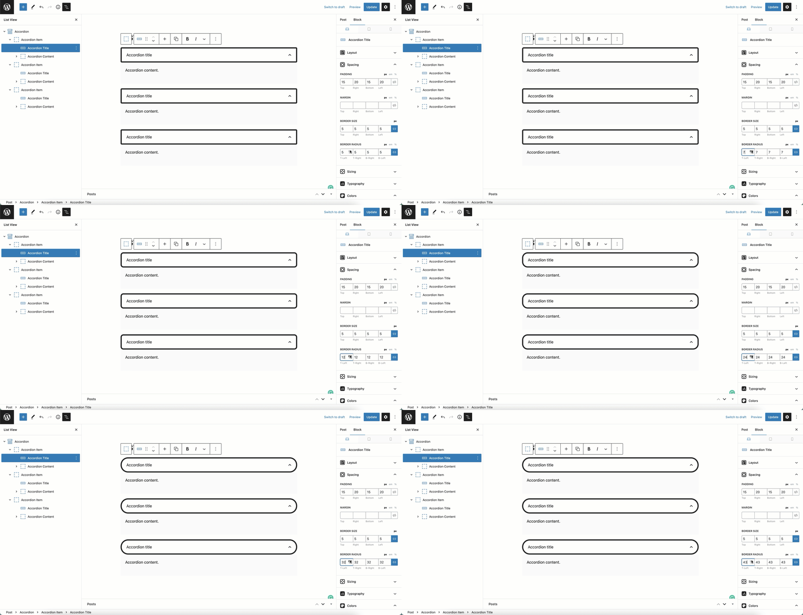
Un-toggle the option if you want to add a unique style to individual accordion items/accordion titles/accordion contents.
Transition
This option allows you to add a transition effect when expand/collapse accordion items.
Accordion Title Type
You can choose the accordion title to be either a simple Button or a Container with more advanced layout and style.
Block Settings – Accordion Item
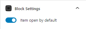
The Accordion Item Block Settings allow you to set an Item open by default. For example, Accordion 1 is set to open by default:
Adding HTML Anchors for Accordion
This is a feature in our pro version only.
By setting HTML anchors within GenerateBlocks accordion, you can provide users with convenient navigation within the accordion block. Once the anchors are in place, you can create links that will take users directly to specific accordion items, and the accordion block will automatically open the corresponding accordion content for them.
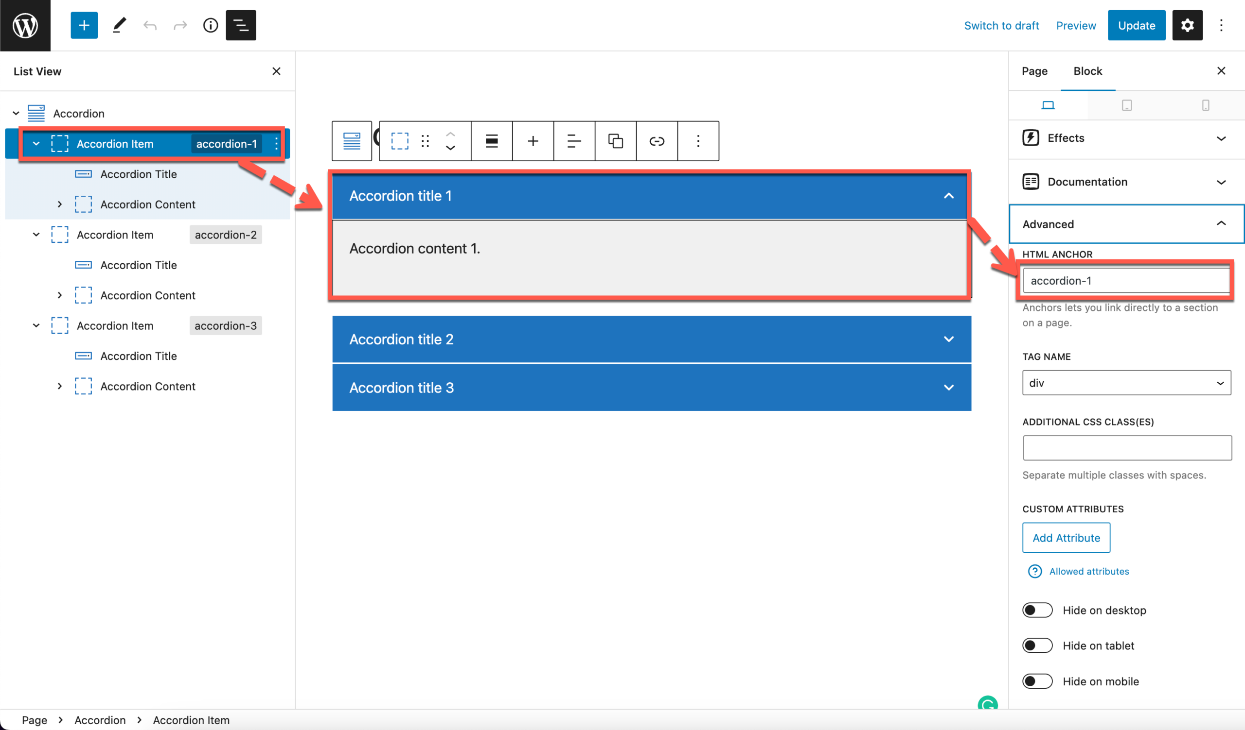
1. Add the anchors to the Accordion Item container
Add HTML anchors to all accordion item containers via the Advanced panel > HTML Anchor.
2. Add the anchors to links
After adding the HTML anchors, you can include the anchor in the page link by appending # followed by the anchor name.
For example, if the page link is your-domain.com/page-1, and the anchor name is accordion-1, the complete link with anchor would be your-domain.com/page-1/#accordion-1.
Examples
Check the below links with anchor:
Using Custom Icons for Accordion
1. Get the Icons
For this demonstration, we will use the two Bootstrap icons below:
Check out the Using Custom SVG Icons video for more information.
2. Add a Custom Class to Icon SVG HTML
Initial State Icon
For the icon that appears in the initial state, we need to add a gb-accordion__icon class to it.
For example, the original SVG HTML of the Emoji smile fill is as follows:
<svg xmlns="http://www.w3.org/2000/svg" width="16" height="16" fill="currentColor" class="bi bi-emoji-smile-fill" viewBox="0 0 16 16">
  <path d="M8 16A8 8 0 1 0 8 0a8 8 0 0 0 0 16zM7 6.5C7 7.328 6.552 8 6 8s-1-.672-1-1.5S5.448 5 6 5s1 .672 1 1.5zM4.285 9.567a.5.5 0 0 1 .683.183A3.498 3.498 0 0 0 8 11.5a3.498 3.498 0 0 0 3.032-1.75.5.5 0 1 1 .866.5A4.498 4.498 0 0 1 8 12.5a4.498 4.498 0 0 1-3.898-2.25.5.5 0 0 1 .183-.683zM10 8c-.552 0-1-.672-1-1.5S9.448 5 10 5s1 .672 1 1.5S10.552 8 10 8z"/>
</svg>
Since this SVG HTML already has a class attribute included, we can simply add the gb-accordion__icon to the class list as below:
<svg xmlns="http://www.w3.org/2000/svg" width="16" height="16" fill="currentColor" class="bi bi-emoji-smile-fill gb-accordion__icon" viewBox="0 0 16 16">
  <path d="M8 16A8 8 0 1 0 8 0a8 8 0 0 0 0 16zM7 6.5C7 7.328 6.552 8 6 8s-1-.672-1-1.5S5.448 5 6 5s1 .672 1 1.5zM4.285 9.567a.5.5 0 0 1 .683.183A3.498 3.498 0 0 0 8 11.5a3.498 3.498 0 0 0 3.032-1.75.5.5 0 1 1 .866.5A4.498 4.498 0 0 1 8 12.5a4.498 4.498 0 0 1-3.898-2.25.5.5 0 0 1 .183-.683zM10 8c-.552 0-1-.672-1-1.5S9.448 5 10 5s1 .672 1 1.5S10.552 8 10 8z"/>
</svg>
Open State Icon
For the icon that appears in the open state, we need to add a gb-accordion__icon-open class to it.
For example, the original SVG HTML of the Emoji frown fill is as follows:
<svg xmlns="http://www.w3.org/2000/svg" width="16" height="16" fill="currentColor" class="bi bi-emoji-frown-fill" viewBox="0 0 16 16">
  <path d="M8 16A8 8 0 1 0 8 0a8 8 0 0 0 0 16zM7 6.5C7 7.328 6.552 8 6 8s-1-.672-1-1.5S5.448 5 6 5s1 .672 1 1.5zm-2.715 5.933a.5.5 0 0 1-.183-.683A4.498 4.498 0 0 1 8 9.5a4.5 4.5 0 0 1 3.898 2.25.5.5 0 0 1-.866.5A3.498 3.498 0 0 0 8 10.5a3.498 3.498 0 0 0-3.032 1.75.5.5 0 0 1-.683.183zM10 8c-.552 0-1-.672-1-1.5S9.448 5 10 5s1 .672 1 1.5S10.552 8 10 8z"/>
</svg>
Since this SVG HTML already has a class attribute included, we can simply add the gb-accordion__icon-open to the class list as below:
<svg xmlns="http://www.w3.org/2000/svg" width="16" height="16" fill="currentColor" class="bi bi-emoji-frown-fill gb-accordion__icon-open" viewBox="0 0 16 16">
  <path d="M8 16A8 8 0 1 0 8 0a8 8 0 0 0 0 16zM7 6.5C7 7.328 6.552 8 6 8s-1-.672-1-1.5S5.448 5 6 5s1 .672 1 1.5zm-2.715 5.933a.5.5 0 0 1-.183-.683A4.498 4.498 0 0 1 8 9.5a4.5 4.5 0 0 1 3.898 2.25.5.5 0 0 1-.866.5A3.498 3.498 0 0 0 8 10.5a3.498 3.498 0 0 0-3.032 1.75.5.5 0 0 1-.683.183zM10 8c-.552 0-1-.672-1-1.5S9.448 5 10 5s1 .672 1 1.5S10.552 8 10 8z"/>
</svg>
3. Combine the Icon SVG HTML
Since there is only one Icon SVG HTML field, we need to combine the SVG HTML of the two icons and make sure the initial state icon is at the front:
<svg xmlns="http://www.w3.org/2000/svg" width="16" height="16" fill="currentColor" class="bi bi-emoji-smile-fill gb-accordion__icon" viewBox="0 0 16 16">
  <path d="M8 16A8 8 0 1 0 8 0a8 8 0 0 0 0 16zM7 6.5C7 7.328 6.552 8 6 8s-1-.672-1-1.5S5.448 5 6 5s1 .672 1 1.5zM4.285 9.567a.5.5 0 0 1 .683.183A3.498 3.498 0 0 0 8 11.5a3.498 3.498 0 0 0 3.032-1.75.5.5 0 1 1 .866.5A4.498 4.498 0 0 1 8 12.5a4.498 4.498 0 0 1-3.898-2.25.5.5 0 0 1 .183-.683zM10 8c-.552 0-1-.672-1-1.5S9.448 5 10 5s1 .672 1 1.5S10.552 8 10 8z"/>
</svg>
<svg xmlns="http://www.w3.org/2000/svg" width="16" height="16" fill="currentColor" class="bi bi-emoji-frown-fill gb-accordion__icon-open" viewBox="0 0 16 16">
  <path d="M8 16A8 8 0 1 0 8 0a8 8 0 0 0 0 16zM7 6.5C7 7.328 6.552 8 6 8s-1-.672-1-1.5S5.448 5 6 5s1 .672 1 1.5zm-2.715 5.933a.5.5 0 0 1-.183-.683A4.498 4.498 0 0 1 8 9.5a4.5 4.5 0 0 1 3.898 2.25.5.5 0 0 1-.866.5A3.498 3.498 0 0 0 8 10.5a3.498 3.498 0 0 0-3.032 1.75.5.5 0 0 1-.683.183zM10 8c-.552 0-1-.672-1-1.5S9.448 5 10 5s1 .672 1 1.5S10.552 8 10 8z"/>
</svg>
4. Insert the Icon SVG HTML
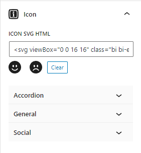
Copy the combined SVG HTML code from step 3 and paste it in the Icon SVG HTML field.