The Backgrounds options allow you to set up an image or a gradient as the background of a Container block or a Button block.
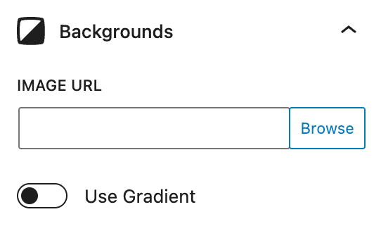
Image
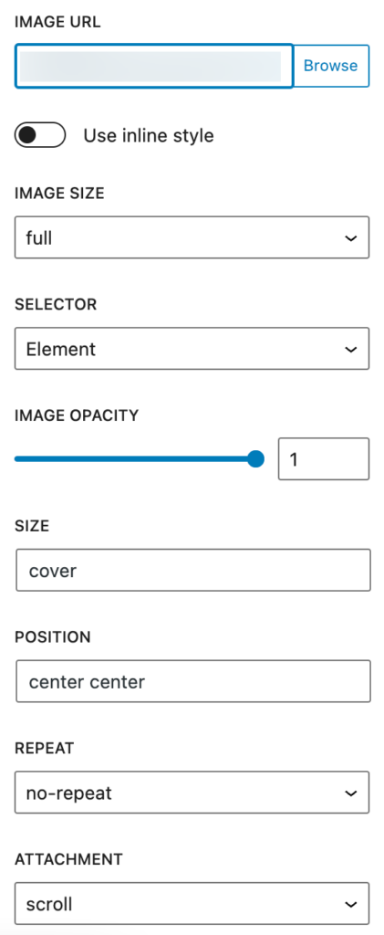
Image URL
This option uses the background-image CSS property.
Enter the image URL directly into the field, or click the Browse button to choose an image from your site’s media library.
use inline style
When this option is enabled, the background CSS will be added as an inline style into the element’s HTML.
image size
This option allows you to choose a specific size for the background image from all the responsive images generated by WordPress.
Selector
This option enables you to either apply a background image directly to the block or to a pseudo-element associated with the block.
The pseudo-element option enables opacity which allows you to add transparency to the background image.
Note: When the pseudo-element option is selected, the image will sit on top of the content within this Container block unless the content itself is set to position:relative or is nested inside a Container block which is set to position:relative.
Image opacity
Setting pseudo-element as the selector enables the opacity option which specifies the opacity/transparency of the background image.
The opacity property can take a value from 0 – 1. The lower the value, the more transparent.
Size
This option uses the background-size CSS property to specify the size of the background images.
There are three syntax options for this option:
- Keyword:
auto,cover, andcontain. - One-value: sets the width of the image and height becomes auto.
- Two-value: the 1st value is the width, and the 2nd is the height.
position
Background position sets the initial position for each background image. A position defines an x/y coordinate, to place the background image relative to the edges of the element. It can be defined using left/right/top/bottom or number values.
repeat
This option sets if/how a background image will be repeated.
Attachment
This option sets whether a background image’s position is fixed within the viewport, or scrolls with its containing block.
Gradient
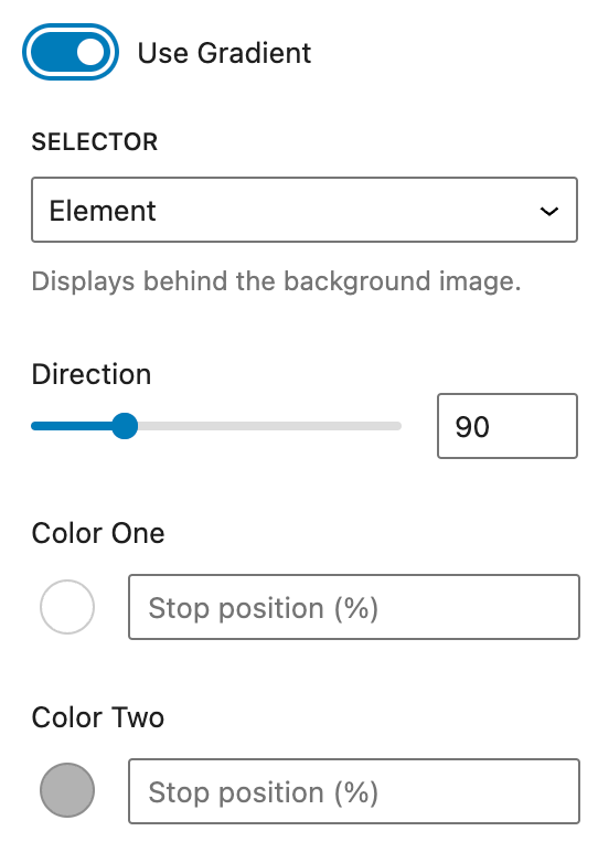
Use Gradient
Toggling this option adds a Gradient to the background. The linear-gradient() function is used to create a linear gradient background for an element.
selector
This option enables you to either apply a background gradient directly to the block or to a pseudo-element associated with the block.
Note: When the pseudo-element option is selected, the gradient will sit on top of the content within this Container block unless the content itself is set to position:relative or is nested inside a Container block which is set to position:relative.
Direction
You can specify an angle as the color direction.
For example, you can use 45(deg) to specify a gradient that goes from the bottom left to the top right at a 45 degree angle.
color
Each color stop is a combination of a color and a stop position. The color is the color value that you want to use for the stop.
You can pick 2 colors in this feature to create a background gradient.
Stop Position (%)
Each color stop is a combination of a color and a stop position. The stop position is the position along the gradient line where the color stop should be placed.
You can specify the stop position using a percentage value. A percentage value specifies the position as a percentage of the gradient line length, where 0% is at the start of the gradient line and 100% is at the end.
Advanced Backgrounds
This is a feature in our pro version only.
Advanced Backgrounds are similar to our Effects feature, but they handle background images and gradients for the Container block.
There are a couple of benefits to using Advanced Backgrounds over the standard background image/gradient features.
- You can define different background images/gradients for different devices.
- You can define them for normal or hover states.
- You can add multiple background images/gradients to the same element if they have different targets (Self and Pseudo Element).
When one of these features are needed, you can turn on the Advanced Backgrounds feature in the “Backgrounds” panel of the Container block.
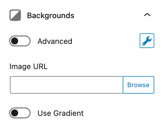
To configure your Advanced Backgrounds, click the wrench icon. Please note that just like our Effects feature, you can configure your Advanced Backgrounds without actually turning them on. To turn them on, toggle the option next to the “Advanced” text.
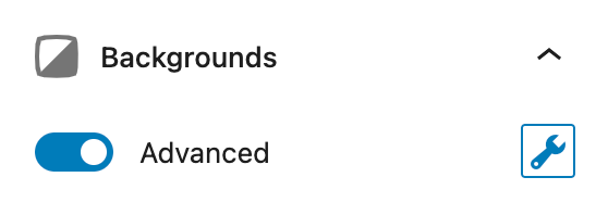
Now when we click the wrench icon, you’ll see a panel like this.
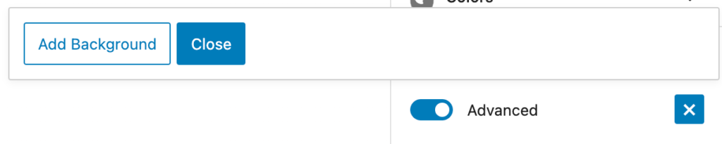
The “Close” button will close the popover and retain any changes we’ve made.
If we click the “Add Background” button, it will add a new background to the Container and allow us to configure it.
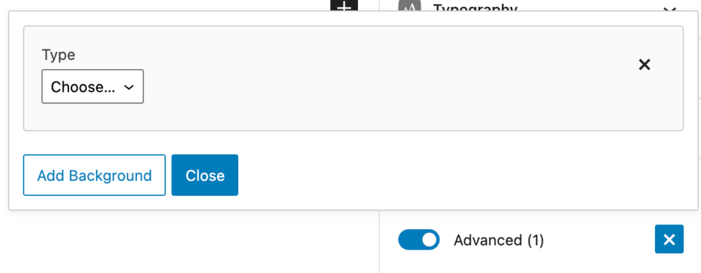
Now we can choose between an Image or Gradient background type. First, let’s go over a few options that are the same between both types.
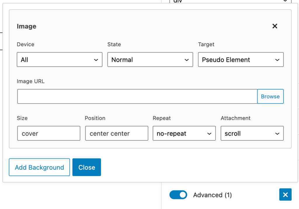
Device
The Device option allows us to define which device this background type is for. We can choose between:
- All
- Desktop
- Tablet
- Tablet + Mobile
- Mobile
State
The state refers to whether the block is static (Normal), meaning no interaction, or whether it’s hovered (you mouse over it).
- Normal – apply to the block as it is on the page with no interaction
- Hover – apply to the block when the current block is hovered
Target
Here we can choose between two targets.
Self
This applies the background to the Container element itself. This is standard, but it doesn’t allow for effects or transitions to be applied to the background.
Pseudo Element
This adds the background as its own element inside the Container. The image type is set to the :before pseudo selector, and the gradient type is set to the :after pseudo selector.
The main benefit of this option is that is allows effects and transitions to apply to the background. Imagine adding a background image, then add an effect to the background image that makes it completely opaque, then displays it fully on hover with a nice transition. This is where you’ll want to use the Pseudo Element option.
Adding Multiple Backgrounds
This option, like the Effects feature, allows us to add an unlimited number of backgrounds. However, we need to be careful that our backgrounds don’t clash with each other.
The first thing to be aware of is the three options we just went over. For example, if we add a background type with these values:
- Device: All
- State: Normal
- Target: Self
We can not add another background type with the same three values. When we add a different background type, we need to ensure that one of these three values is different than the other ones.
Also worth noting is that CSS uses the same property (background-image) for background images and gradients, so you can’t have an image type and gradient type applied to the same target if the other two values match as well.
Background Image
The image background type has basically the same options as our default background image features for the Container block. The only difference is that it doesn’t have an Opacity feature, as you should use the Opacity & Blend feature in the Effects panel instead (it’s way better!).
Image URL
Upload a background image for the container. Click the Browse button to choose an image from the media library. Alternatively, you can add a custom URL to the input.
Image Size
If you’re using an image from your Media Library, you can choose an image size from the available list of sizes.
Size
The size option refers to the background-size property.
Further reading: <https://developer.mozilla.org/en-US/docs/Web/CSS/background-size>
Position
The position option refers to the background-position property.
Further reading: <https://developer.mozilla.org/en-US/docs/Web/CSS/background-position>
Repeat
The repeat option refers to the background-repeat property.
Further reading: <https://developer.mozilla.org/en-US/docs/Web/CSS/background-repeat>
Attachment
The attachment option refers to the background-attachment property.
Further reading: <https://developer.mozilla.org/en-US/docs/Web/CSS/background-attachment>
Background Gradient
The background gradient has the same options as our standard Gradient option.
This option uses the linear-gradient background-image property. You can learn more about it here: <https://developer.mozilla.org/en-US/docs/Web/CSS/linear-gradient()>
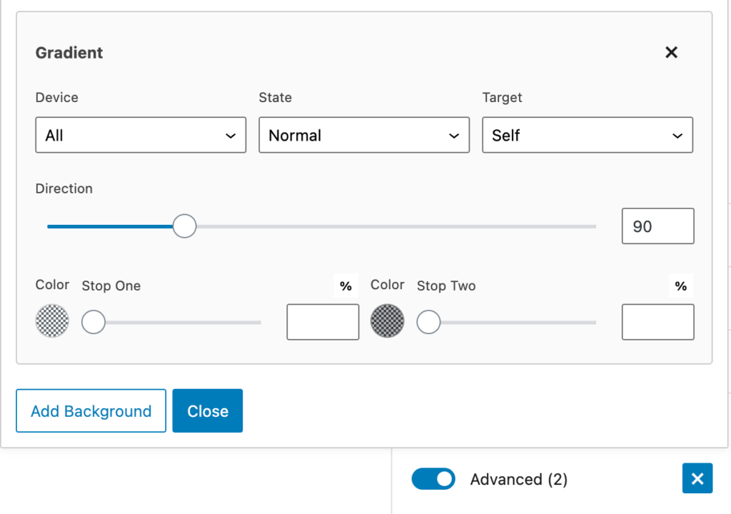
Direction
This is the direction of the linear gradient, from 0-360 degrees.
Color One
The first color of the gradient.
Stop One
Where the first color stops in the Container.
Color Two
The second color of the gradient.
Stop Two
Where the second color stops in the Container.