The Button block allows you to add button(s) to the page.
Each individual button has a lot of options you can use to fully customize them.
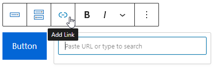
The most important part of a button is its destination. You can access the URL field by clicking the Add Link button.
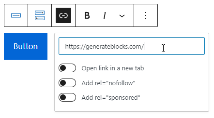
Once a URL is entered, more options will appear:
Adding a Button Container
Prior to GenerateBlocks 1.7, adding a Buttons block to the page actually added two blocks, the Button Container and individual Button block inside of it. With the new Container block and the addition of the flexbox options, it made perfect sense to deprecate the “Buttons” block.
Now adding a Button block only adds a singular button and you have the option from the blocks toolbar to add a Button Container block variant around it. This is only necessary when organizing multi-buttons layouts and alignments. Please check out the Button Alignment article to learn more.
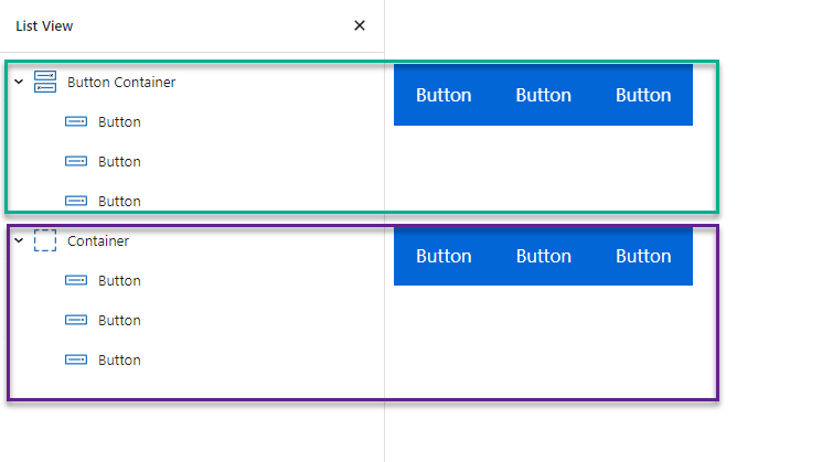
Note that Button Container is simply a Container block with Display option set to Flex by default. The available components are identical. In other words, these two structures are exactly the same:
Button Alignment
These options require GenerateBlocks 1.7.
Prior to GenerateBlocks 1.7, adding a Buttons block to the page added two blocks, the Button Container and individual Button block inside of it. With the new Container block and the addition of the flexbox options, it made perfect sense to deprecate the “Buttons” block.
This change provides users with more control over their designs and allows for greater creativity by revealing more possibilities.
Button Alignment Examples
Multiple button blocks in one row
This is the default behaviour of a Button block as its Display attribute is set to inline-flex.
Multiple button blocks in one row with Alignment
To set alignments for multiple Button blocks in one row:
- Wrap the Button blocks with a Container block.
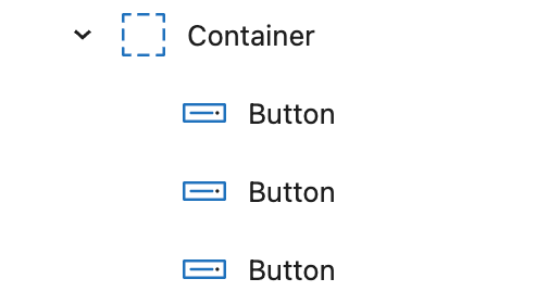
- Display:
flex - Column gap:
10px(optional: to add space between Button blocks)
- Use the Justify Content options to set the desired alignment.
Multiple button blocks fill one row
To make multiple Button blocks in one row and fill the entire space:
- Wrap the Button blocks with a Container block.
- Display:
flex - Column gap:
10px(optional: to add space between Button blocks)
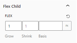
- Select the Button blocks and use the following setting under Flex Child:
- Flex grow:
1
stack full-width button blocks
To stack the Button blocks vertically and make them full width:
Select the Button blocks and choose the following settings under the Layout component:
- Display:
flex - Justify content:
center/flex-start/flex-end(optional: to position the Button content)
stack non-full-width button blocks
To stack the Button blocks vertically and do NOT make them full width:
- Wrap the Button blocks with a Container block.
- Display:
flex - Direction:
column - Row gap:
10px(optional: to add space between Button blocks)
- Multi-select the Button blocks and and choose the following settings under the Spacing component:
- Margin-left:
auto - Margin-right:
auto
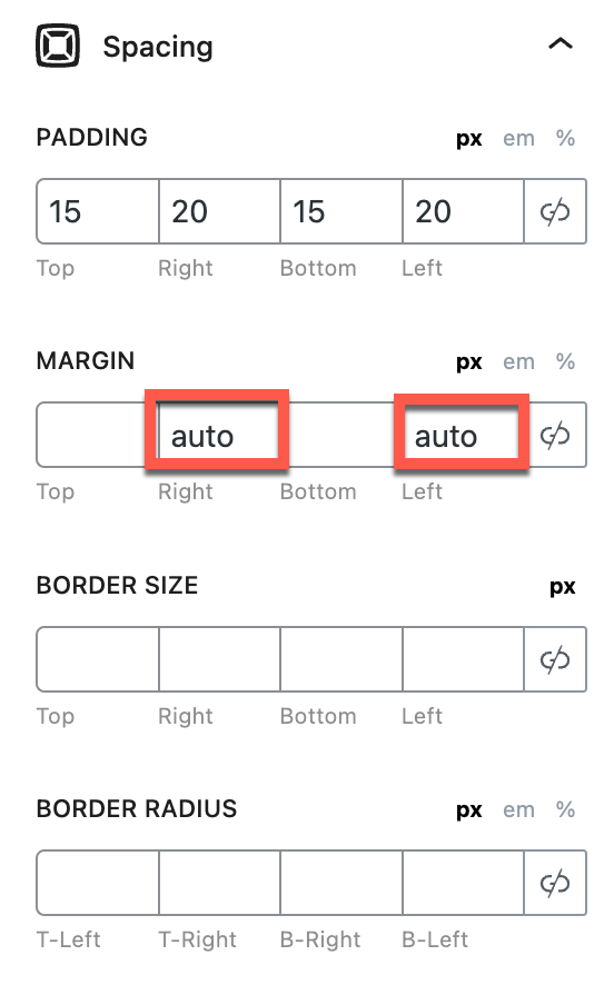
Note: when both margin left& right is set to auto, it horizontally centers the Button block.
To align the Button to the left, set only the ‘margin-right’ property to auto.
To align the Button to the right, set only the ‘margin-left’ property to auto.
Sync GB button style with GeneratePress theme
Many GenerateBlocks users also use the GeneratePress theme along with GP Premium features. Some of these users wish to align GenerateBlocks buttons with the style of the GP theme’s button.
Sync with GP button color settings and define button paddings
By using this filter, you have the capability to achieve this synchronization. Additionally, you have the flexibility to specify custom padding values for your GenerateBlocks buttons as needed.
add_filter( 'generateblocks_defaults', function( $defaults ) {
    $color_settings = wp_parse_args(
        get_option( 'generate_settings', array() ),
        generate_get_color_defaults()
    );

    $defaults['button']['backgroundColor'] = $color_settings['form_button_background_color'];
    $defaults['button']['backgroundColorHover'] = $color_settings['form_button_background_color_hover'];
    $defaults['button']['textColor'] = $color_settings['form_button_text_color'];
    $defaults['button']['textColorHover'] = $color_settings['form_button_text_color_hover'];
    $defaults['button']['paddingTop'] = '10';
    $defaults['button']['paddingRight'] = '20';
    $defaults['button']['paddingBottom'] = '10';
    $defaults['button']['paddingLeft'] = '20';

    return $defaults;
} );
Define typography in GP’s typography system
Furthermore, if you wish to establish distinct typography for GenerateBlocks (GB) buttons within GeneratePress’ typography system, follow these steps:
- Navigate to GP’s Customizer.
- Click on Typography.
- Access the Typography Manager.
- Click the
Add typographybutton. - Choose “Custom Selector” as the Target element.
- Enter
.gb-buttonin the custom CSS selector field. - Begin defining your customized typography styles for GB buttons.
By following these instructions, you can seamlessly tailor typography settings to suit your preferences for GB buttons within the GeneratePress theme.