Our Headline Block allows you to fully control your content.
This block isn’t intended to be used for full paragraphs of text. Instead, you should use the standard Paragraph block for that.
The Headline Block is ideal for headings, call to actions or one line features.
Element
The Element option allows you to choose what kind of text your headline is going to be.
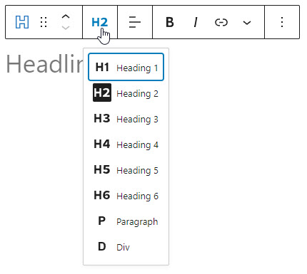
As of right now, it’s not possible to use a span element in the block editor.
Alignment
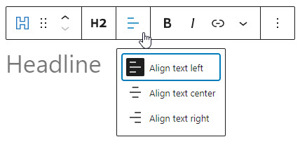
The alignment icons allow you to left, center or right-align your headline.
Highlight
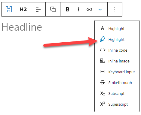
This option allows you to select certain text and apply a unique color to it.
Headline Icon Alignment
These options require GenerateBlocks 1.7.
Starting in GenerateBlocks 1.7, we have introduced comprehensive flexbox options in the Layout component. This allows us to remove the icon position options from the Icon component of the Headline block.
This change provides users with more control over their designs and allows for greater creativity by revealing more possibilities.
Icon positions
icon on the left
This is the default layout of a Headline with an icon. You don’t need to do any specific settings.
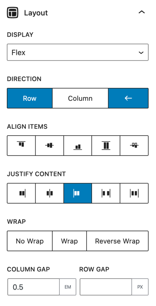
icon on the right
Select the Headline block and set:
- Direction:
row-reverse(row + ←); - Justify content:
flex-end;
You can also set a value for the Column gap to add space between the text and the icon.
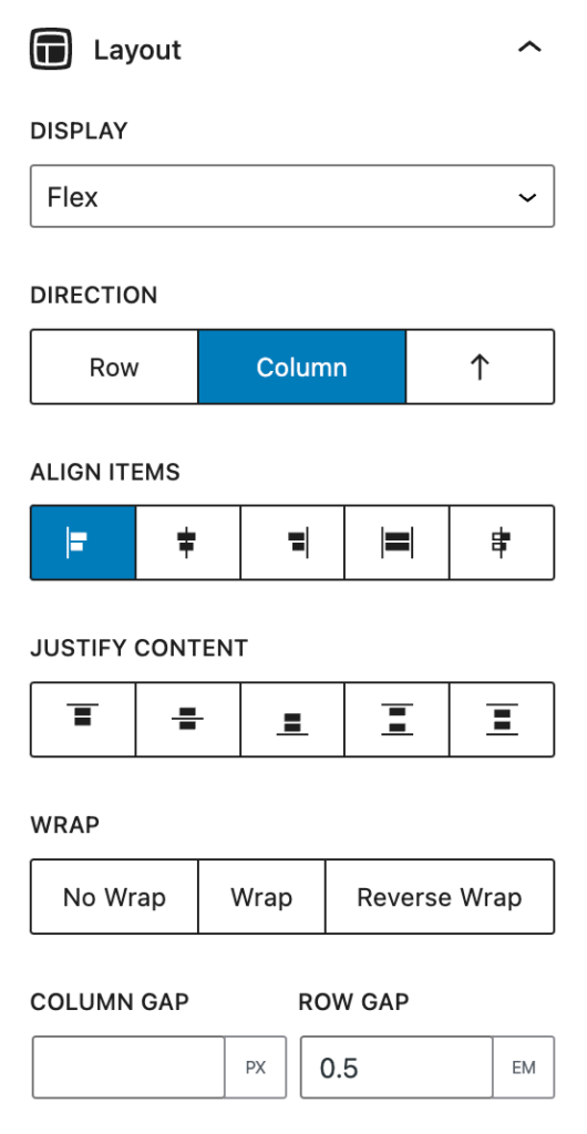
icon on the top left
Select the Headline block and set:
- Direction:
column; - Align items:
flex-start;
You can also set a value for the Row gap to add space between the text and the icon.
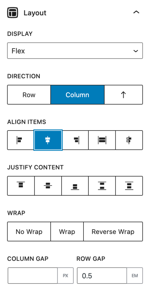
icon on the top center
Select the Headline block and set:
- Direction:
column; - Align items:
center;
You can also set a value for the Row gap to add space between the text and the icon.
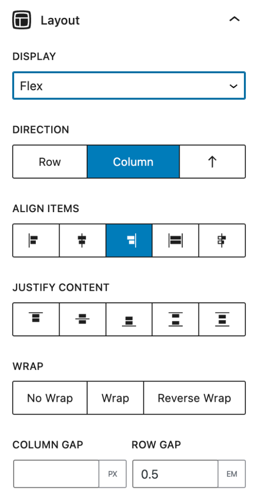
icon on the top right
Select the Headline block and set:
- Direction:
column; - Align items:
flex-end;
You can also set a value for the Row gap to add space between the text and the icon.
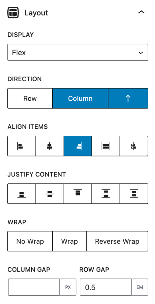
icon on the bottom right
Select the Headline block and set:
- Direction:
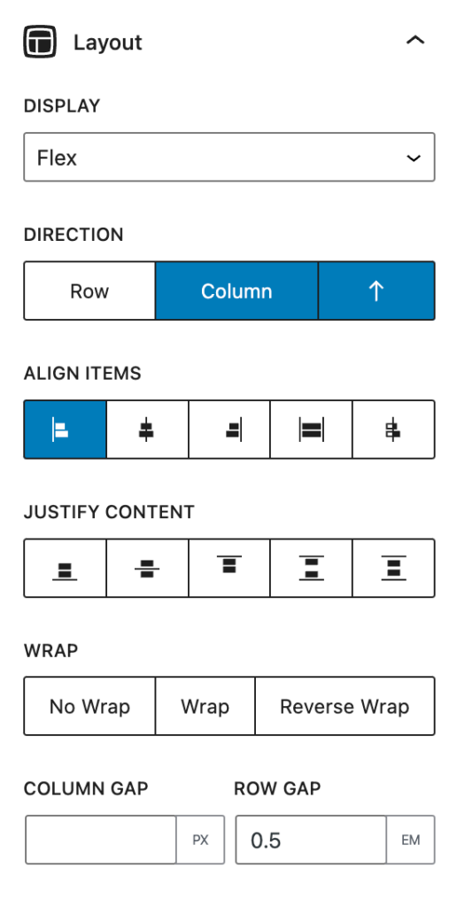
column-reverse(column + ↑); - Align items:
flex-end;
You can also set a value for the Row gap to add space between the text and the icon.
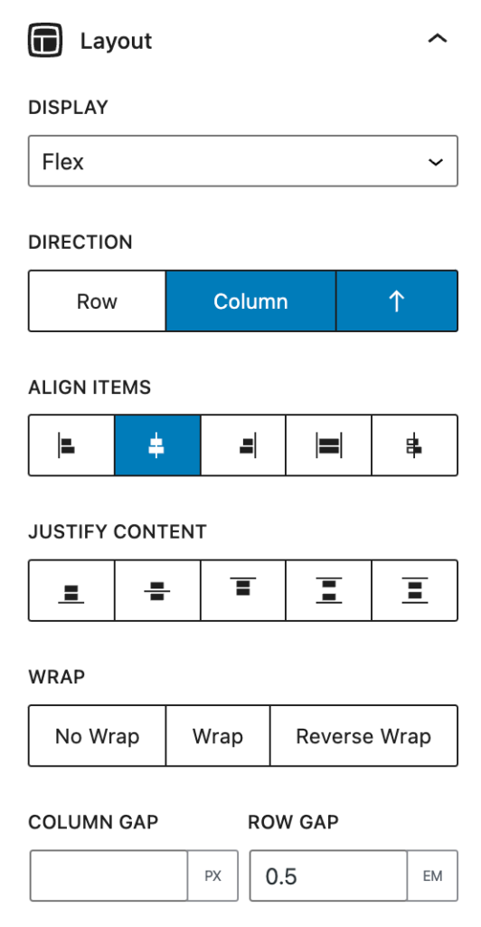
icon on the bottom center
Select the Headline block and set:
- Direction:
column-reverse(column + ↑); - Align items:
center;
You can also set a value for the Row gap to add space between the text and the icon.
icon on the bottom left
Select the Headline block and set:
- Direction:
column-reverse(column + ↑); - Align items:
flex-start;
You can also set a value for the Row gap to add space between the text and the icon.