
Description
The Navigation block displays a dynamic WordPress Menu. It provides extensive design controls allowing you to build all types of custom navigation. Used in conjunction with the Site Header and other GB Blocks you an build any kind of custom header for your site.
To help users get started we have created 15 Header Patterns found in the GenerateBlocks Pattern Library along with the following Quick Start guide.
Quick Start
Adding a basic Navigation to your site can be completed in 5 easy steps:
- Create a Menu in the WordPress Menu Builder in Appearance > Menus
- Edit your site header template*
- Open the GB Pattern Library and add your chosen Site Header Pattern
- Open the Editor List View and Select the Navigation Block
- In the Navigation block settings choose your WordPress Menu
*Site Header template
Depending on the Theme you’re using will determine how to build a site header template.
For GeneratePress Premium users you can use the GP Block Element – Site Header
For Block Based themes you can use a Template Part.
Quick set menu styles
Here you can use the style shortcuts to set the menus background and text colors (normal, hover & current) as well as font size and padding.

Quick set mobile menu colors
Here you can use the style shortcuts to set the mobile background and text colors as well as menu item background and text colors (normal, hover & current).
Visually style the mobile menu
Switch the responsive view to mobile and click the hamburger toggle to open the menu. Now you will be able to see live changes made to the following settings.

Block Structure
The block is comprised of a main Navigation Block and several child blocks. Each block provides extensive controls for customising the navigation.
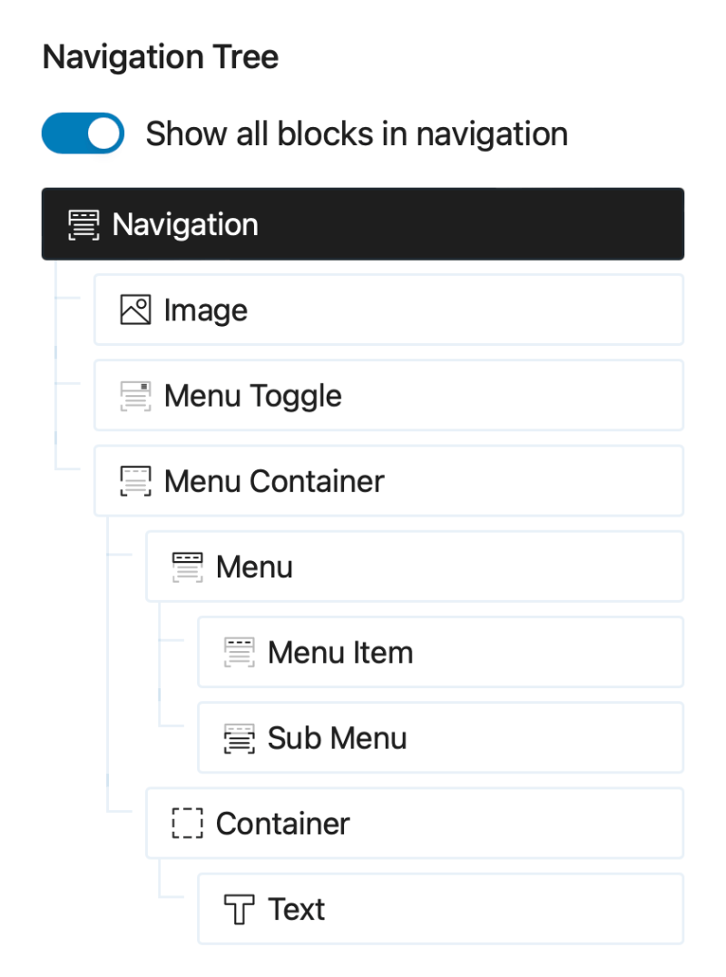
Navigation Tree
The Navigation Tree can found in the Block Settings panel for all Navigation and Menu blocks. It lets you quickly select any of the navigation blocks from the settings panel.
By default, it shows only navigation-related blocks, but you can toggle it to display any other blocks that have been added to the Navigation, such as Buttons.

Navigation
The main <nav> element where the general settings and behaviour can be defined including, the Menu to be displayed, sub menu behaviour and the mobile menu break point.

Menu
Choose from any of the available WordPress Menus.
No Menus Found
the block settings will ask you to create a menu if none are found.
WordPress Menus can be created in the Dashboard > Appearance > Menus.
Enable Menu Support ( Block Themes )
If you’re using a block theme the Menu select input will be replaced with an option to enable Menu Support.

Sub-menu type
Choose one of the the following methods for displaying sub menus.
- Hover
- Click Menu Item
- Click Toggle
Sub-menu Transition
Choose a sub-menu animation transition:
- Fade
- Slide & Fade Up
- Slide & Fade Down
- Slide & Fade Left
- Slide & Fade Right
Choosing a transition provides additional options:
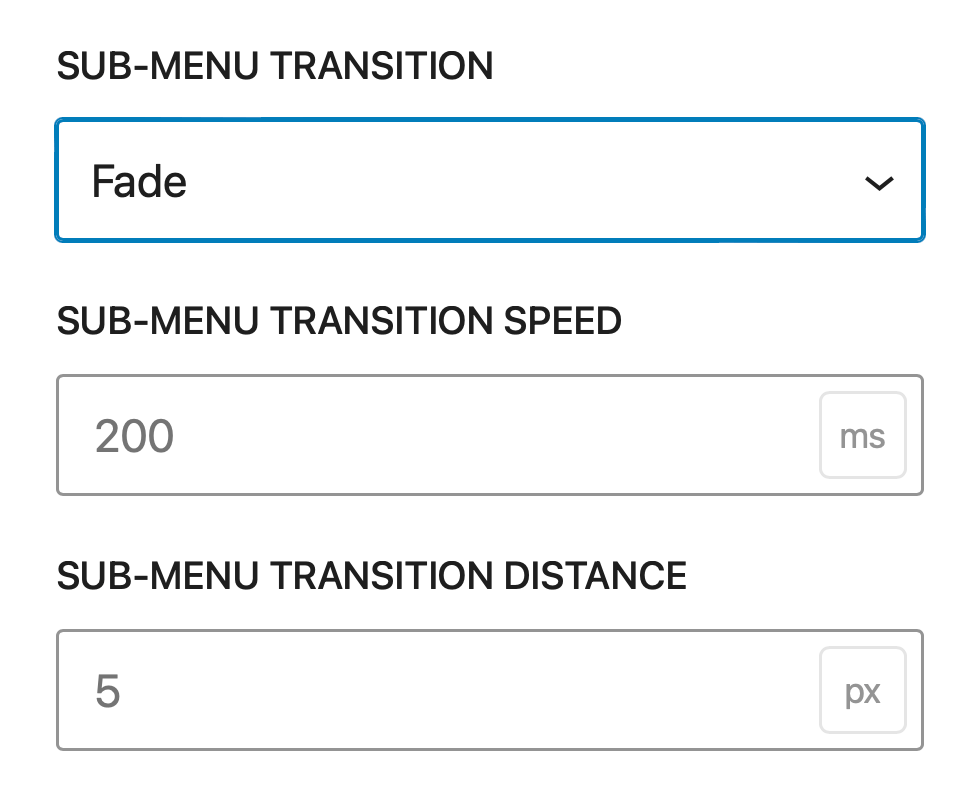
Sub-menu transition speed
Set the Transition Speed
Sub-menu transition distance
Set the distance the sub menu travels; this applies only to slide transitions.
Mobile Breakpoint
Set the screen size at which the Mobile Menu is displayed
Mobile Menu Type
Choose the menu overlay type
- Full Overlay
- Partial Overlay
MOBILE MENU ANCHOR
When Partial Overlay is chosen the mobile menu will automatically position itself beneath the Navigation ( or Site Header ). You can change this behaviour by adding a element selector for the mobile menu will attach to the bottom of.
Mobile Menu Transition
Choose the mobile menu transition
- Fade
- Slide Left
- Slide Right
- Slide Up
- Slide Down
- Fade & Slide Left
- Fade & Slide Right
- Fade & Slide Up
- Fade & Slide Down
MOBILE MENU TRANSITION SPEED
Set the transition speed for the mobile menu.
Menu Toggle
Choose the Menu Toggle Icon and use the shortcuts to set the Toggle Background and Text colors For default, Hover and Current states.

Style Shortcuts
Background
Set the Toggle Background colors.
Text
Set the Toggle Text colors
Selector for styling the Toggled version
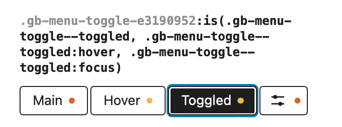
In the block settings select the Toggled selector to style the block in its toggled state.
Overlay close icon
It is the Toggled selector that allows you to style the close icon inside the overlay.
To change its position from right to Left you can set its Style > Position -> Position -> Left to 0`
Menu Container
The primary purpose of the Menu Container block is to wrap the menu and provide the background overlay when the Navigation is in the Mobile ( Toggled ) view state.

Style Shortcuts
These shortcuts apply their property values to the Mobile Menu Container selector ( see below )
Mobile Background
Set the Background colors for the Mobile ( Toggled ) view..
Mobile Text
Set the Text colors for the text within the Mobile ( Toggled ) view.
Selectors

The Menu Container block comes with a list of predefined selectors. The selectors allow you to target the container and the menu items within whilst in the Toggled state.
Mobile Menu Container Selector
The block setting shortcuts for Background and Text colors are applied to the Mobile Menu Container Selector.
There are several selectors to choose from including.
-
Mobile Menu Container
The overlay container. The Shortcut Background and Text colors are applied here. Menu items within will inherit the Text colors.
-
Mobile Menu
The Menu List (
<ul>element ) -
Mobile Menu Item, Mobile Menu Item Hover, Mobile Menu Item Current
The Menu Items in there standard, Hover and Current States.
-
Mobile Sub-Menu Item, Mobile Sub-Menu Item Hover, Mobile Sub-Menu Item Current
The Sub Menu Items in there standard, Hover and Current States.
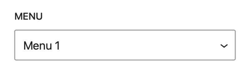
Menu
Select the Menu to be displayed
Menu Item
The Menu Item is a placeholder block that represents all Menu Items. The block settings comes with several shortcuts for styling the menu items include background & text color for normal, hover and current states. As well Font sizes and padding options.
Style Shortcuts
Background
Set the Menu Item Background colors, including Hover and Current colors.
Text
Set the Menu Item Text colors, including Hover and Current colors
Font Size
Set the Menu Item font size.
Inline Padding
Set the Inline Padding for the menu items to increase the items horizontal spacing.
Block Padding
Set the Block Padding for the menu items to increase the items vertical spacing.
Sub Menu
The Sub Menu is a placeholder block that represents all Sub Menu Items. The block settings comes with shortcuts for styling the menu items background & text color for normal, hover and current states.
Style Shortcuts
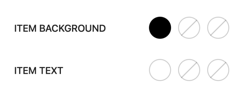
Item Background
Set the Sub Menu Item Background colors, including Hover and Current colors.
Item Text
Set the Sub Menu Item Text colors, including Hover and Current colors.