Build and manage your own library of custom forms that can be deployed anywhere across your site and maintained from one location.
Features include:
- Build forms in the block editor with GenerateBlocks
- Connect to 3rd Party APIs inc. Mailchimp, Kit. MailerLite, ActiveCampaign, Brevo
- Custom integrations with Webhooks
- Build confirmation emails with dynamic merge fields
- Populate default values using static text and dynamic tags
- Conditional Fields displayed on other field values.
- Anti Spam built in with optional CloudFlare Turnstile
Forms are not enabled by default
Go to Dashboard > GenerateBlocks > Settings to enable the Forms feature.
Getting Started
Building with Patterns
The Pro Pattern Library has a Forms category which contains 10 x Contact and 16 x Subscriber Form Patterns and the easiest way to get going.
- Open the page, post, element or wherever you want to add your Form
- Open the Pattern Library
- Insert your chosen From pattern
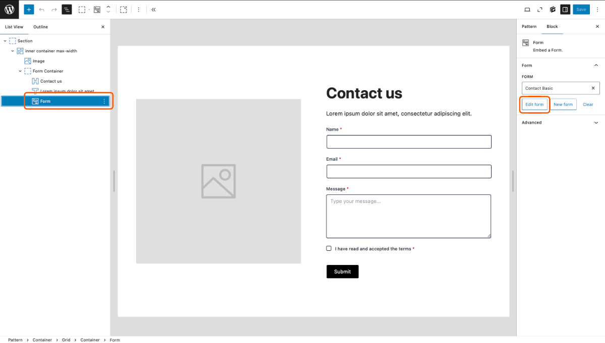
- In the List View select the Form Block
- In the block settings sidebar choose Edit Form to configure your form without leaving your editor
Building from scratch
- Create a new form
- Navigate to GenerateBlocks > Forms in your WordPress admin.
- Add New and choose a starter Template
- Give your Form a title
- Configure the Form Settings
- In the editor Right Sidebar > Form Tab > Form Settings
- Configure the settings of the chosen form type.
- Build the Form using Blocks
- Add, remove, edit the Form Field and Button blocks
- Style the blocks to match your brand
- Save and Deploy the Form
- Save the Form
- Navigate to the post or template where the form is to be displayed.
- Add the Form Block to the post and choose your newly created Form
Admin Overview
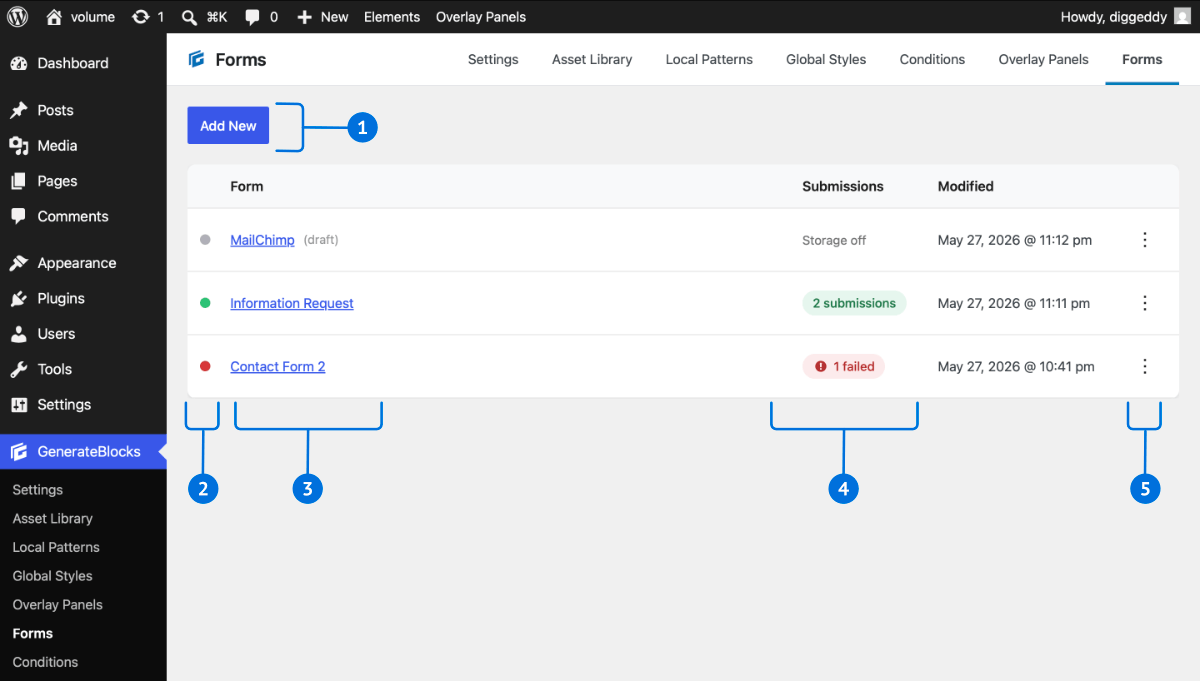
- Add New Form Button
- Form Status Indicator
- Grey = Draft
- Green = Good
- Red = Error, hover over for tooltip info
- Form Name
- Form Submissions Status
enable Submission Storage in Form Settings- Storage Off – no submissions are being stored
- # Submissions ( Green ) – click to view submissions
- # Error ( Red ) – click to view submissions
- Form Menu Options ( 3 dot kebab menu )
- Edit Form
- Duplicate Form
- Check usage ( see where Form is being used )
- Set as Draft
- Delete Form
Create a new Form
Navigate to GenerateBlocks > Forms in your WordPress admin and choose Add New. This will create a new form and open the form editor.
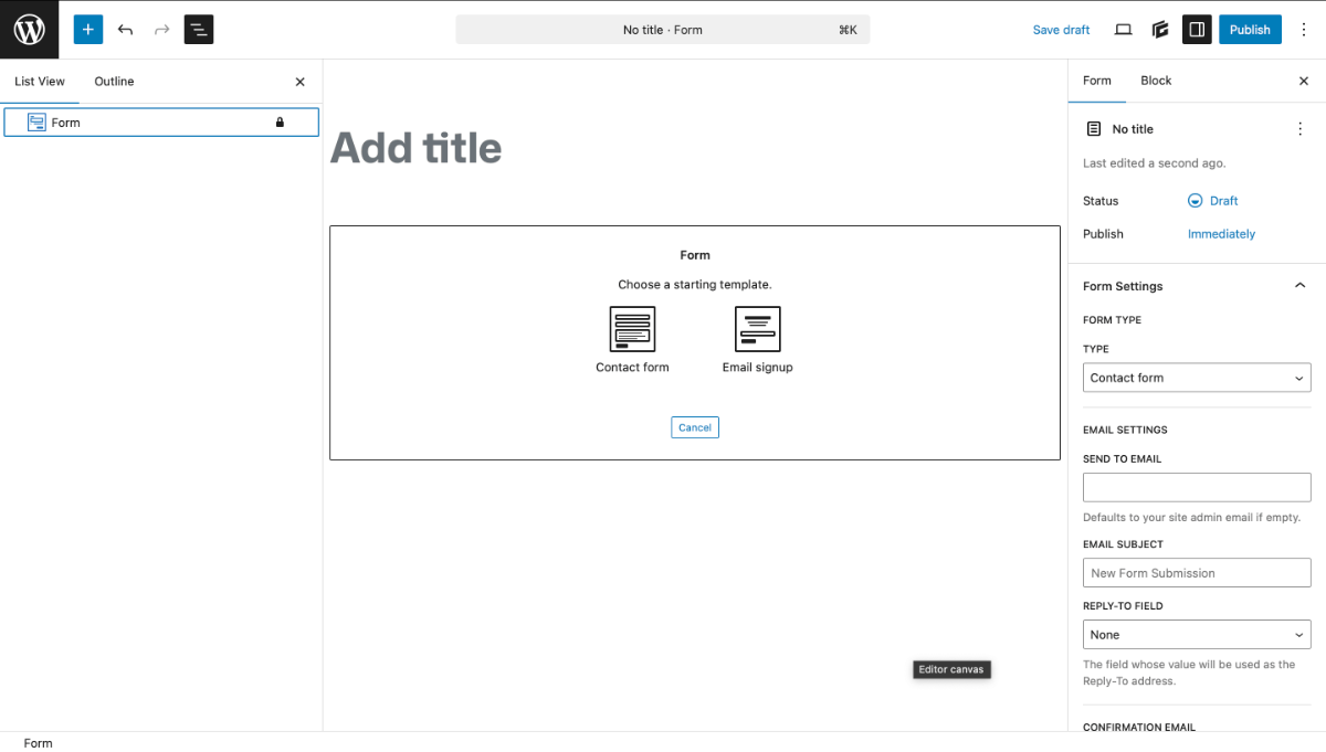
Choose a starting template and Add a Title
The new form will start with a Form Block added to the page; select a Starting Template:
- Contact Form
- Email Signup
A basic form of the chosen type will be inserted for you. Now give your form a Title.
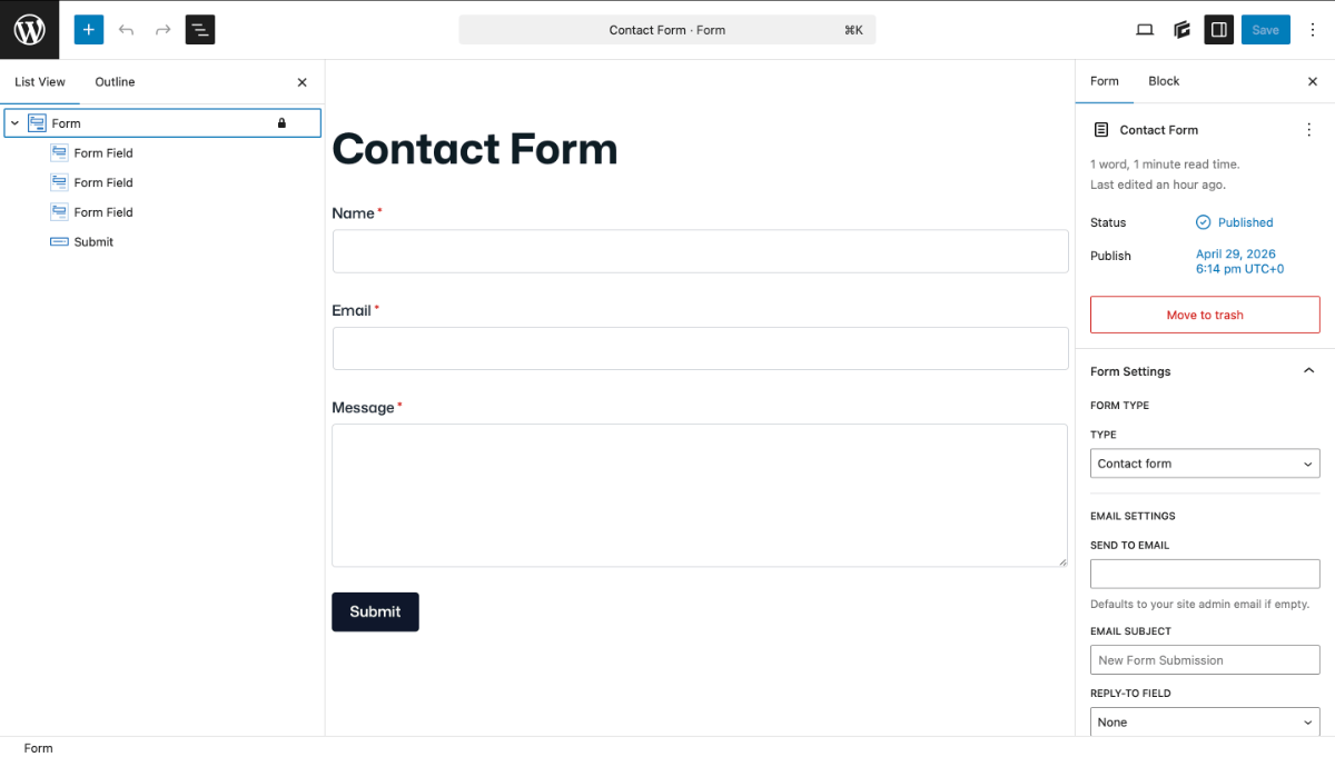
Next Configure the Form settings in the Editor > Right-hand sidebar panel > Form tab.
Configure the Form Settings
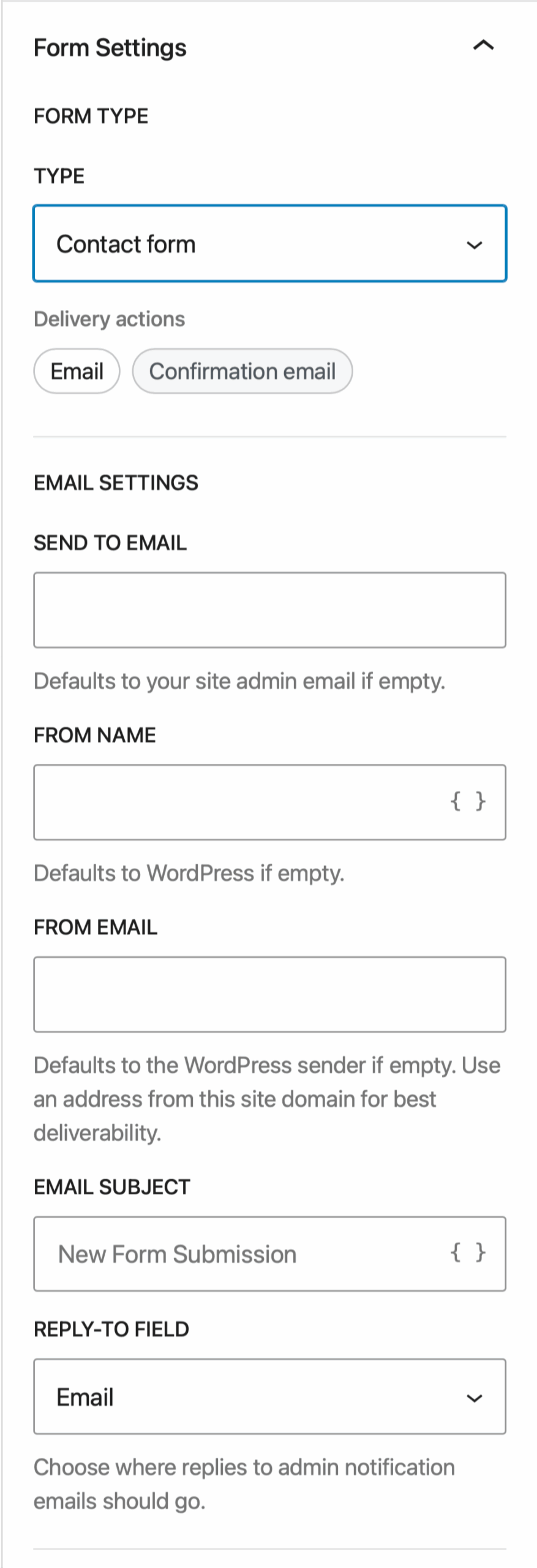
Open the Editor > Right-hand sidebar panel > Form tab. The first setting is the Form Type which will contextualise the settings. There are currently 3 Form Types:
- Contact Form
- Email Signup
- Contact Form + Email Signup
Contact Form Settings
Email Settings
Configure the email settings for where the form data will be sent.
SEND TO EMAIL – add email to send the data. Leave empty to use site admin email.
FROM NAME – set the from name of the email*
FROM Email- set the from email address*
EMAIL SUBJECT – set the subject text of the email*
REPLY-TO FIELD – choose the Form Field to set the Reply-to email.
*supports merge tags
Confirmation Email
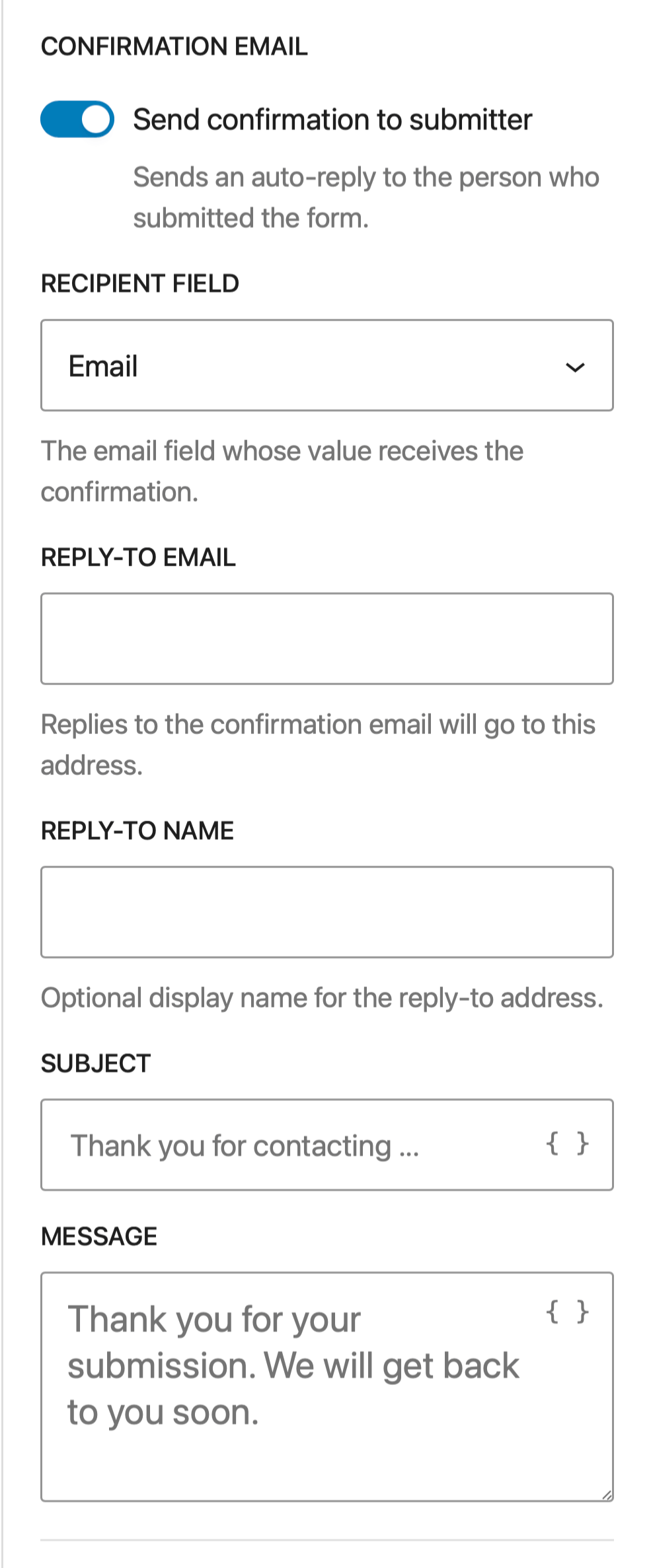
Send a confirmation email to the form user.
RECIPIENT FIELD – choose the email field
REPLY-TO EMAIL – set the reply-to email for the confirmation email
REPLY-TO NAME – set the optional reply-to name to display in the confirmation email
SUBJECT – set the confirmation email subject text*
MESSAGE – set the confirmation email message*
*supports merge tags
Merge Tags
Merge tags allow you to add field data to the confirmation Subject and Message.
Merge tag syntax: {field:name}
e.g. {field:name} or {field:message}
Shortcut to insert a field merge tag
Fields that supports merge tags have a shortcut button to insert a form field for you.
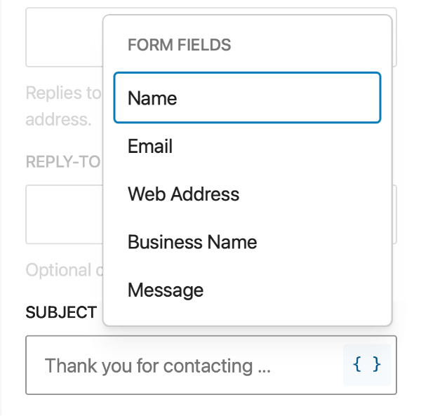
Messages
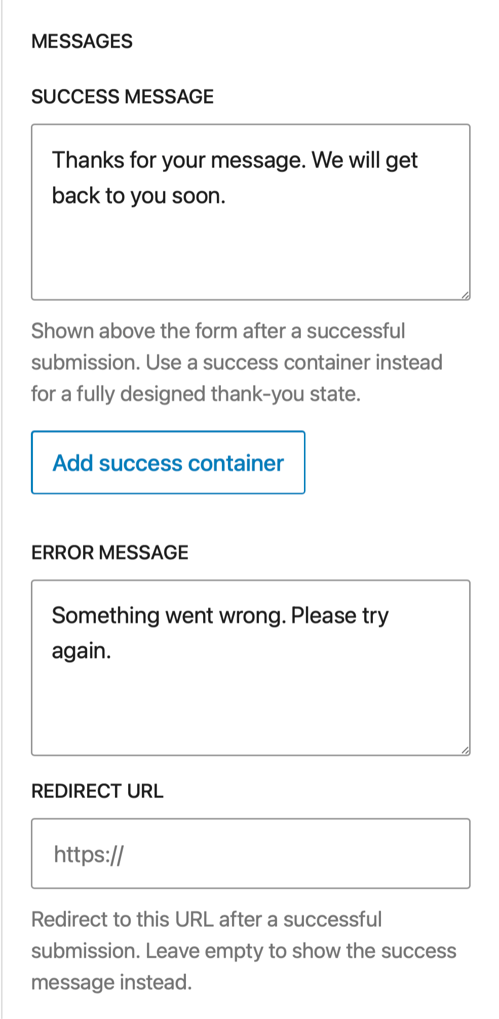
Set the success and error messages on form submission.
SUCCESS MESSAGE – Set the default success notice.
ADD SUCCESS CONTAINER – insert customisable success notice blocks.
ERROR MESSAGE – set the default error notice.
Redirection
REDIRECT URL
Set an optional URL to redirect to after the form submission. Leave this field empty if you do not want a redirect.
Submission Storage
Keep recent valid submissions in the dashboard as a safety net for missed or failed delivery. When enabled the system will:
- store store submissions in the database
- display submission data in the GenerateBlocks > Forms admin
- store a maximum of 500 submissions ( filterable )
- auto remove submissions over 180 days old
Spam Protection
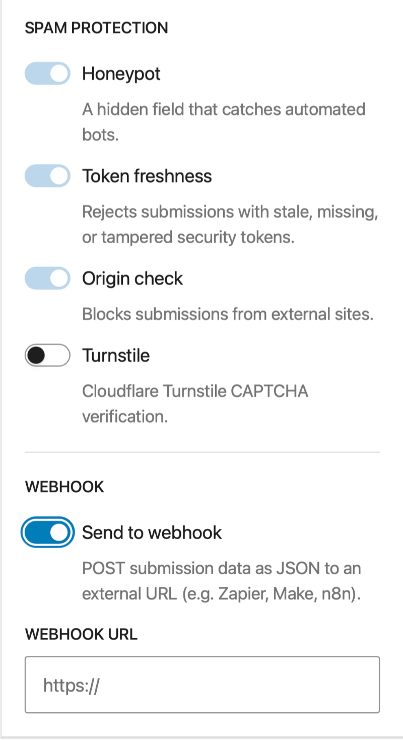
Auto Enabled spam protection includes:
- Honeypot – A dynamic hidden field to catch automated bots
- Token Freshness – Reject submissions with stale, missing or tampered security tokens
- Origin Check – Blocks submissions from external sites.
TURNSTILE
Enable CloudFlare Turnstile CAPTCHA verification. Requires your Site ( Public ) Key and Secret Keys from your CloudFlare account.
Webhook
ENABLE WEBHOOK – Enable and set a webhook URL to send data in JSON format.
Email Signup Form Settings
The Email Signup Form Type is used to connect to a 3rd party mail service provide or a custom service using a Webhook. They differ to the Contact Form type by introducing a settings to connect to an API and configure that connection by mapping the necessary fields.
The Confirmation email, Message, Spam protection and regular Webhook settings are the same as the Contact Email type and are referenced above. This section will focus on just setting up the Email Signup
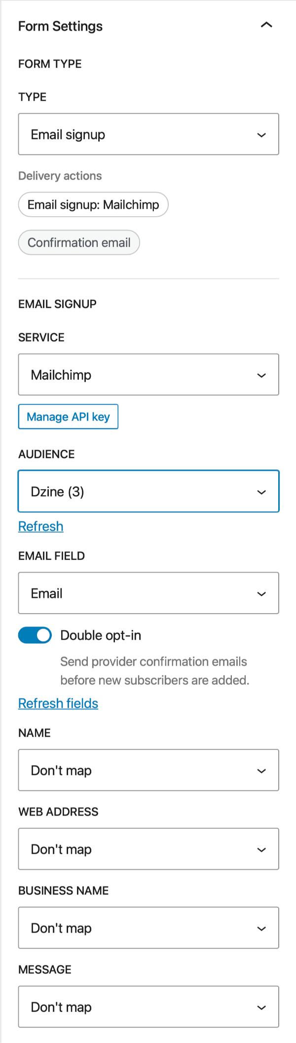
Quick guide to setup
- Select your Service
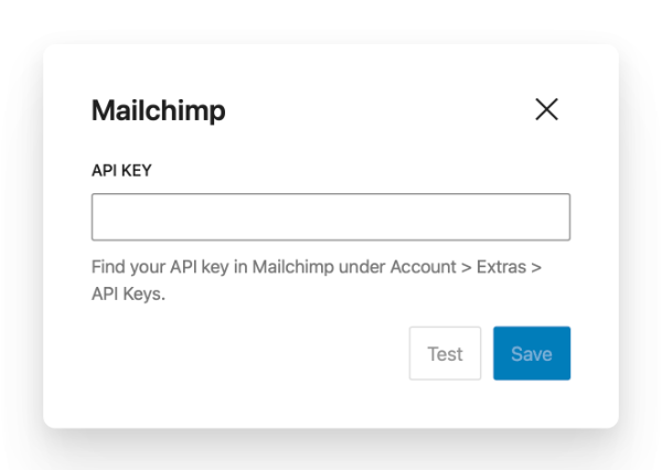
- Set up the API using Manage the API Key
- Choose the “List”
- each provider has different options to choose eg. Mailchimp = Audience
- Choose the Field to map to the Email Field
- Select other Fields to map
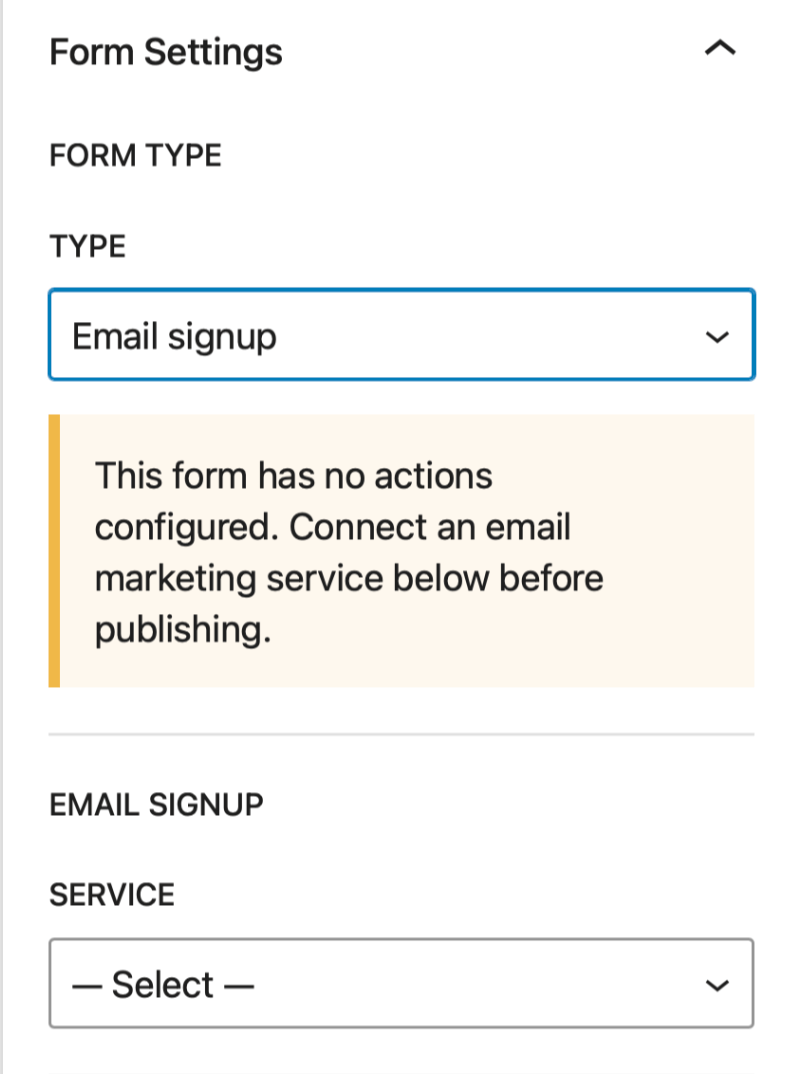
EMAIL SIGNUP
SERVICE – Choose from one of the following service to connect your API key.
- Mailchimp
- Kit ( ConvertKit )
- MailerLite
- ActiveCampaign
- Brevo
- Webhook
3rd Party Services
To access any 3rd party requires an account with the service provider. Neither the account or the appropriate registration requirements are facilitated by GenerateBlocks.
Manage API key
Once a service provider has been selected you will need to connect to the service. This requires you to enter the appropriate API key, and for some providers the API URL. Click the Manage API Key button to open the modal where you an configure this.
- API URL – some services require an API URL
- API KEY – enter the 3rd party providers API Key
Lists, Groups, Audiences, Forms etc.
Depending on the selected service provider you maybe required to select a List, Group, Audience, From, Segment etc. The settings will automatically display the relevant option for your selected API.
Email Field
Select the field name to connect the email fields.
Double Opt-in
Opt-in to provider confirmation emails before new subscribers are added.
Refresh Fields
Click to refresh the mapped field list after changes to the API.
Mapped Fields
Displays a list of email subscriber fields that can be mapped to your forms fields. Default state is Don’t Map.
Contact Form + Email Signup Settings
The Contact Form + Email Signup Type is a hybrid type that performs both contact form data collection and email signup in the one form.
Form Type Template
There is no dedicated template for this Form type. You should choose the Contact Form Template to begin and change Form Setting Type to Contact Form + Email Signup
To configure the Form you can refer to the documentation above as the majority of settings are identical
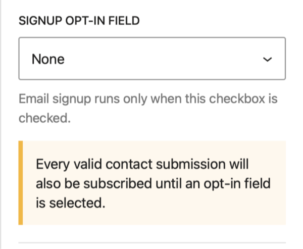
Signup Opt-in Field
A common form pattern is a Contact Form with a checkbox opt-in to subscribe to a mailing list. This hybrid form type allows you to do that.
- Add a check box field to your form for the Optin
- Select the Checkbox field in the Form Settings: Signup Opt-in Field
Building the Form
The visible form is built just like a regular post or pattern with some rules:
- new forms begin with a starter template:
- Contact Form or Email Sign Up
- the template will add:
- a top level form block
- some Field Blocks and a submit button
- you can delete any starter blocks and any valid blocks
- a form must have one and only one form block
The Form Block Structure
An example of the form block in the list view:
A Form will contain one or more Form Field Blocks, and each field has a Label and Control block..
The Form Block
The Form Block is the HTML form element. You can combine it with any other blocks and place any valid block inside it to create any kind of design you want.
All new forms start with a template that adds the Form block with one or more Form Field blocks and a submit button inside.
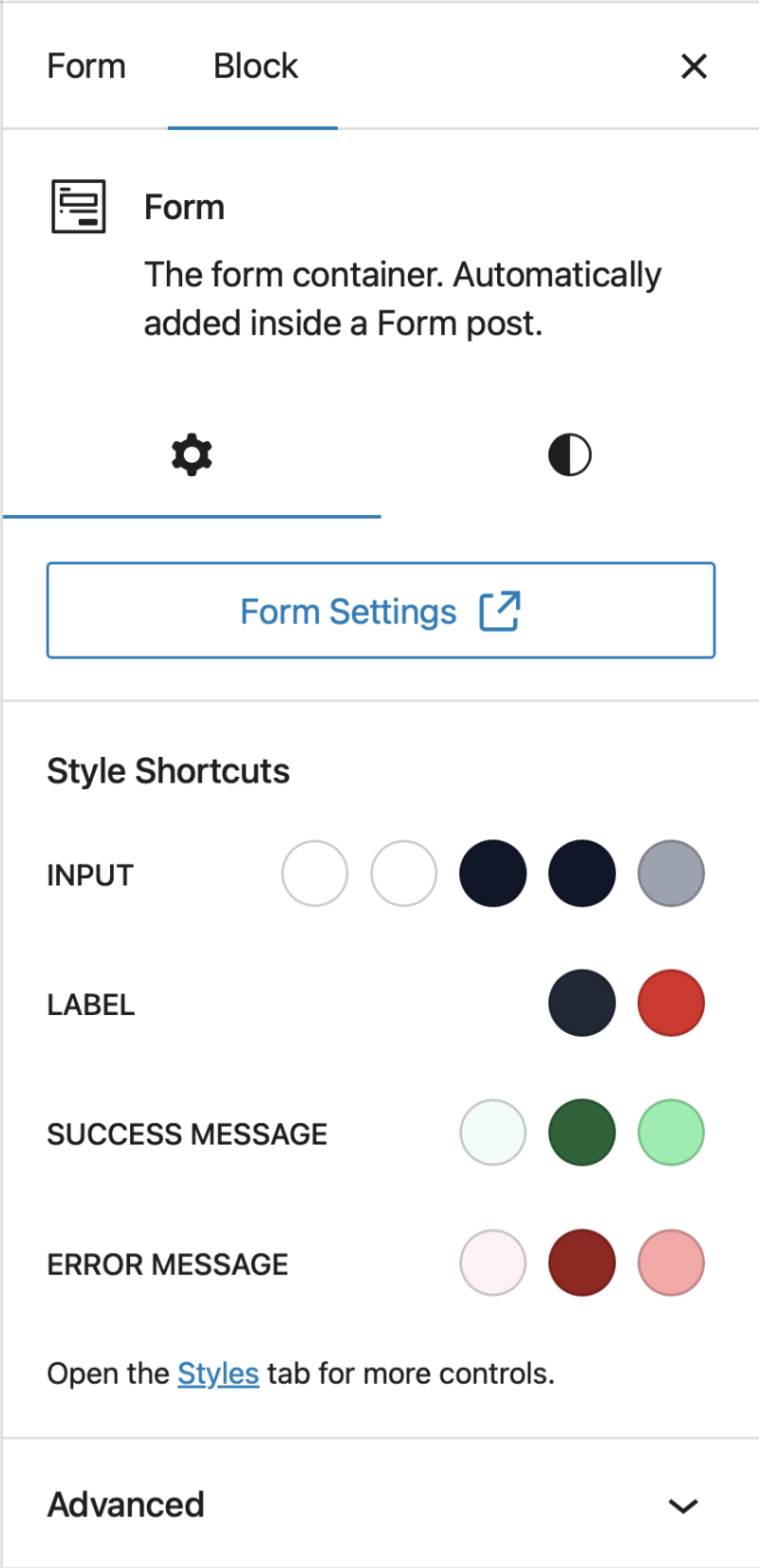
The Form Block settings
Style Shortcuts
Set the colors for Inputs, Labels, Success Message and Error Message. These shortcuts apply the relevant properties in the Styles tab.
Adding Fields and other blocks inside the Form
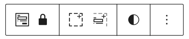
You can any type of block inside the Form using the regular methods such as the regular block inserter. The blocks toolbar also provides a quick function to insert Form Field Blocks:
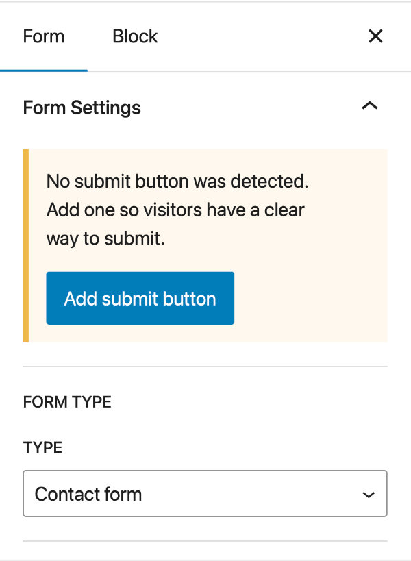
Adding a ( missing ) Submit Button
If you have accidentally deleted the submit button, then go to the Right-hand sidebar panel > Form tab and click the shortcut button to return it.
The Form Fields
The Form Field is a versatile block that contains a Label and a Control block which allow you to build any kind for field controls.
Configuring a Form Field
- Select the Form Field block
- Go to the block settings:
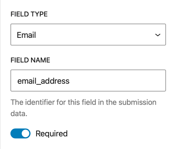
- set the FIELD TYPE
- give it a unique FIELD NAME
- set the Required option
- Go to the block settings:
- Select the Form Field Label block
- Set the label in the editor or block settings
- Select the Form Field Control block
- Go to the block settings
- configure the control settings
- settings are contextual to the FIELD TYPE
- Go to the block settings
Form Field settings
FIELD TYPE
Set the field to one of the following types
- Text
- URL
- Telephone
- Number
- Textarea
- Select
- Checkbox
- Radio
- Checkbox Group
- Hidden
FIELD NAME – Set a unique field name – used as the field identifier in the submission data.
Form Label settings
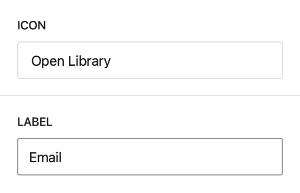
ICON – Choose a option icon for the label
LABEL – Set the Label for the form field.
Form Control settings
The Form control settings are contextual and will change depending on the FIELD TYPE set in the Form Field Block
Text, email, url, telephone, number, textarea
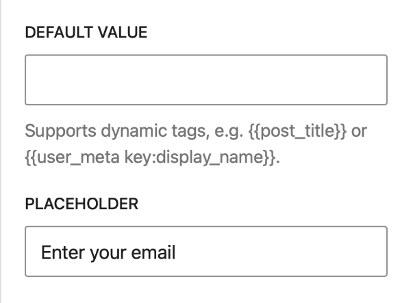
DEFAULT VALUE – Set a an optional default value for the input fields.
Supports dynamic tags, e.g. {{post_title}} or {{user_meta key:display_name}}.
PLACEHOLDER – Display optional placeholder text or the default disabled option in a select input.
REQUIRED – Make the field required.
ROWS – Set the number of rows for a Textarea field.
Checkbox
CHECKED VALUE – The submitted value for the checked-box.
Select, Radio and Checkbox Group
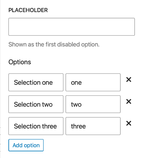
OPTIONS
Build the list of Options for Checkbox Group, Radio and Select fields. Each Option requires a Label and a Value. For Select fields the Placeholder field can be used to display the first disabled option.
Conditional Form Fields
Requirements: the form must contain selectable fields such as Checkboxes, Radios or Selects.
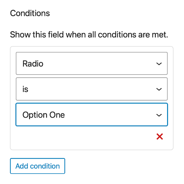
Conditions allow you to show or hide field blocks when the user performs certain form actions, such as checking a box or radio.
- Select the Field Block you wish conditionally display
- Go to the form field block settings
- Add condition
- Choose a field name
- Select a operator
is,is not,is empty,is not empty - Set the value to test if applicable.
Validation Messages
Browsers automatically provide client Side validation for form fields. The messages it produces cannot be edited or styled and translated to the browser locale.
If you want to implement your own Javascript validation, then you can disable the browser native validation with the following HTML attribute:
data-gb-skip-native-validation
You can read more on client side validation in this MDN article.
Deploying the Form
Now you have created a form, you need to display it on your site. You can add the form to any posts, pages, templates, patterns, modals or GP Elements.
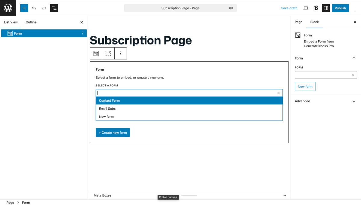
Adding the Form
- Navigate to the place where you want to add the form.
- Insert the Form Block
- Choose the form from the block inserter
Creating and editing forms on the fly
When you add the Form Block to your post, you can also choose to Create a New Form.
If you already have inserted a Form, the blocks settings provides an option to Edit that form.
Both of these options open the Form Editor in a modal, allowing to create and edit forms without leaving your current editor.
Styling Forms
The Form Block and its child blocks can be styled like any other GenerateBlock.
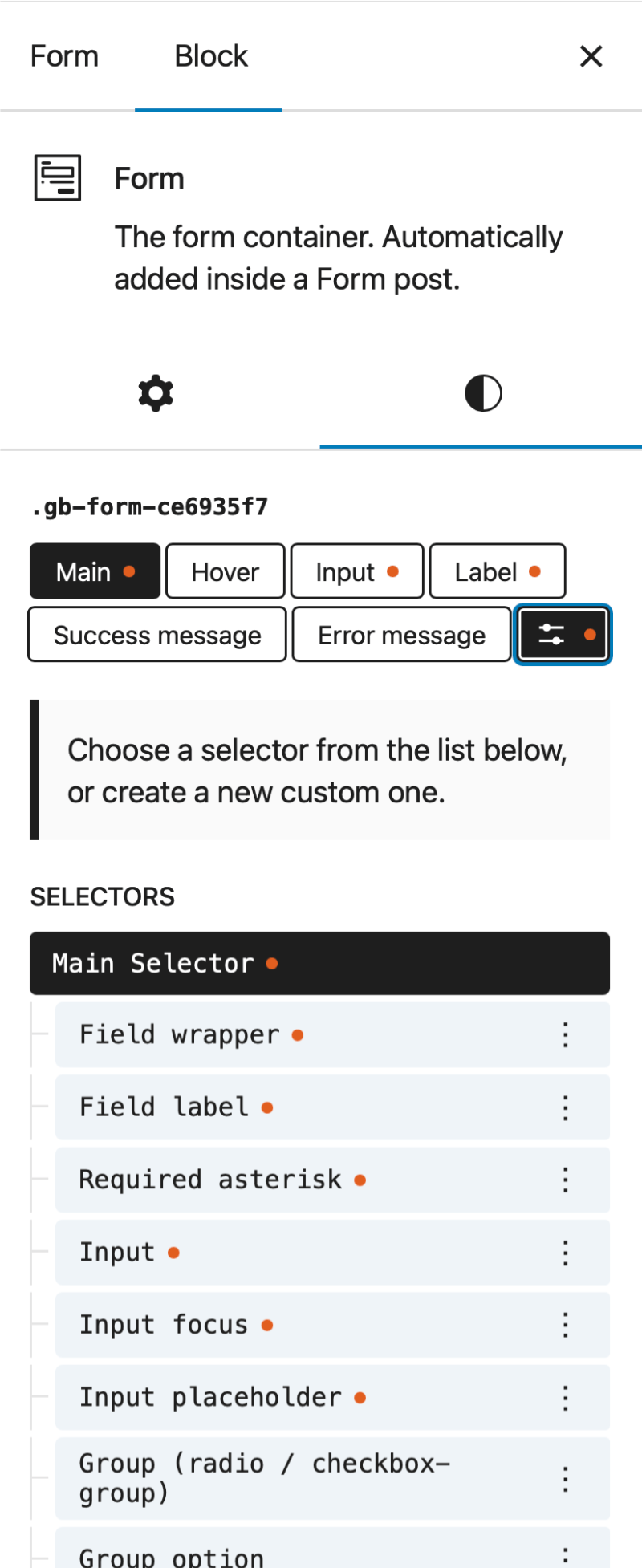
That said, there are color shortcuts and dedicated selectors included in the Form Block settings & styles which can be used to reduce build times and repetitive styling.
Color Shortcuts
In the Form Block > Settings panel is a shortcut color pallet that includes:
- Input
Background, Background Focus, Text, Text Focus, Placeholder - Label
Label Text, Required Asterix - Success Message
Background, Text, Border - Error Message
Background, Text, Border
These shortcuts save time by applying the chosen color value to the an appropriate From Block selector property.
Selectors
in the Form Block > Styles > More Selectors you will see a list of predefined selector properties, allowing you to style common form elements. With them, you can style all input and label elements in one go or target conditional content such as an error notice.
- Field Wrapper
all Form Field blocks - Field Label
all Form Field Label blocks - Required Asterix
all required * ( Asterix ) of the form labels. - Input
Form Field Controls that are alphanumericalinputsandtextareafields - Input Focus
Form Field Controls that are alphanumericalinputsin a:focusstate - Input Placeholder
placeholder text alphanumericalinputsandtextareafields - Group ( checkbox / radio )
the Group form field block for checkbox groups and radio - Group Option
the option wrapper for the individual checkbox or radio - Submit Button
- Submit Button Hover
- Submit Button Busy
- Error Message
- Success Message
the default success message – does not apply to the custom success message.
HTML Attributes
The Form blocks supports HTML Attributes with some restrictions on the Field Field Control blocks as the HTML is dynamically generated depending on the Form settings
Field Controls Supported attributes
aria-*
data-*
autocapitalize
autocomplete
enterkeyhint
inputmode
max
maxlength
min
minlength
pattern
spellcheck
step
title
Field Controls Reserved attributes
aria-invalid
aria-required
checked
class
disabled
id
multiple
name
placeholder
readonly
required
rows
selected
style
type
value