Pop-ups and Modals are just a couple of ways to use the standard overlay panel type. They let you place content on top of the current page for alerts, confirmations, or quick interactions, without navigating away.
You can read more general information on overlay panels here.
This article focuses on building a pop-up or modal using Overlay Panels.
The basics
Pop ups are created using the Overlay Panels feature in GenerateBlocks Pro.
- Pop ups are created using the Standard Overlay Panel type.
- Each pop up is saved as a separate Overlay Panel.
- Pop Ups can appear on various triggers.
- Triggers include Hover, Click, Timed, % scrolled, Exit Intent or a Custom Event
- Like all Overlay Panels, pop ups can be conditionally displayed using the Conditions feature.
Quick Start
Create a Standard Overlay Panel
- Navigate to GenerateBlocks > Overlay Panels in your WordPress admin.
- In the Overlay Panel admin choose Standard from the Add New dropdown.
- This will open the block editor.
- In the Block Editor give your Overlay Panel a descriptive name.
- Open the Pattern Library and choose a Pop Up Pattern to get started.
- Configure the Overlay Panel settings.

Build your Pop Up with GenerateBlocks
The block editor
The first thing you will notice is that Overlay Panels are built in the regular block editor. No proprietary systems or tools to learn. You can build your pop up your way using whatever Blocks you want.
Remember you’re 100% in control of the entire pop up design if you’re having trouble knowing where to start import one of many patterns from the GenerateBlocks Pro pattern library.
Start with a Container Block for padding and backgrounds
If you’re building from scratch start your build with an outer container block. This container should have padding and a background color.
The Patterns
To help you get started we have created a series of Pop Up Patterns available in the Overlay Panels collection.
- Open the Pattern Library in the GenerateBlocks Panel
- Select the Pop Up Category
- Choose a Pop Up to insert.
All Patterns are built using GenerateBlocks Pro and have a small amount of Global Styles to help you customize them as a set.
How to build a popup: The Anatomy of a Pop Up Pattern
To help illustrate how a Pop Up works, we can use Pop Up 1 from the Pattern Library as an example. Here is how it looks:
And here is the List View of the blocks:
The anatomy is split Ito 3 distinct parts:
- The parent container
- The content blocks
- The exit button bar
The Parent Container ( Overlay Panel )
Our pop up needs a parent container. This container is present in all pop up Patterns and are named Overlay panel for easier identification..
The Global Style
The parent container has local block styles and a single global style class of: .gbp-overlay-panel.The global style provides the block with:
You can modify these global style values or add new properties such as Borders to apply them to all Pop Up Patterns.
All other styles come from the local Block Styles
The Local Styles
Width = 450px; this sets the preferred width of the container.
Max Width = 100%; this stops the container block from overflowing on smaller screens.
Padding = 32px; this adds a safe zone around the pop up panels content.
Margin Top & Bottom = 32px; this stops the panel from touching the browsers vertical edges.
Position = Relative; this allows us absolutely position our Exit Button. More on that later.
The Content Blocks
The patterns come with some filler content in Headline, Text and Buttons blocks which are wrapped inside their own Content Container. You can edit, style or remove these blocks; and add additional blocks if you need. There is no limitation to what you can build inside your pop up.
The Exit/Close Button should come last in the list
When modifying the content please ensure the Exit/Close blocks are last in the List View.
The Exit Button Bar
The Button Bar which contains the button are the last blocks inside the container ie. at the end of the List View. This is for accessibility. Keyboard or other assistive technology users will be able to tab through the pop up content; buttons, form fields etc. before reaching the exit/close button.
However, the visual position of the button block is at the top right hand corner, which is achieved with the exit button bar styles:
Padding = 4px; keeps the button inside away from the edge.
Text Align = Right; this positions the close button to the right.
Position = Absolute, Inset Top, Right, Left = 0; this positions the bar and the contained button at the top of the pop up.
The Close Button
Inside the Button bar is a Close Icon Button, which when pressed will close the pop up which requires some Advanced settings.
The button blocks settings
Icon is set on the individual button to a regular X icon. Changing this icon only applies to this button, it will not update the other patterns.
Icon Display is set to Show the Icon by itself. This removes the option to add a text label.
Advanced > Aria Label is set to Close Overlay, this provides an accessible name in the absence of of the text label.
Advanced > Overlay Panel Trigger is set to Close Opened Overlay Panel. This is all thats required to make any button close an open overlay panel.
The Global Style
The close button blocks styles are applied from a single global style class of: .gbp-overlay-panel__close
This global style is applied to all close buttons in the Pop Up patterns and styles the buttons padding, colors and positioning.
Configuring the Overlay Panel options
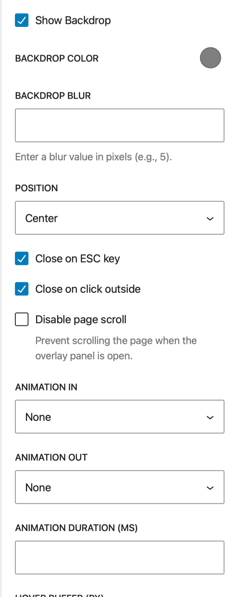
In the editor right sidebar open Overlay Panel tab to view its options.
Use these settings to configure the various options including:
- Display Conditions
- Trigger type
- Backdrop
- Close options
- Animation
- Hover Buffer
- Width Mode
For more information on each of these general overlay panel settings see: Overlay Panels


Triggering the overlay panel with a Click or Hover
Overlay panels with a trigger type of click and or/hover must be attached to a block that the user can interact with.
- Decide where to add your trigger element
- eg. in a GP Element, a reusable block, a widget area, the post content.
- Add a GenerateBlock Button with a HTML Tag of Button for the trigger
- Note: you can use any GenerateBlock if you wish.
- Go to the button block settings Advanced > Overlay Panel Trigger and choose the overlay panel you want it to open.
- Style the Button Block
How to’s
How can I set the width of the Overlay Panel?
By default, an overlay panel’s content is displayed in the center of the screen and sized to fit its contents.
To manually adjust the width of the panel:
- select the parent Container Block
- Set the block Styles > Sizing > Width to a fixed unit value eg. 450px
- Set the block Styles > Sizing > Max Width to 100%
- this will stop the container overflowing screens smaller than the set width
Can I Make a Full Width Overlay Panel?
Yes, you can:
- Set the Overlay Panel settings > Width Mode to Full Width
- Select the parent Container Block and set its Sizing > Width to 100%
Can I Make a Full Screen Overlay Panel?
Yes, you can:
- Make a Full width pop up ( see above )
- Select the parent Container Block
- Set its Sizing > Height to 100dvh.
- Set its Position > Overflow Y to
auto
Allow the Overlay Panel to vertically scroll
Longer overlay panels may extend beyond the height of the viewport on smaller screens and will require the panel to be scrollable for the user to fully interact with it. To allow this:
- Select the parent Container Block of your overlay panel.
- In the blocks Styles set:
- Sizing > Max Height to
100vh - Position > Overflow Y to
auto
- Sizing > Max Height to
How do I add a Close Button to the Overlay Panel?
All pop up patterns come with a close button included. If you’re building your design from scratch then follow these steps:
- add a GenerateBlock Button Block
- Open the Button Block settings
- Set the Tag Name to Button
- Set the Advanced > Overlay Panel Trigger to Close Opened Overlay Panel
- Design the Button how you want.
Can other blocks or HTML elements Open or Close an Overlay Panel?
If you can add data attributes to your blocks then yes you can.
To open, you need to add the attribute provided in the individual Overlay Panel settings > Data Attribute it will look like this:
data-gb-overlay="gb-overlay-47374"
To close, you can add the attribute:
data-gb-overlay-close