
Description
Create interactive carousel layouts to display any kind of content including image galleries, testimonials, hero slides, posts and many other types of static and dynamic content.
Quick Start
- Add a Carousel block to the post
- Choose a Layout to start with
- Open the editor List view to see its construction
- Add, Remove and update the carousel item blocks
- Modify the Carousel Block settings

Choosing a Layout
- Basic
A 3 x Item carousel with Image Blocks displaying 1 slides per view. - Testimonial
A 3 x Item carousel containing Testimonial templates - Query
A query block carousel with a default post query and template - Image Gallery
A 6 x item carousel with Image Blocks displaying 3 slides per view. - Hero Slider
A 3 x item carousel with a hero pattern template displaying 1 slide per view
Viewing the block layout
Opening the List view is the best way to get an overview of the blocks structure and begin editing them. See Block Structure below for examples of the standard and query block layouts.
Updating carousel items
Each slide in the carousel is represented by the Carousel Item block. You can add, remove and update any blocks within the carousel item.
Carousel Block Settings
The Carousel Block is where you define the carousel settings and behaviour. This includes: the number, positioning and spacing of the slides layout; the navigation and interaction options including keyboard control; whether to autoplay and infinite loop and the slide and effect transition between slides.
For more detail see the block settings below.
Adding Carousel Items
To add additional items to the carousel , select any of the Carousel blocks and choose the Add Carousel Item from the block toolbar. This will create a duplicate of the last item in the carousel.
Block Structure
The Carousel Block has a nested block structure. Starting with the parent Carousel block which provides the main carousel settings; such as the number of slides to view, whether to use slide or fade transitions, the keyboard controls and more.
Standard Carousel
Inside the standard Carousel Block is the Carousel Items block which provides the track for each of the individual Carousel Item blocks.
Each Carousel Item should be treated as the individual slide container and can be populated with any kind of block content and styled like a regular Container such as padding, background colors, borders etc.
Additional and optional blocks provided are the Carousel Pagination and the Carousel Control blocks used for navigation..
Query Block Carousel
In addition to the standard form, the Carousel also provides a Query Block variant. This variant omits the need for Carousel Items and Carousel Item blocks. Instead if use the Looper Block for the Items track and Loop Item Block for the individual carousel items.
Using the Query Block carousel you can create interactive displays for all the kinds of dynamic content the regular Query Block can display; whether that be displaying any post type, custom post meta or custom options such as an ACF Gallery or repeater.
Navigation: Pagination and Carousel Control
In both examples above we see the the optional Carousel Pagination and Carousel Control blocks:
Pagination
The Carousel Pagination block can be added via the carousel block toolbar and will display either Bullets, Fractions or Progress bar as defined in the Carousel Block Settings
Carousel Control
The Carousel Control block(s) can be added via the carousel block toolbar. Multiple control blocks can be added to a carousel, each can have a custom icon and provide a different Control Type including:
- Next
- Previous
- Play
- Pause
- Play / Pause Toggle
- First
- Last
Toolbar
The Carousel block has the following toolbar options.


Block Settings



Layout
Slides per View
A responsive control for setting the number of slides to view. The field supports decimal values eg. 1.5.
Space Between
A responsive control for setting the Pixel width space between slides. Range from 0 to 200px.
Grid Rows
A responsive control for arranging the slides in rows. Default is 1 Row.
Slides per Group
Number of slides to advance per navigation click.
Centred Slides
Toggle on to center the active slide
Auto Height
Adjust the carousel height to match each slide.
Responsive
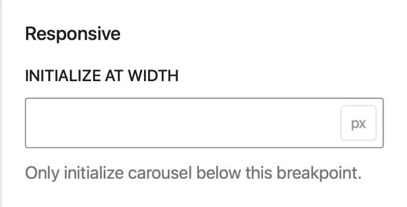
Initialise at Width
Set a width at which the layout will display as a carousel. Use this option to design a standard layout for larger screen eg. a Grid, which converts to a Carousel on smaller devices.
Navigation
These settings are used to set the options of the Carousel Navigation block.
Pagination Type
Choose the navigation type to display:
- Bullets
- Fraction
- Progress Bar
Clickable Bullets
Requires: Navigation Type of Bullet
Clock the bullets to navigate to that carousel item
Dynamic Bullets
Requires: Navigation Type of Bullet
Display dynamic bullets; useful for when there is a large number of carousel items.
Infinite Loop
Allow the Carousel to loop from start to end and vice versa.
Keyboard Navigation
Enable keyboard Tab key navigation.
Mousewheel Control
Allow mousewheel control to rotate carousel items whilst hovering over carousel. This option will work depending on the users devices settings. Standard use requires: holding SHIFT key + Mousewheel movement.
Grab Cursor
Show the Grab hand cursor when hovering over carouse to indicate the slides can be draggedl.
Stop on Last slide
Requires: Navigation > Infinite Loop to be disabled.
Stop the carousel when the last carousel
Autoplay
Start Autoplay Automatically
On page load the carousel will commence rotation automatically. Autoplay is disabled in the editor to avoid distraction.
Delay
Set the time delay between rotation steps.
Pause on Mouse Enter
Pause the autoplay when mouse enters the carousel area.
Disable on Interaction
Stop the autoplay on interaction with the carousel.
Effects
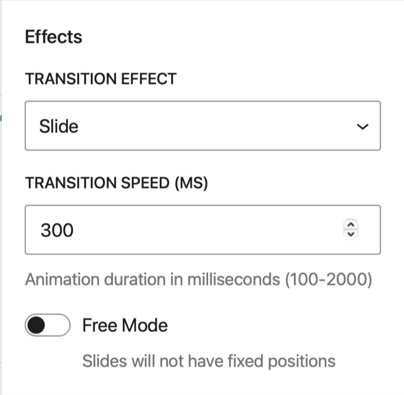
Transition Effect
Choose between Slide and Fade transitions.
Transition Speed (MS)
Set the transition duration time in milliseconds
Free Mode
Slides do not have a fixed position.
Style Selectors
Read more about Selectors here.
Carousel
The Carousel block provides additional selectors for stylings slides based upon their current interactive states.
Slide .gb-carousel-item
Target all slide elements within the Carousel. Useful for adding styles to all slides.
Active Slide .gb-carousel-item.is-active
Target the current active slide. Useful for applying an effect or focus style for the current slide.
Inactive slide .gb-carousel-item:not(.is-active)
Target all slides are not active. Use this in tandem with the active slide to create transitions between inactive and active states.
Next slide .gb-carousel-item.is-next
Target the next slide
Preview slide .gb-carousel-item.is-previous
Target the previous slide.
Carousel Control
In addition to the main and hover selectors you can choose disabled state and the icon.
Disabled :disabled
Style the Carousel Control when in its in a disabled state.
Icon .gb-carousel-control-icon svg
Style the SVG icon of the button.
Carousel Pagination
The carousel pagination block provides selectors for the various pagination styles under the New selector option.
Pagination Dots
Dot .gb-carousel-dot
Dot Hover .gb-carousel-dot:hover
Dot Active .gb-carousel-dot.is-hover
Dynamic Dots
Main Active .gb-carousel-dot.is-active-main
Previous .gb-carousel-dot.is-active-prev
Previous -2 .gb-carousel-dot.is-active-prev-prev
Next .gb-carousel-dot.is-active-next
Next +2 .gb-carousel-dot.is-active-next-next
Pagination Display ( Progress Bar and Fractions )
Progress Bar Fill .gb-carousel-pagination-progressbar-fill
Fraction Current .gb-carousel-current
Fraction Total .gb-carousel-total